Muto
Visual Identity
Bringing a new urban mobility brand to life
We were asked to design the visual identity for Muto, Netherlands e-bike giant Stella’s new urban mobility brand. Our joint mission was to offer an antidote to the stereotypical urban monoculture surrounding modern e-bike marketing.
Our aim was to position Muto as a utilitarian, yet fun lifestyle product to appeal to a diverse audience.
Our thorough brand identity work provided a solid toolkit to see Muto through launch alongside a suite of animated graphics, typography and both physical and digital applications to help the identity live and breathe and evolve in the real world.
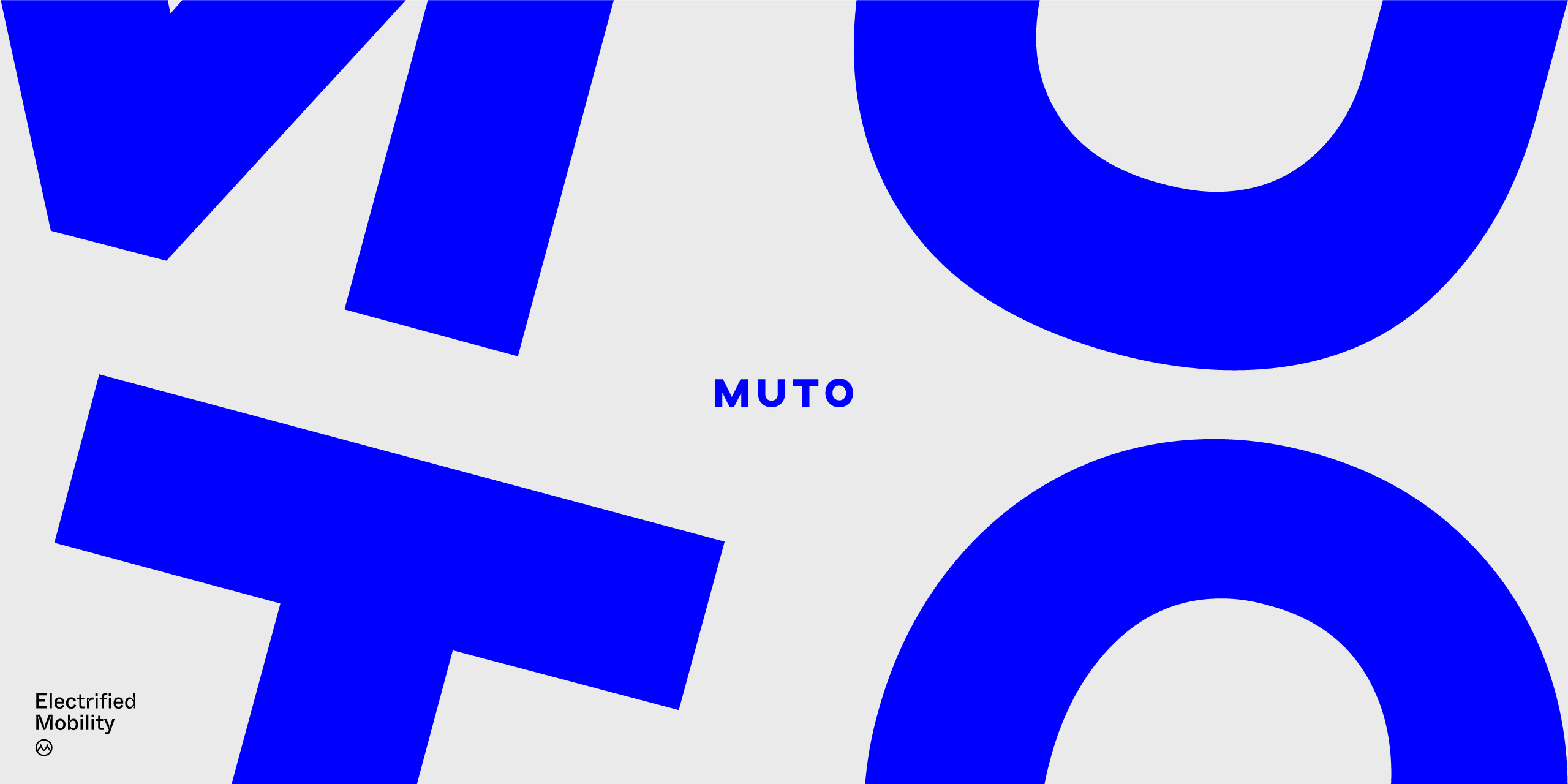
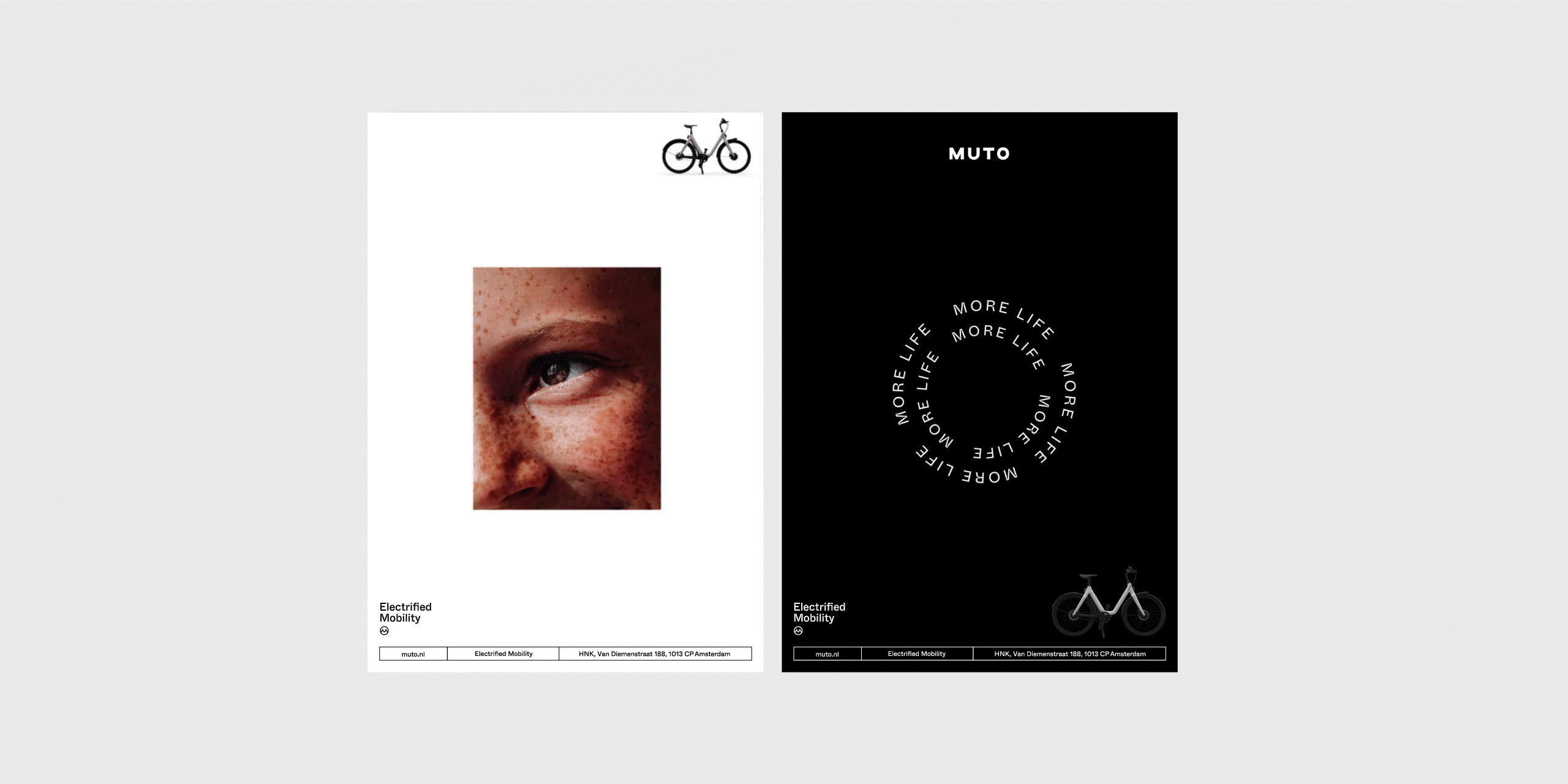
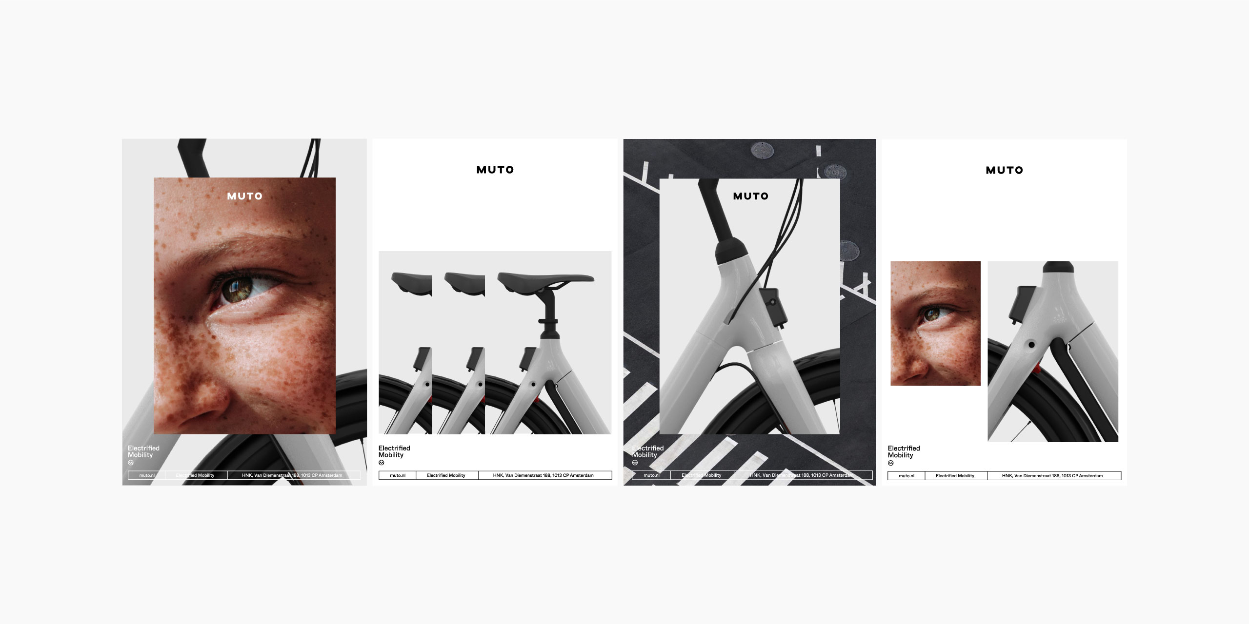
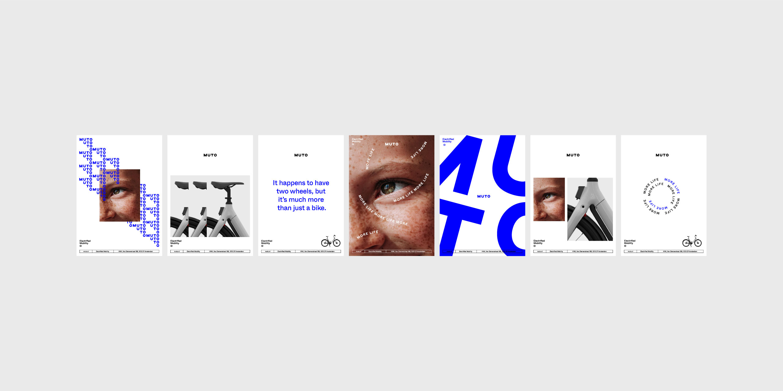
We took a bold yet minimal approach to the identity, seeking to create a feeling of movement through dynamically cropped and collaged photography and animated typographic elements. Creating contrast both in the scale of typographic elements and the use of ‘Electric Blue’ lent a subtle digital or ‘electrified’ feel, while emotive photography sought to inject a sense of the joyful experience Muto provides.
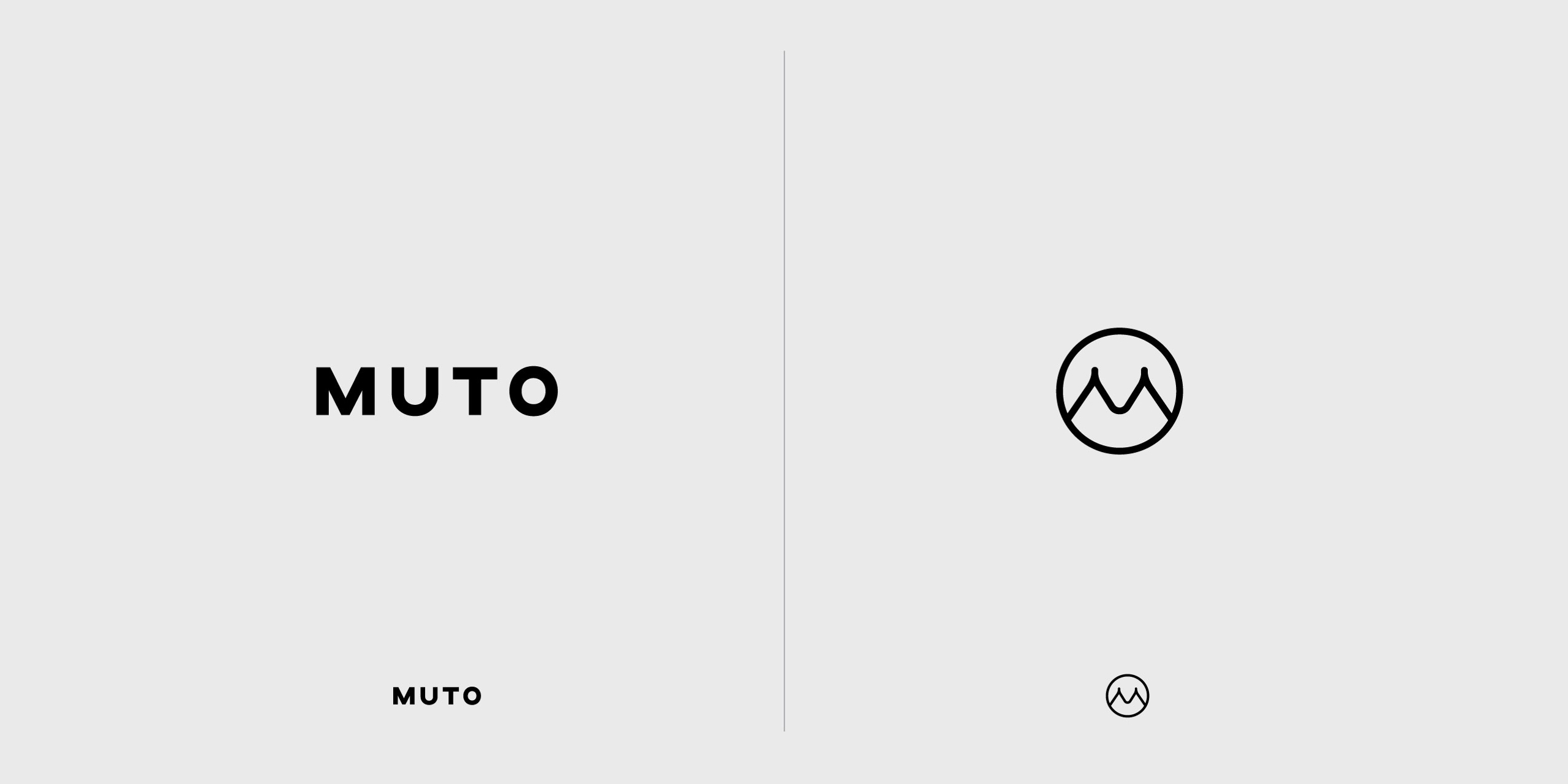
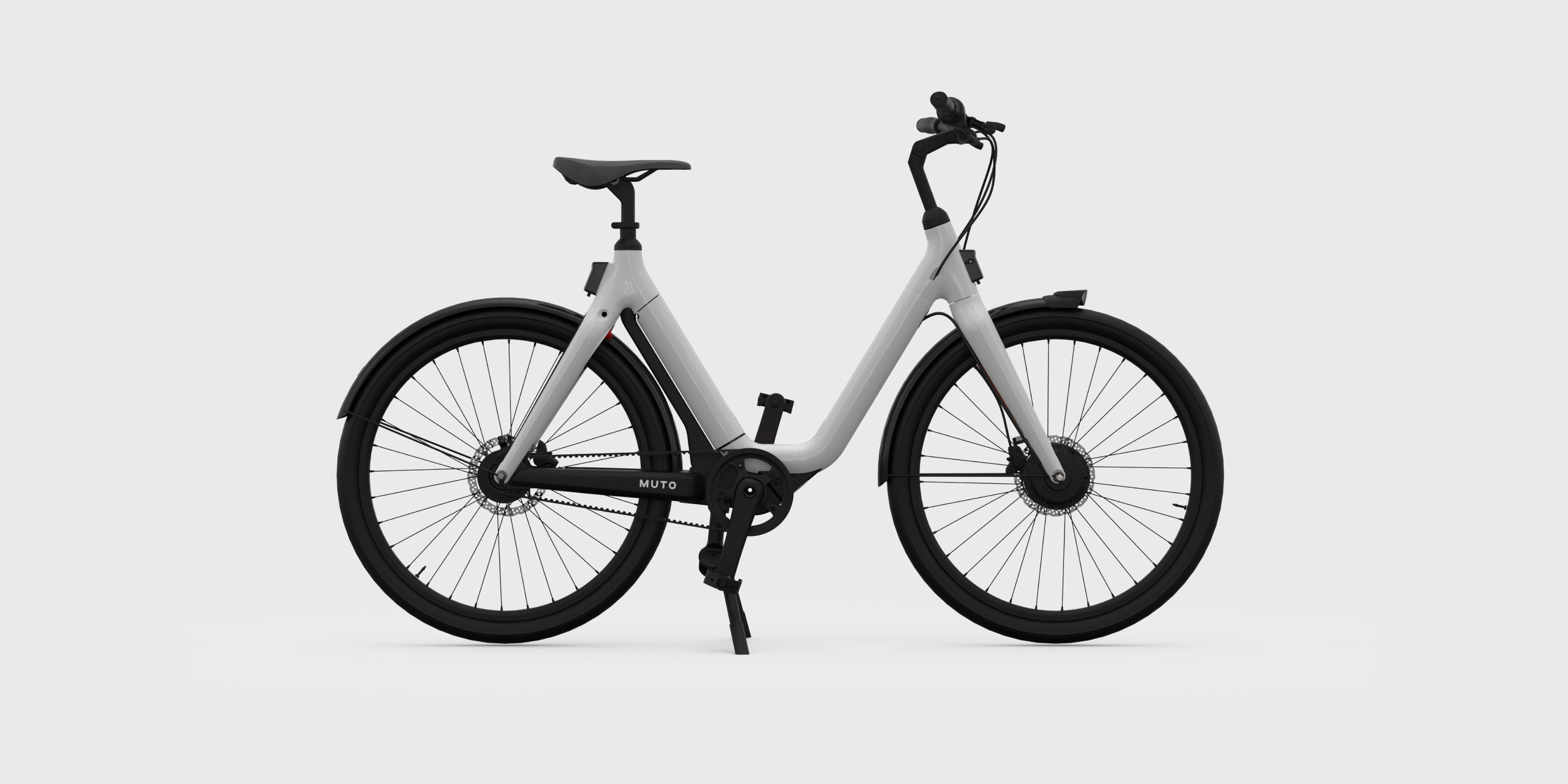
Two marks were created: an animated logotype to give an inherent sense of forward motion and an M-symbol inspired by the e-bike’s frame, encapsulated in a circle as a robust branding element to live across accessories and smaller applications.

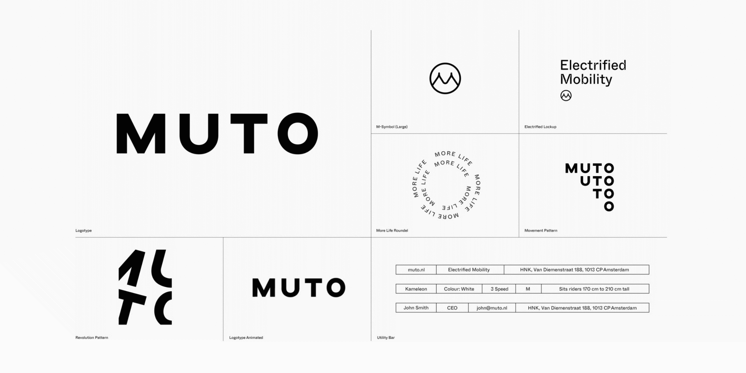
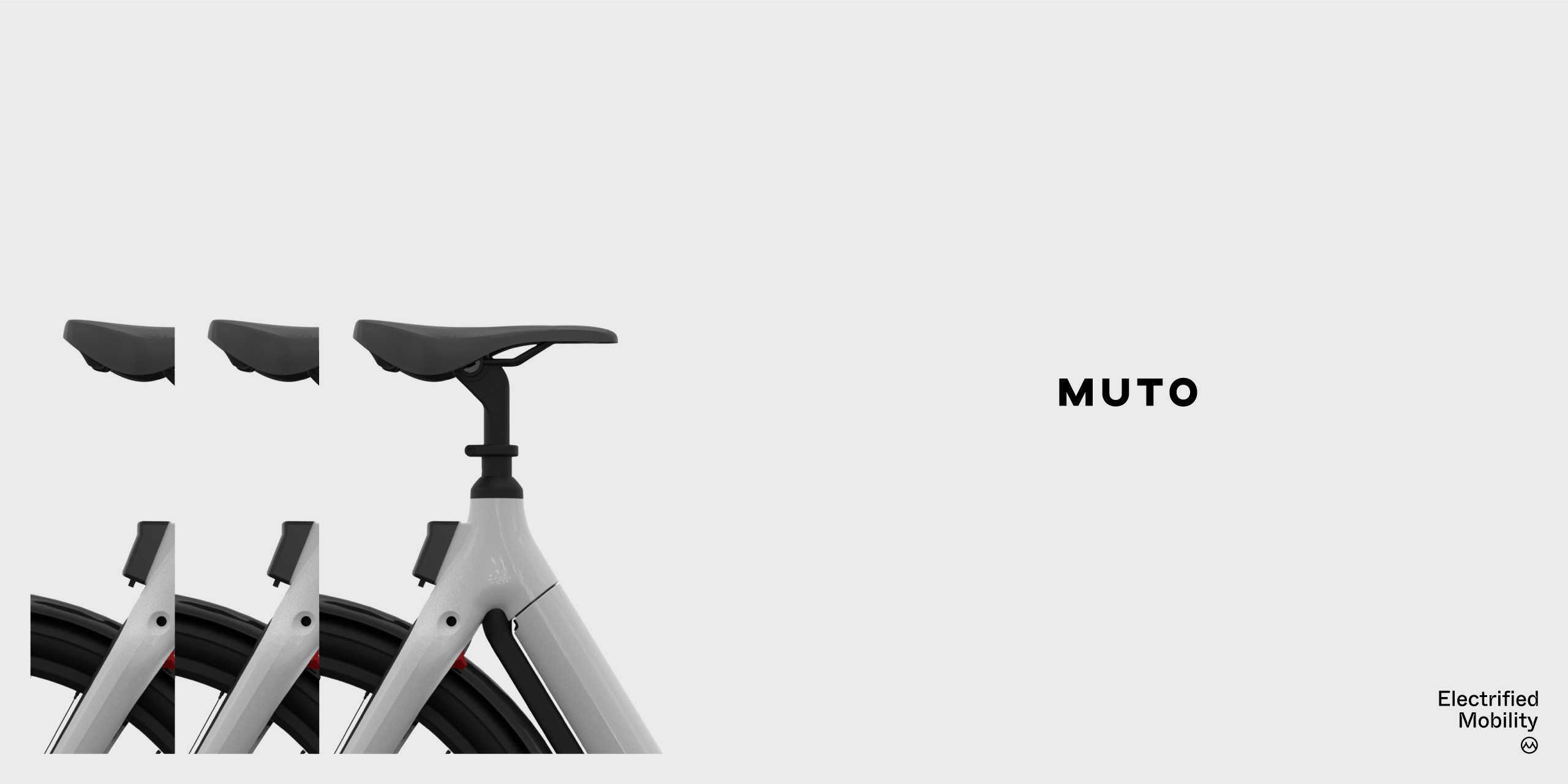
Inspired by Muto’s utilitarian approach to their e-bike’s design, we created a suite of graphic elements that could snap into layouts of any media in a variety of combinations. We created an easy-to-follow set of guidelines that allowed enough flexibility to keep things dynamic while providing the rules needed to maintain consistency.
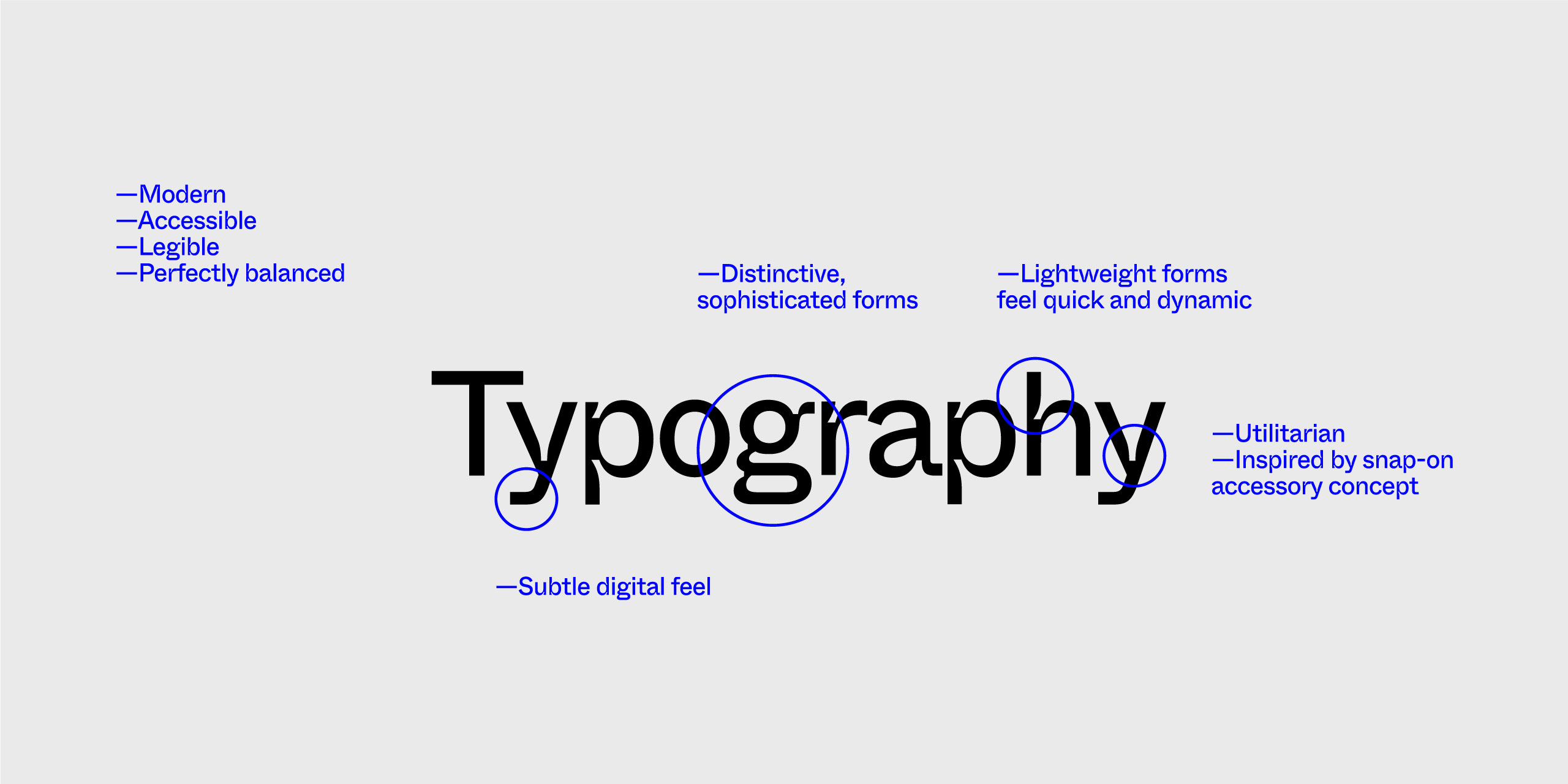
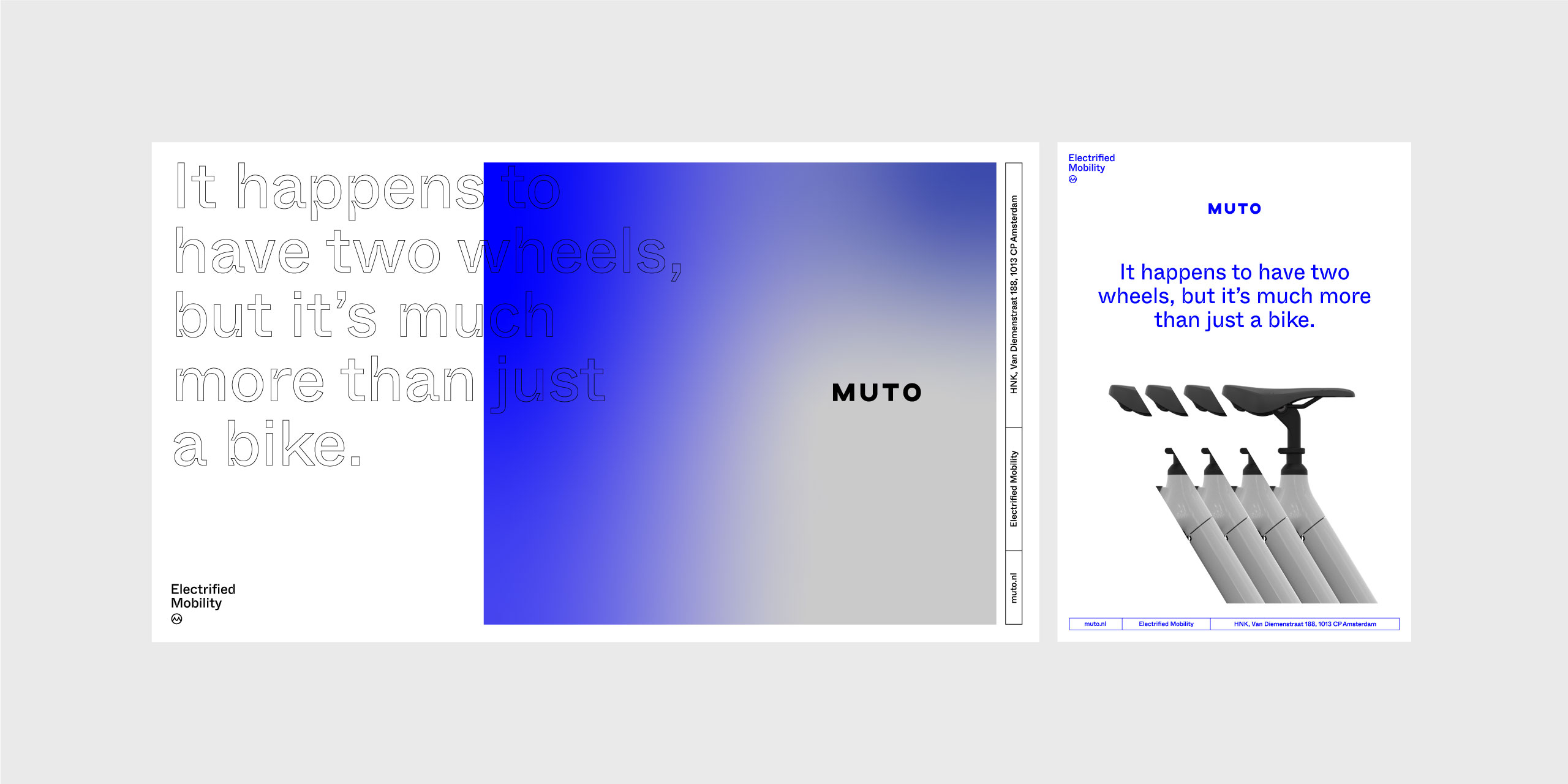
For the typography we selected Whyte Inktrap for its sophisticated lightweight forms, which felt quick and dynamic, along with its squared descenders providing a subtle electronic feel. The chiseled ink traps also perfectly alluded to Muto’s easy snap-on-snap-off accessory system.
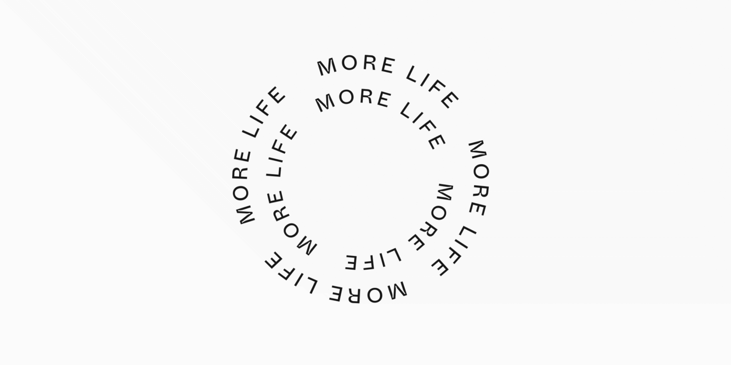
A series of animated elements integrated into various touchpoints allowed the brand to highlight a sense of playfulness, and conjure up a sense of electrically-assisted forward motion.
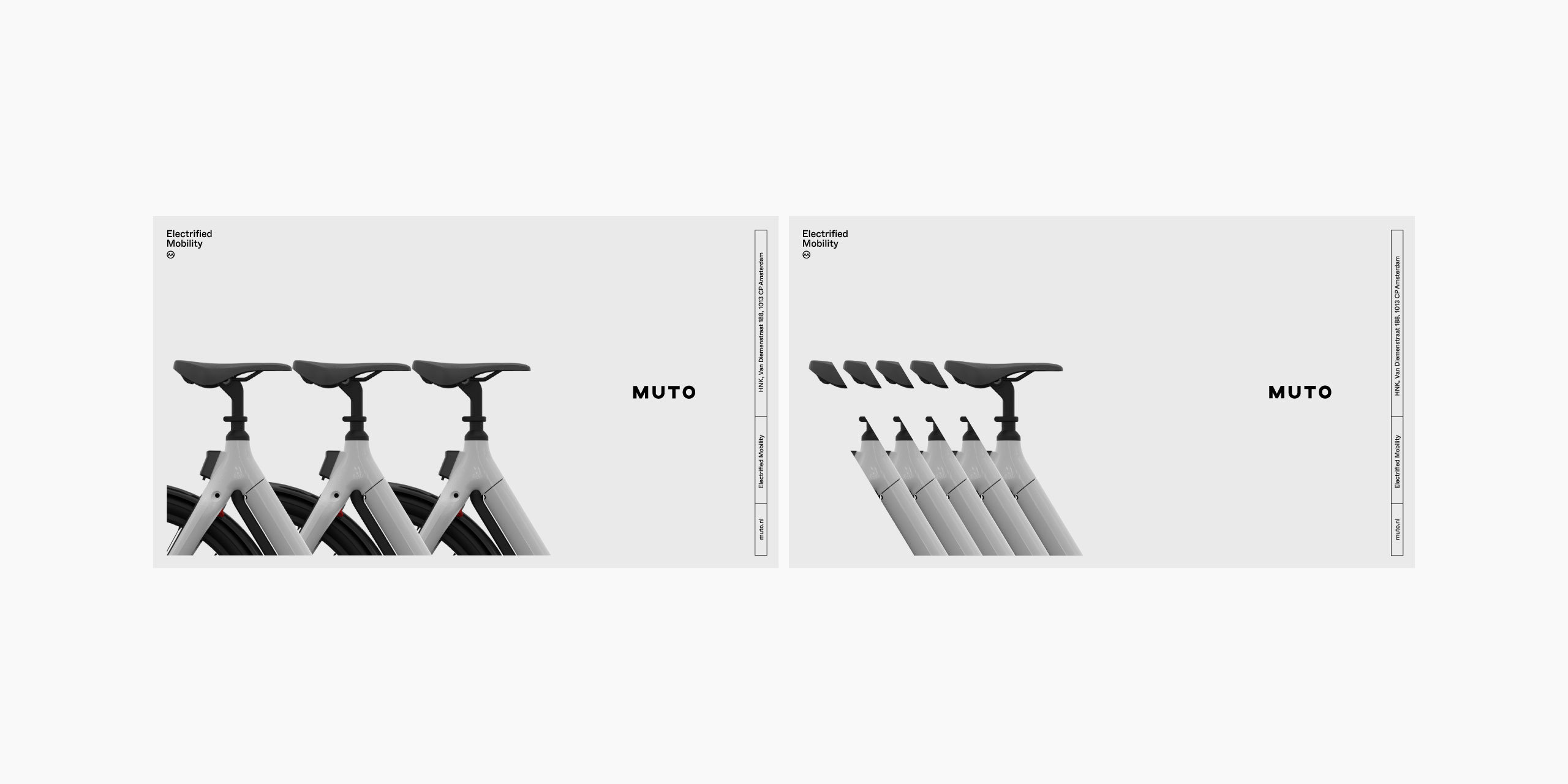
We created a flexible suite of elements that could be combined in multiple ways to allow the brand’s communications to always feel fresh, while also maintaining a strong sense of consistency to ensure audiences would easily recognise the Muto brand.
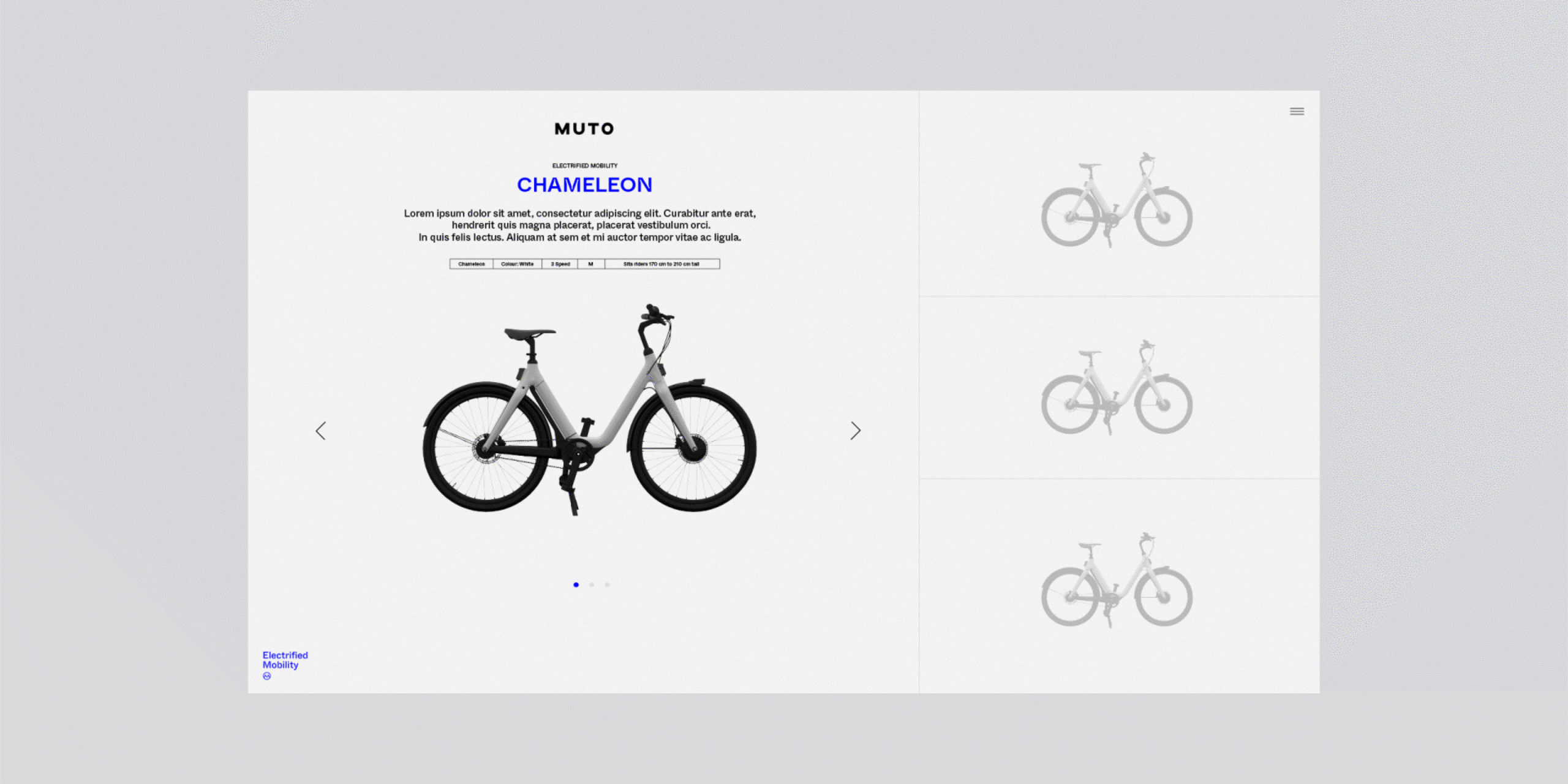
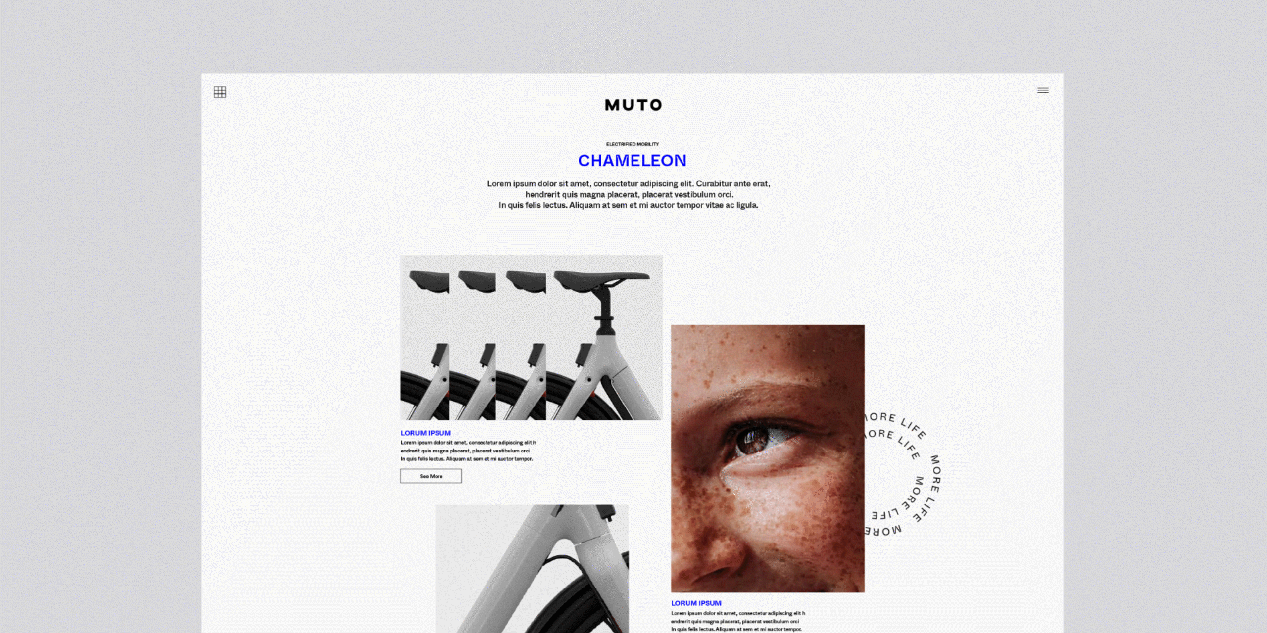
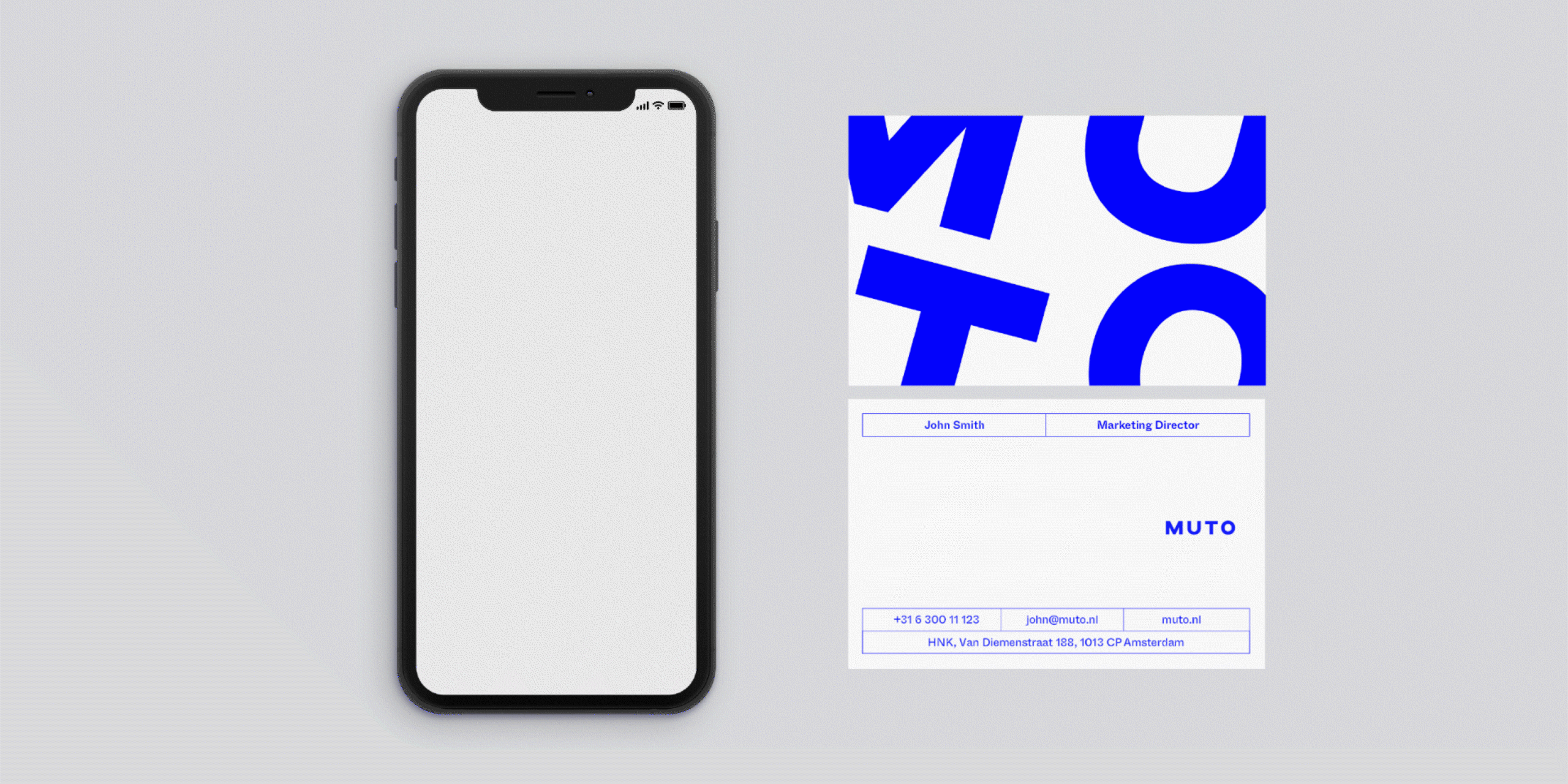
Our website concepts maintained the same approach as our campaign-focused layouts with a playful, fluid approach to commercial and editorial content. We also applied the same creative thinking to concepts for the Muto app and printed collateral.