New Balance
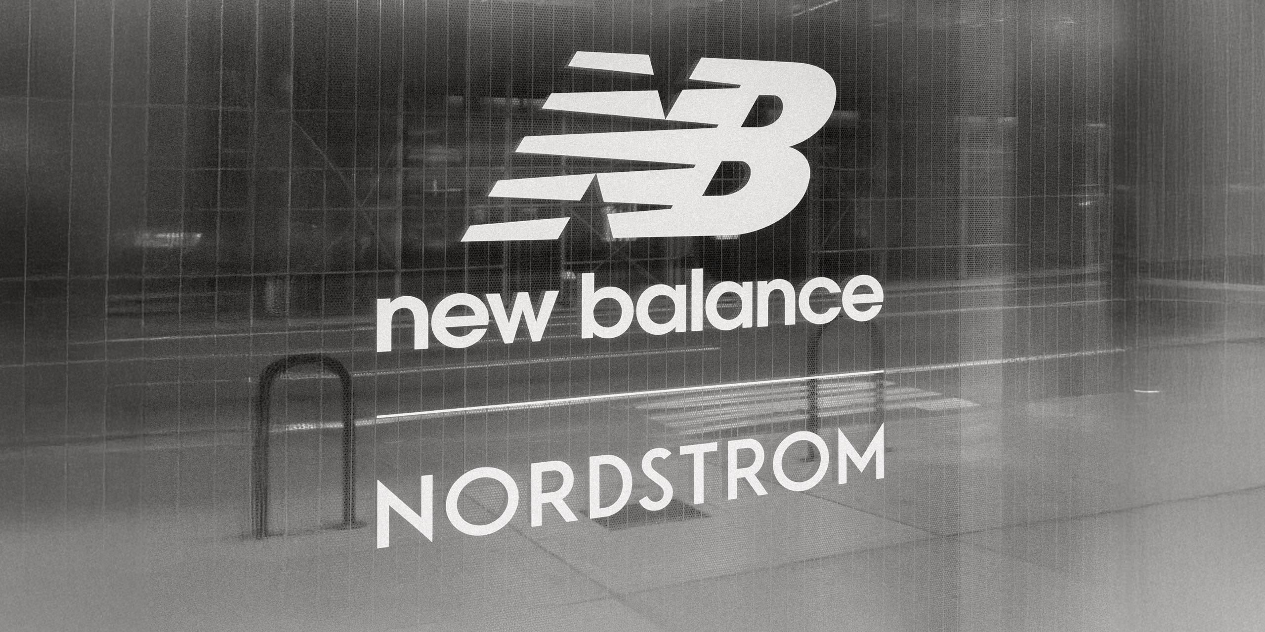
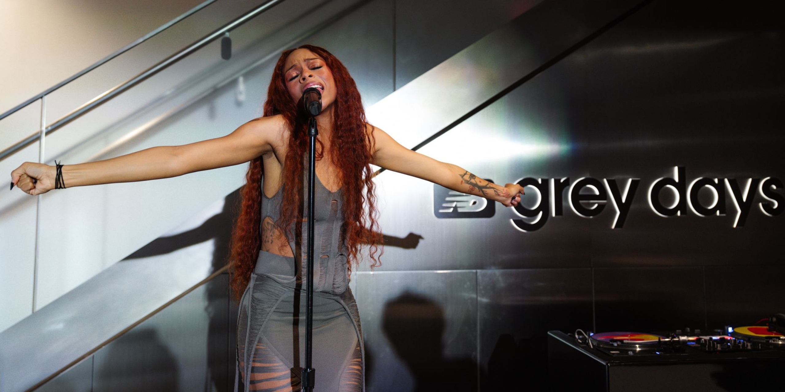
Grey Days at The Corner, Nordstrom NYC
Creating a Grey Days experience takeover at one of New York's most prominent retail destinations.
Following our work on New Balance’s retail design guidelines, we were charged with designing two consecutive pop up spaces for the brand in the Nordstrom NYC store.
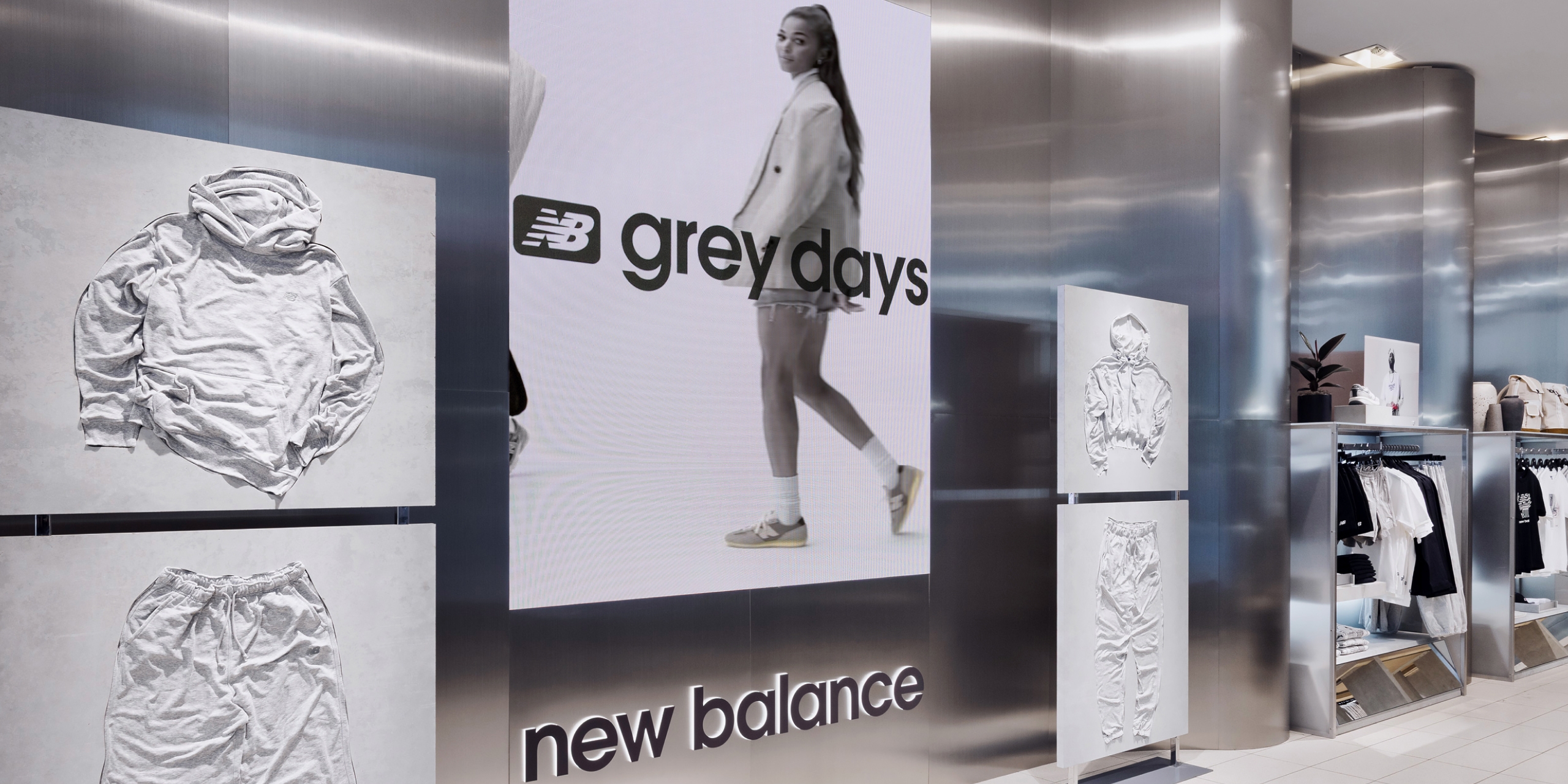
The first month of the Pop Up space was to focus on “Grey Days” as a celebration of the brand’s iconic use of their signature Grey colourways. The brief was to design a space that would align with the aesthetic of previous years’ campaigns, but feel fresh, and focus on craftsmanship and style.
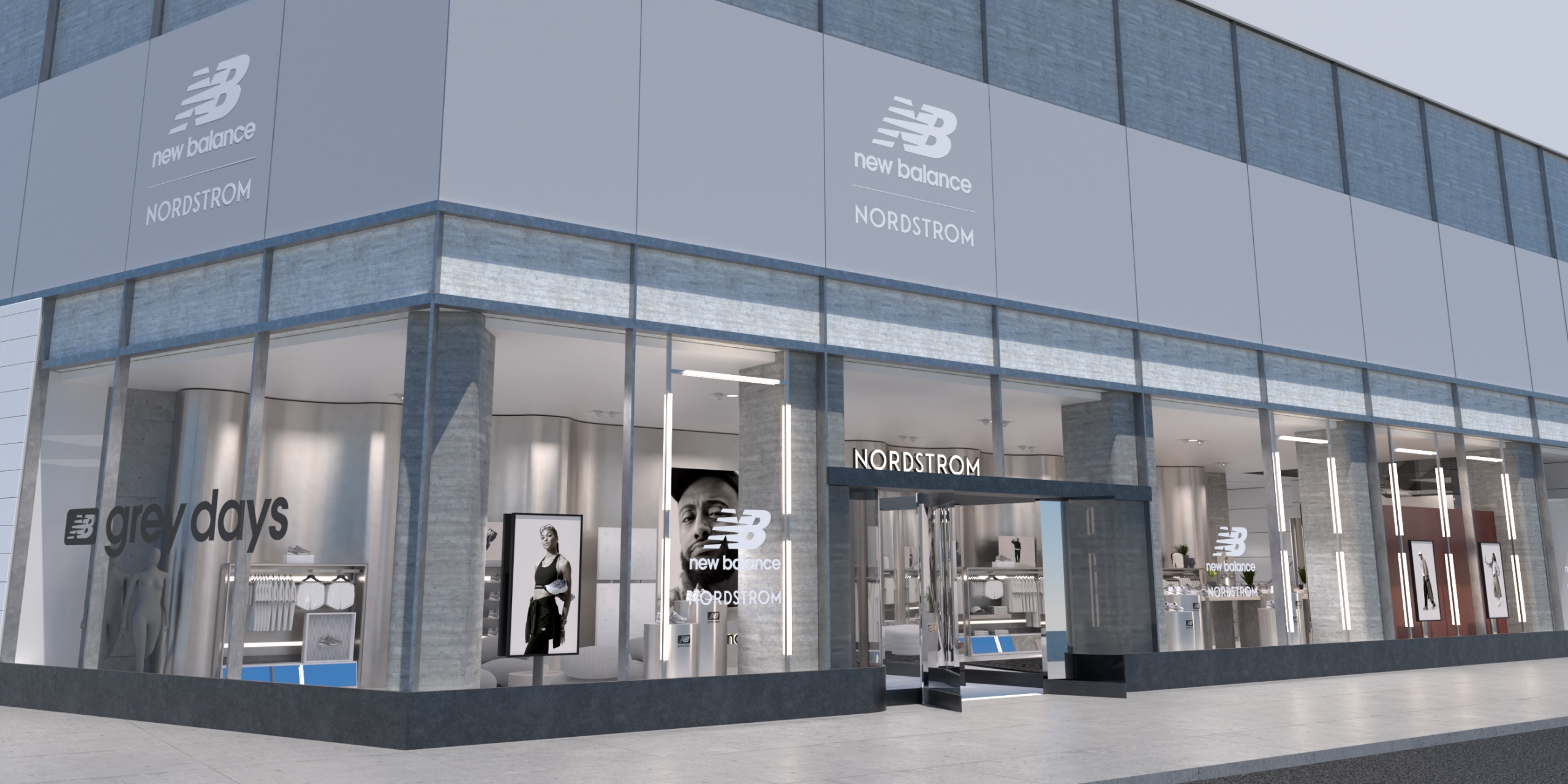
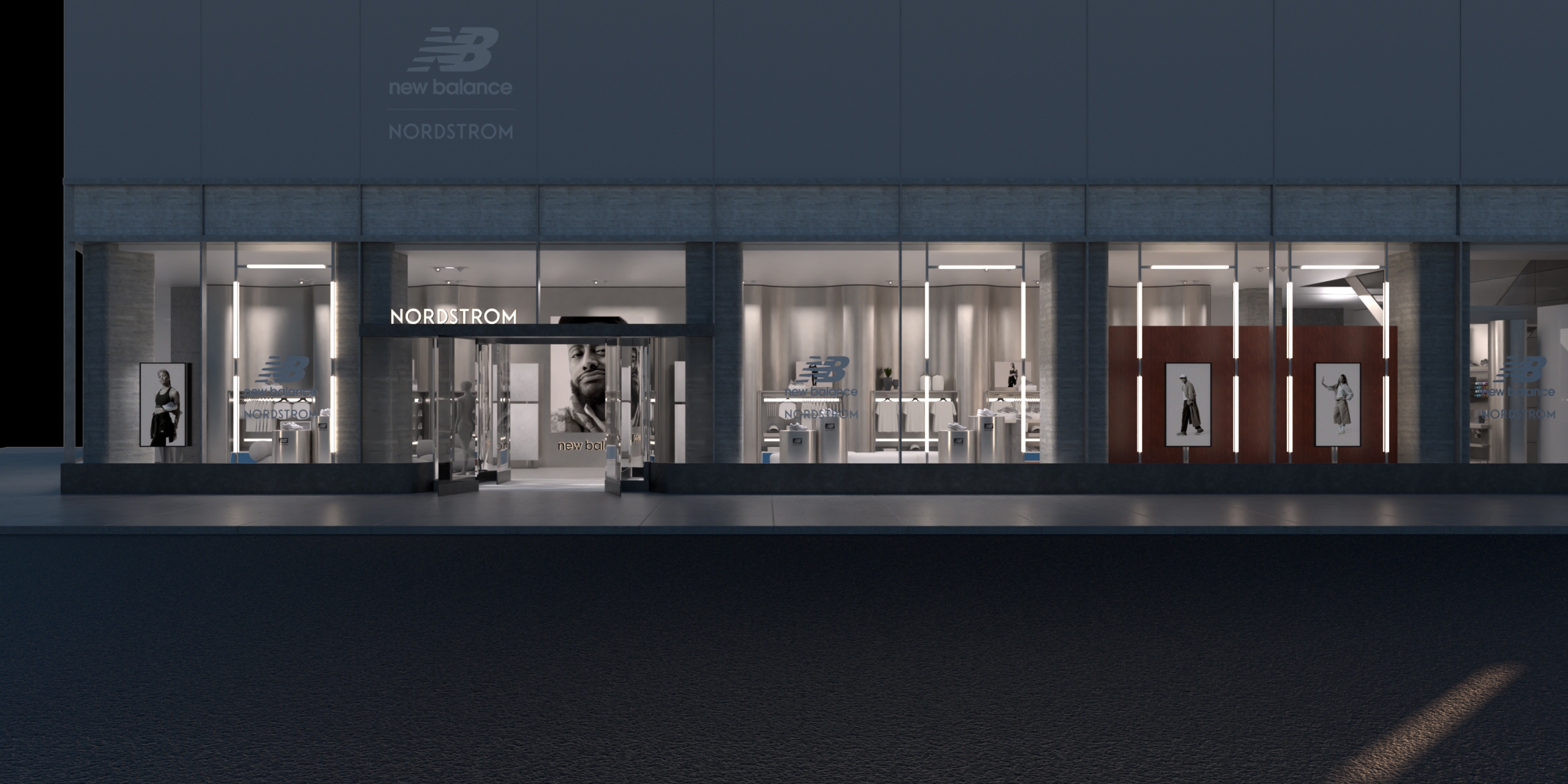
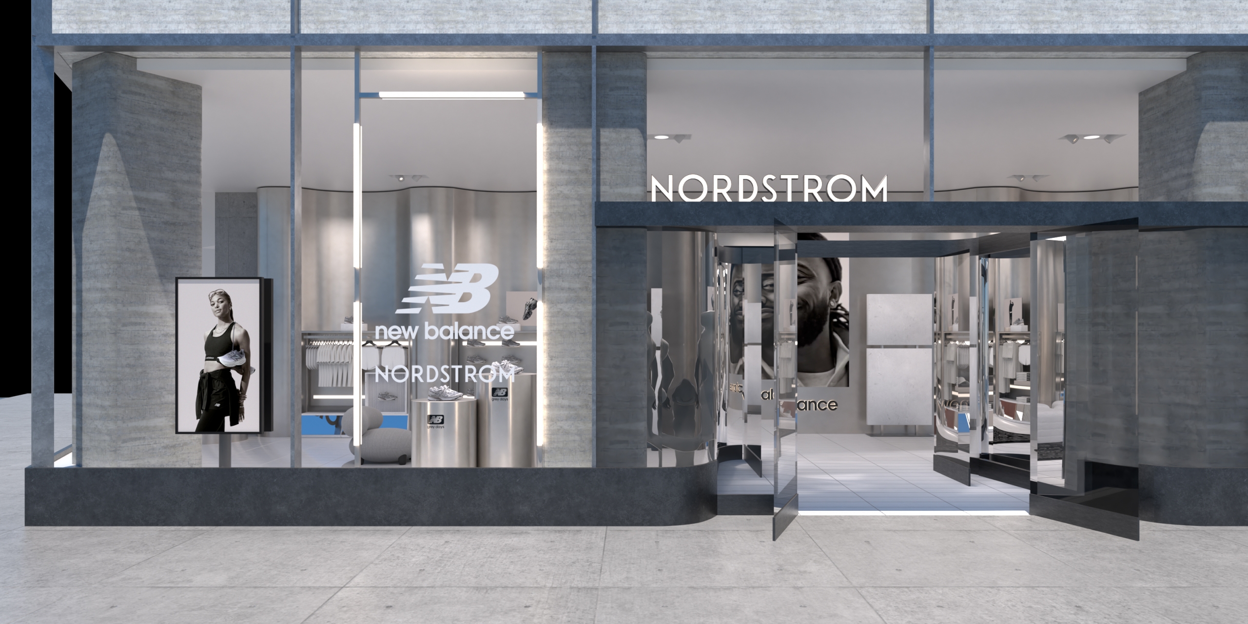
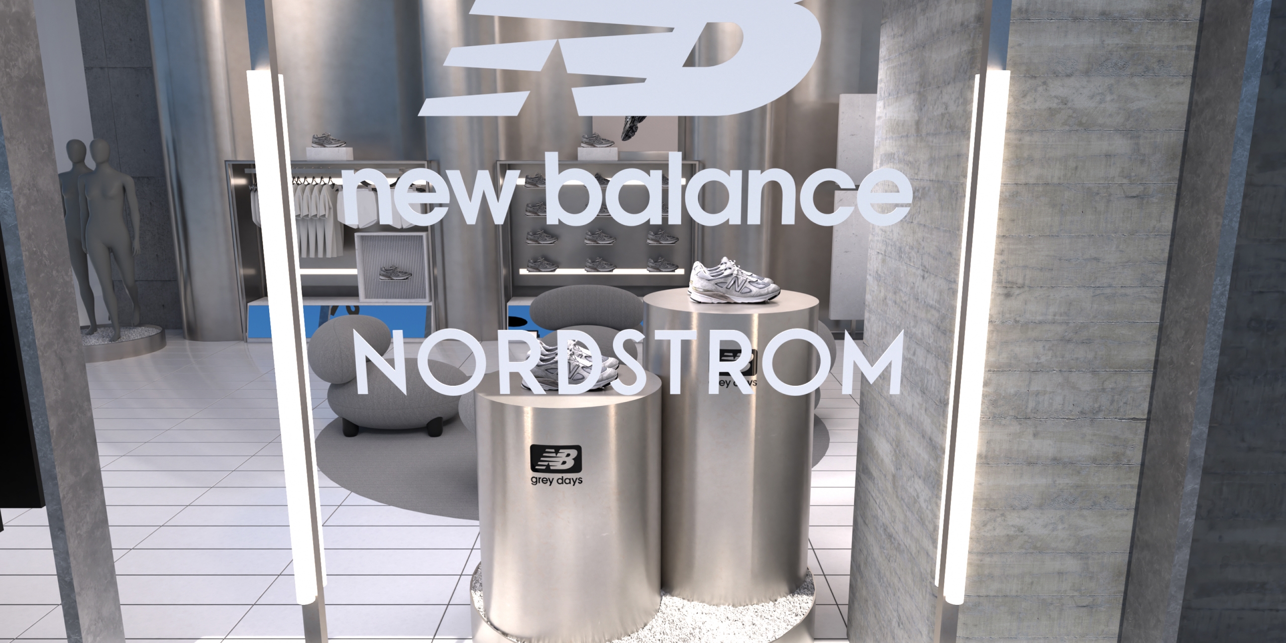
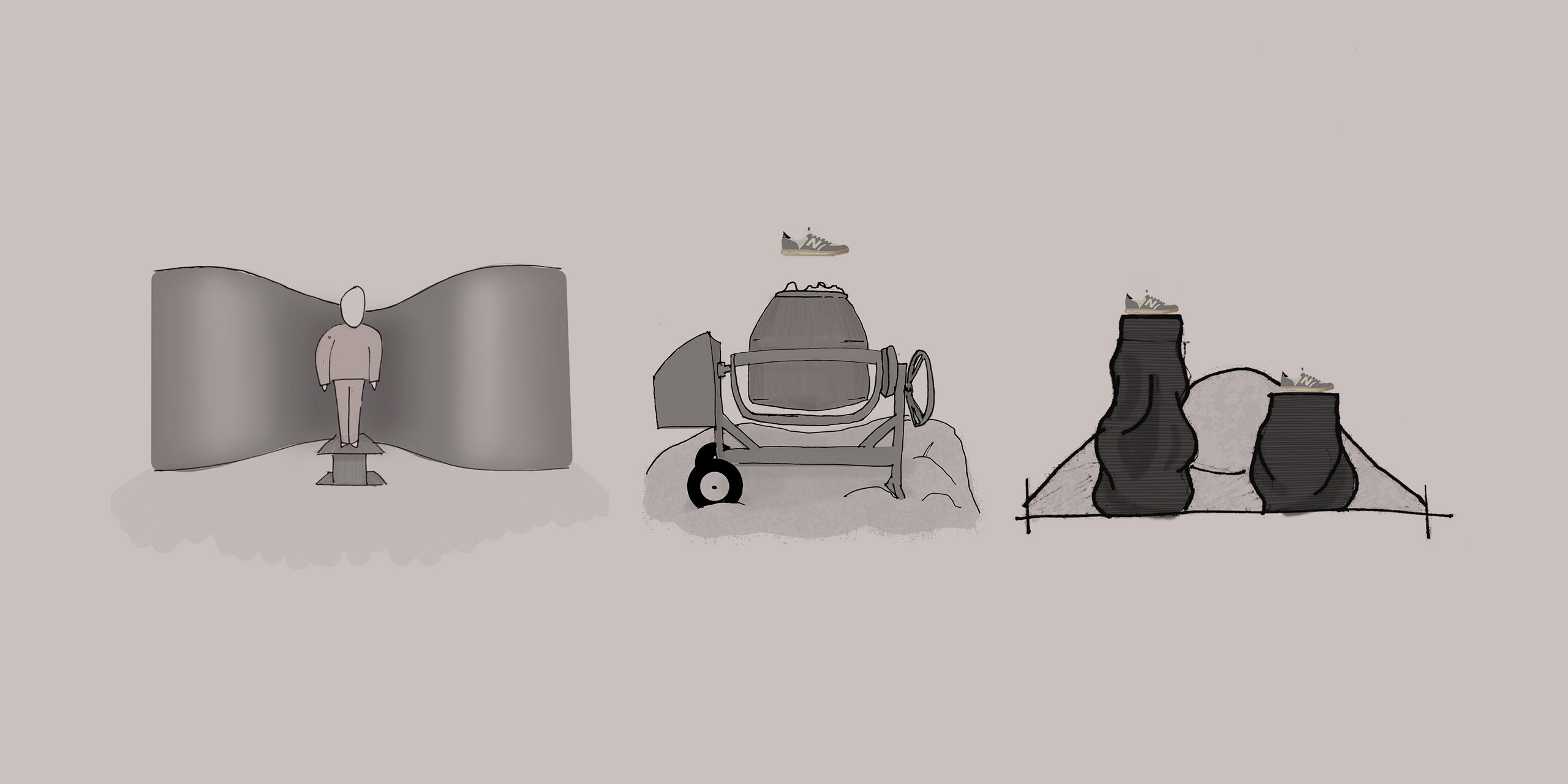
We utilised the huge windows at Nordstrom NYC to full effect by creating a huge monochromatic hoarding that drew attention on the busy intersection of Broadway and West 57th Street. LED tube lighting framed the large windows to pull focus onto key products elevated on shimmering steel plinths.
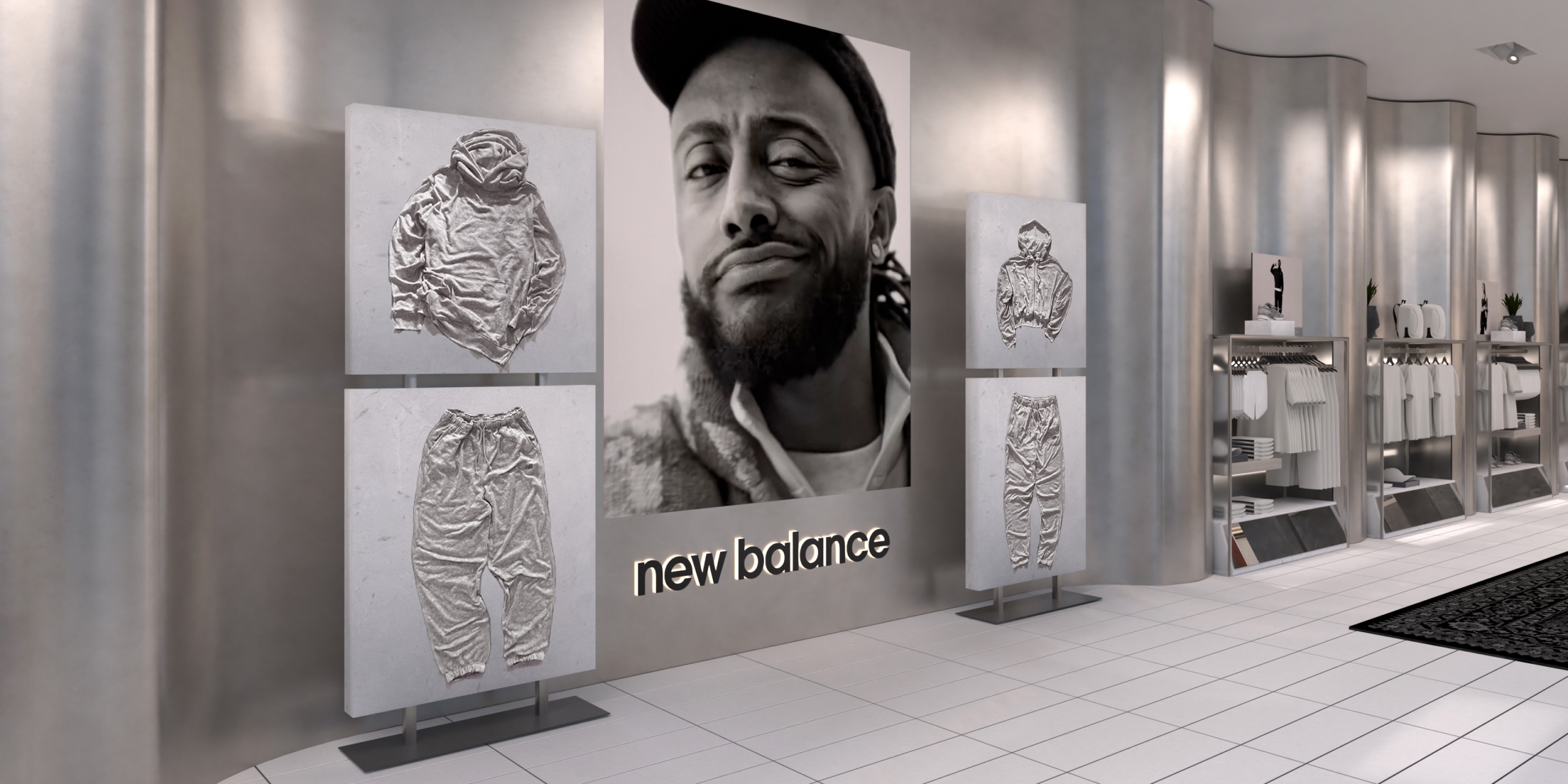
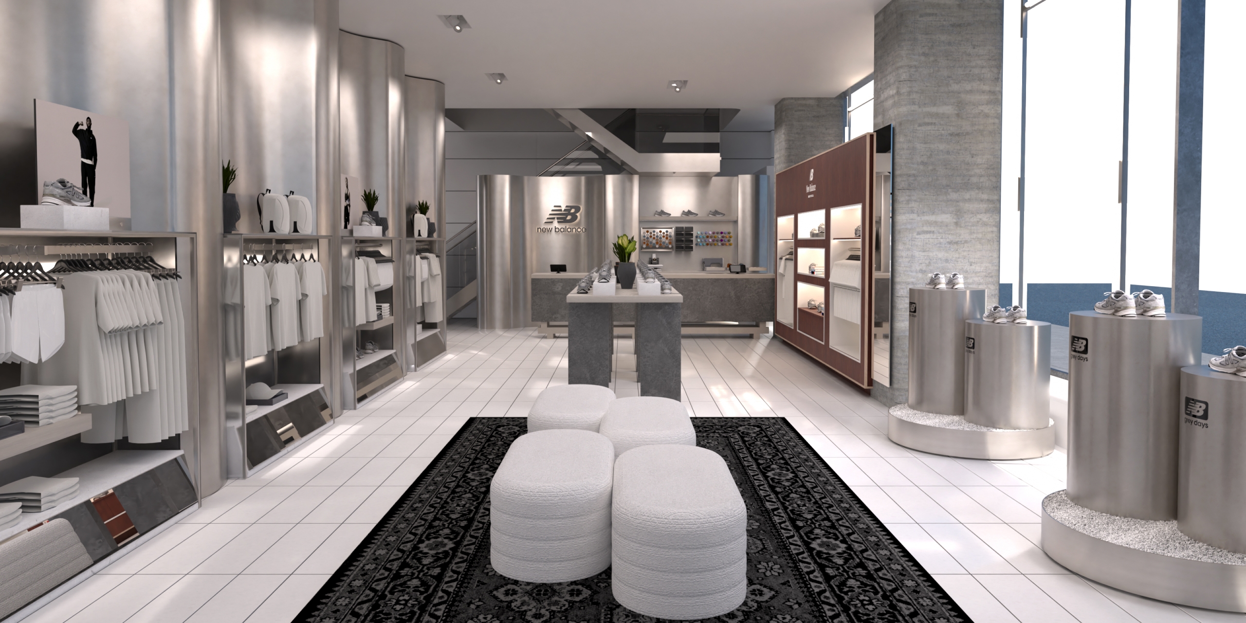
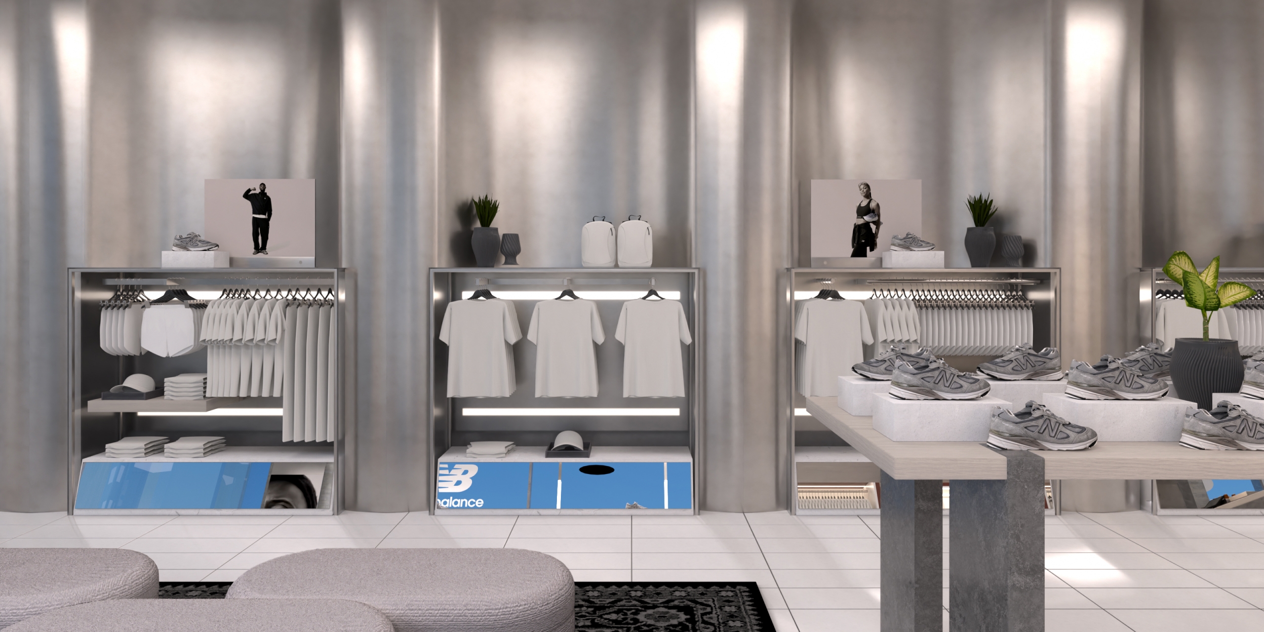
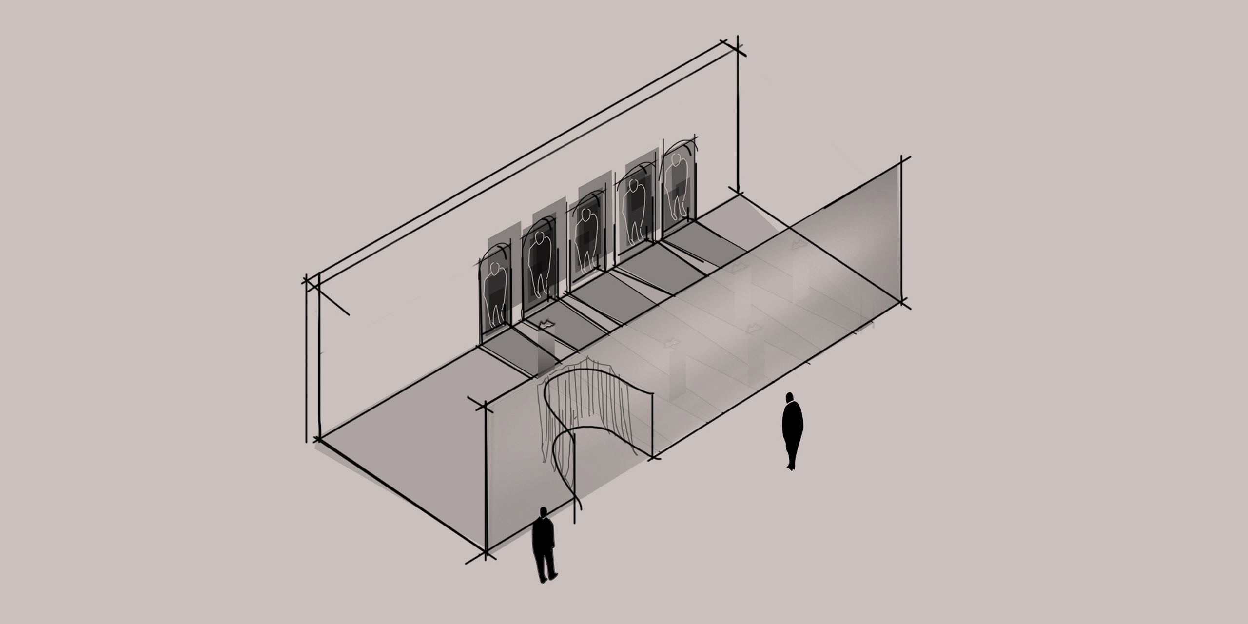
Once inside the store, customers were greeted with a huge LED screen introducing the Grey Days campaign. Key looks were set in concrete panels, blending the product with the urban environment that inspired New Balance’s iconic use of grey.
Continuing our use of textural elements and varied materials we created an undulating steel wall that ran throughout the space, bending light to create nuances of grey. This served as a dynamic backdrop visible from the busy street, making use of Nordstrom’s huge windows.
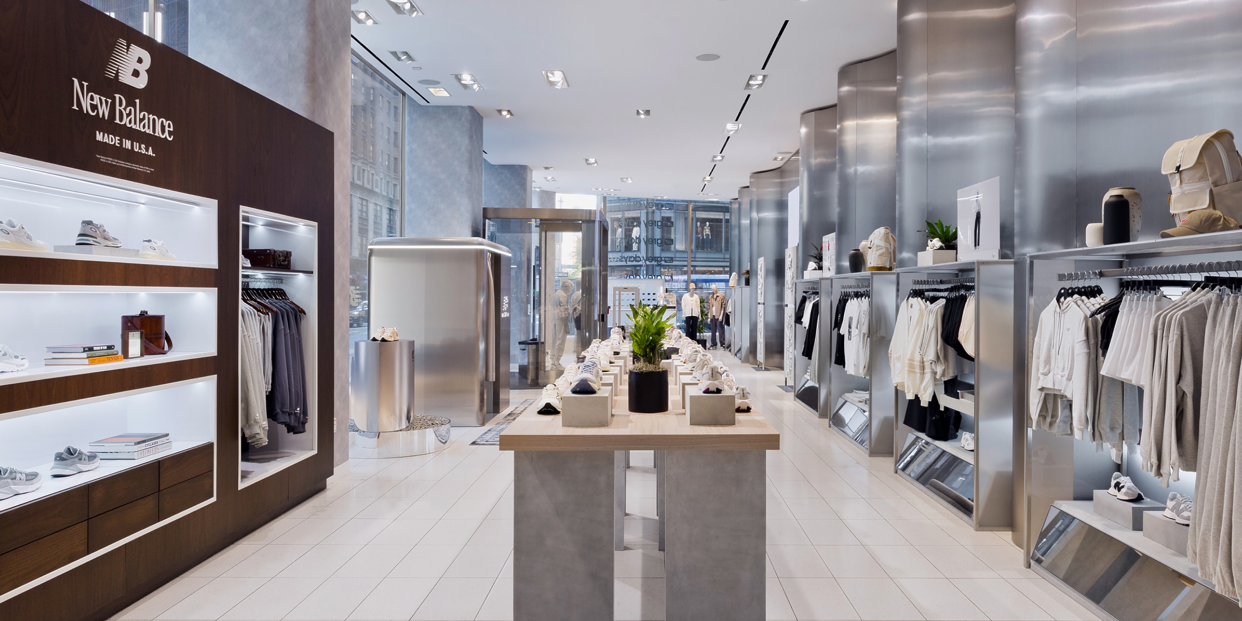
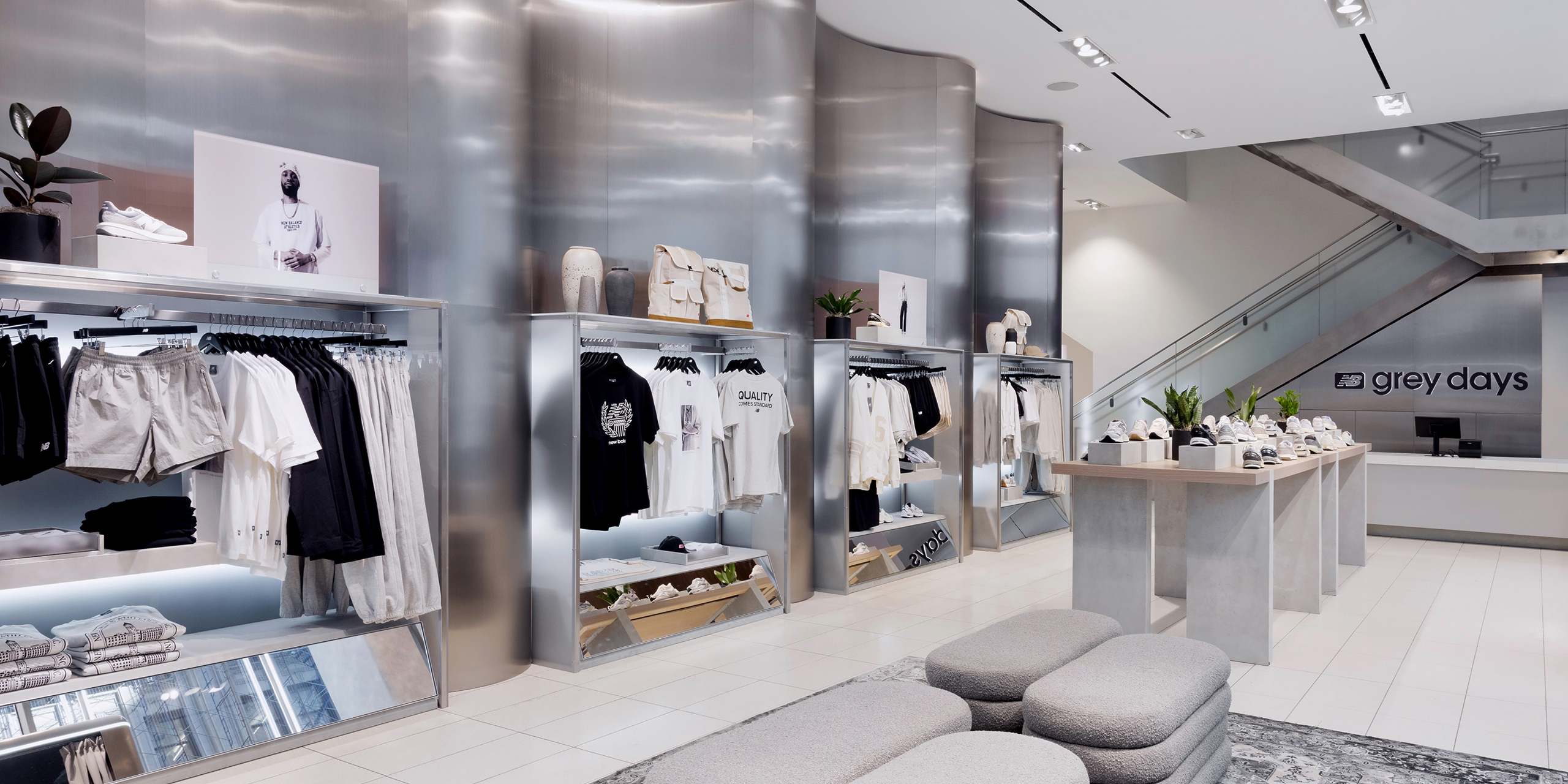
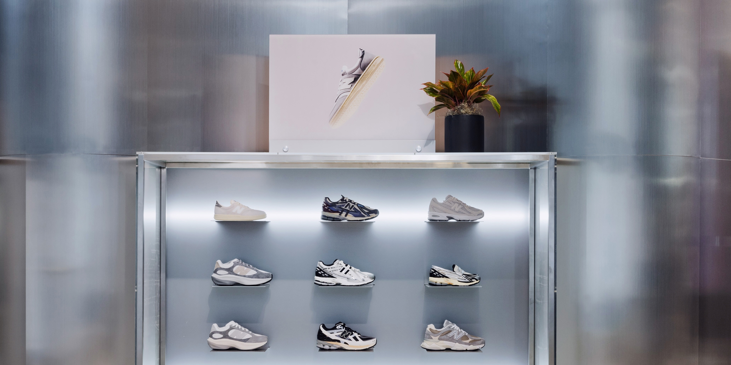
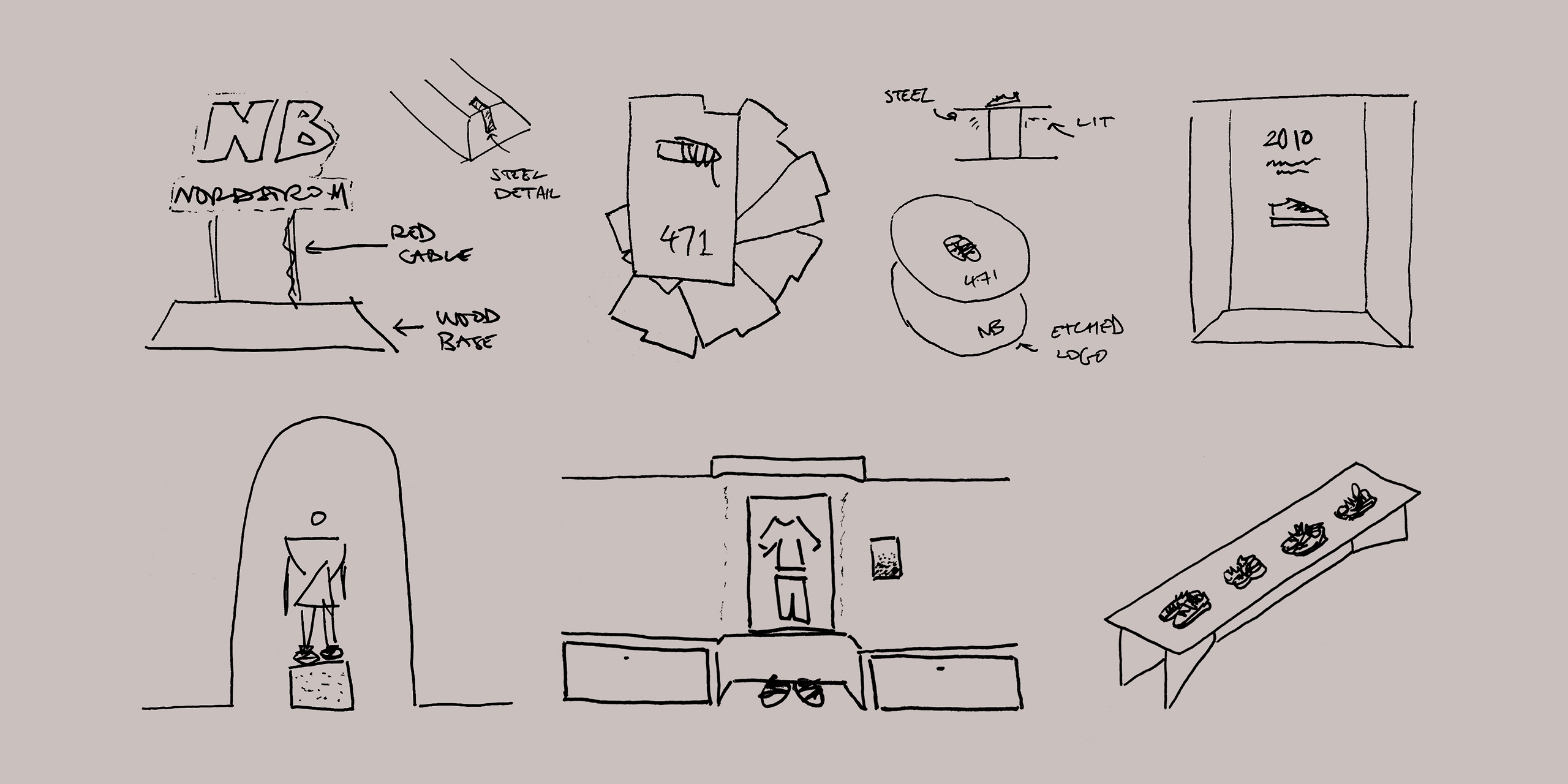
The central table displayed a large range of the New Balance footwear collection, using concrete blocks to create separation and elevate particular items. The table itself highlighted the concept of ‘crafted’ through interlocking concrete slab legs and a grey-washed birchwood top.
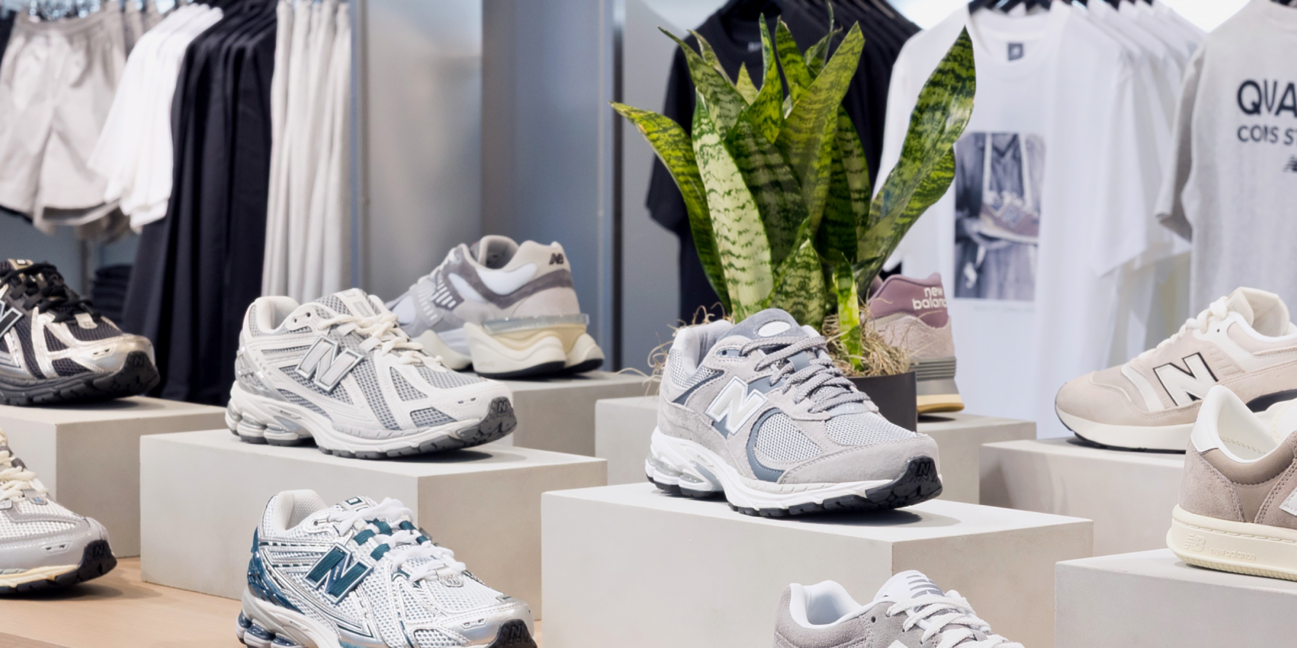
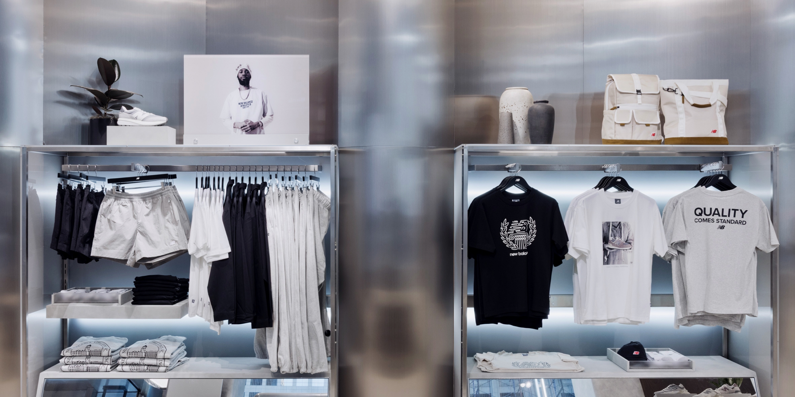
Props such as plants, books and ceramics both softened the grey space and highlighted the monochromatic nature of the pop-up by adding subtle colour, nuance and detail.
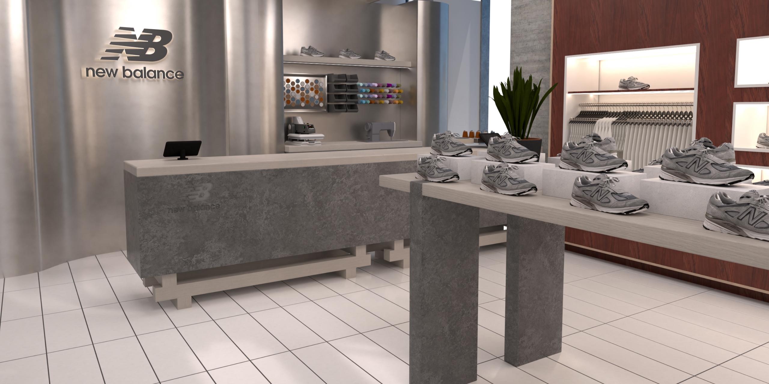
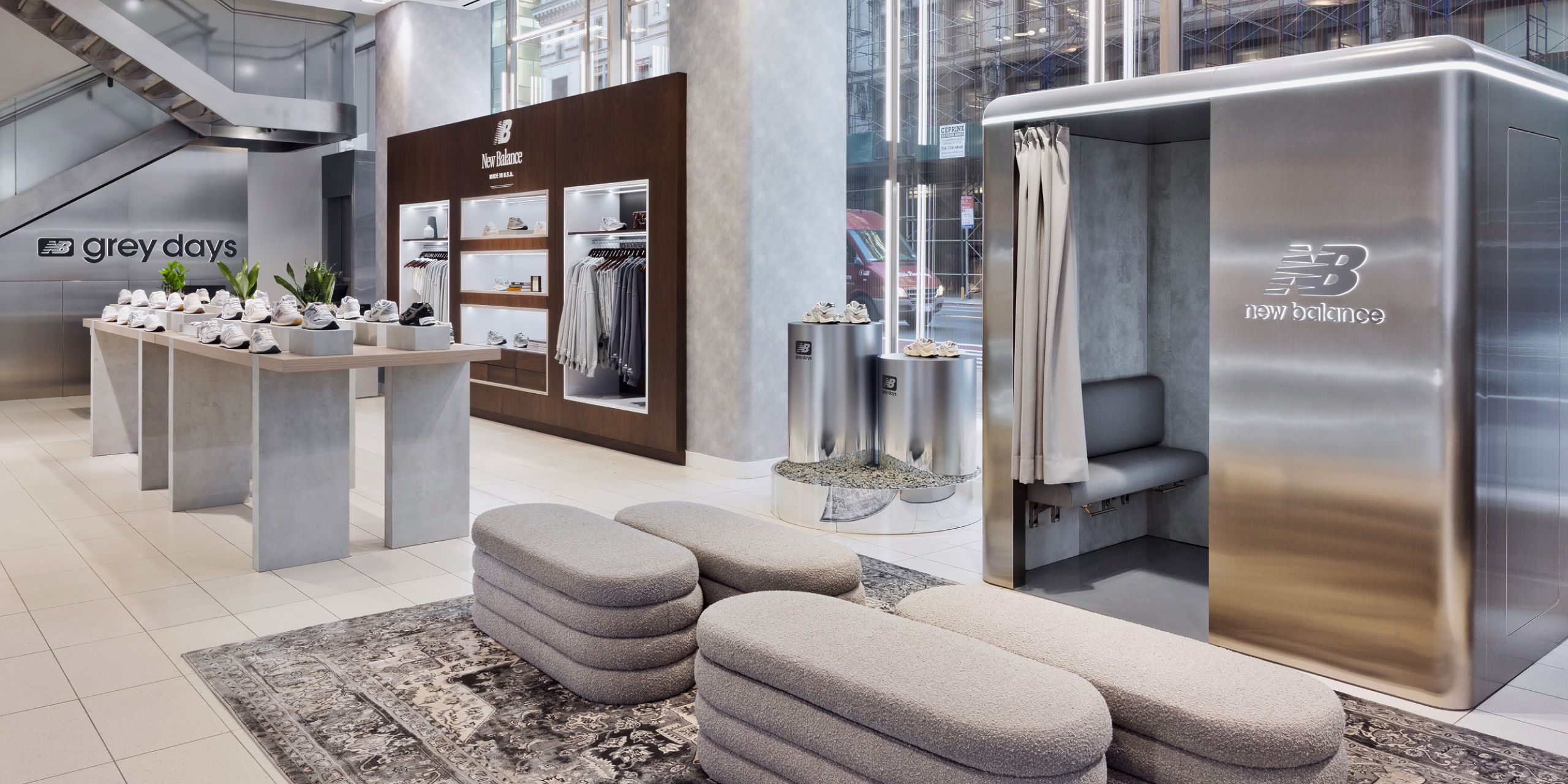
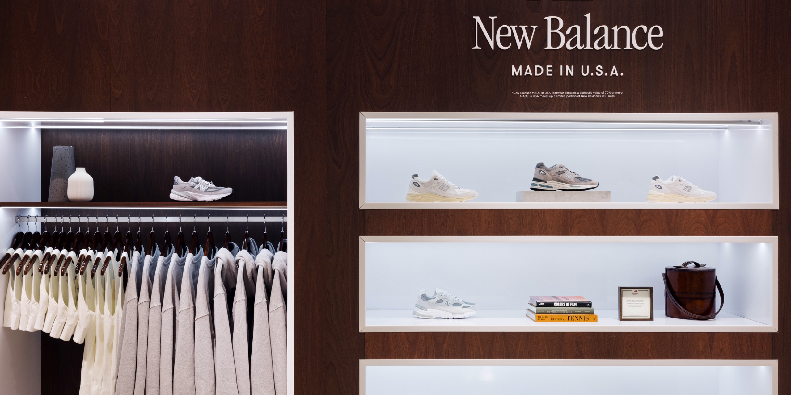
A rich dark wooden cabinet highlighted New Balance’s elevated Made In USA collection, deliberately contrasting with the rest of the space and inviting the customer to engage with the brand’s heritage and craftsmanship.
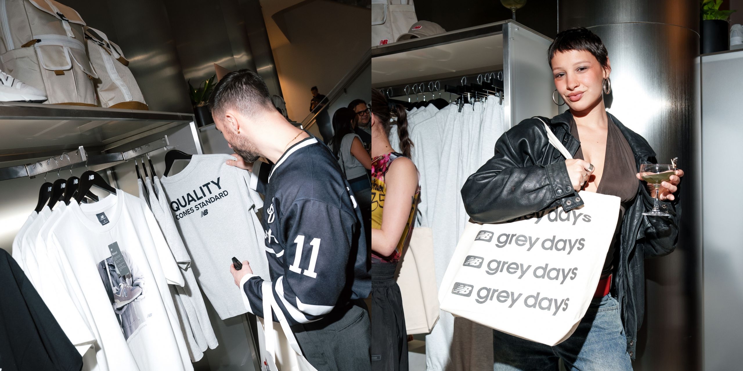
A customisation station allowed customers to tap their own creativity and make their purchases unique, and the space was designed to allow for various activations taking place throughout the 3 month period.
Utilising the New Balance retail design guidelines that we created, we were able to interpret the space in two different ways: campaign-led for Grey Days; brand-led for the Core space design which followed directly after.
Credits
New Balance
Amber Bazdar, Matthew Divita, Maura Miller and Azadeh Sharifnia
Creative Design & Concepts- Rosie Lee Creative
Production & Installation- SPACE/CRAFT Worldwide, Inc. & X.Wave
Photography & Videography- Keith E. Morrison