Preview
Branding, website and store design
Creating NY’s activewear marketplace.
Located in SoHo, New York Preview is a curated marketplace that brings together leading athletic and lifestyle brands from around the world, allowing previously online-only brands to develop a brick and mortar presence and build a relationship with in-store customers. We were asked to create a brand identity, website and spatial design that was compelling and distinctive - without overshadowing the partners they work with.
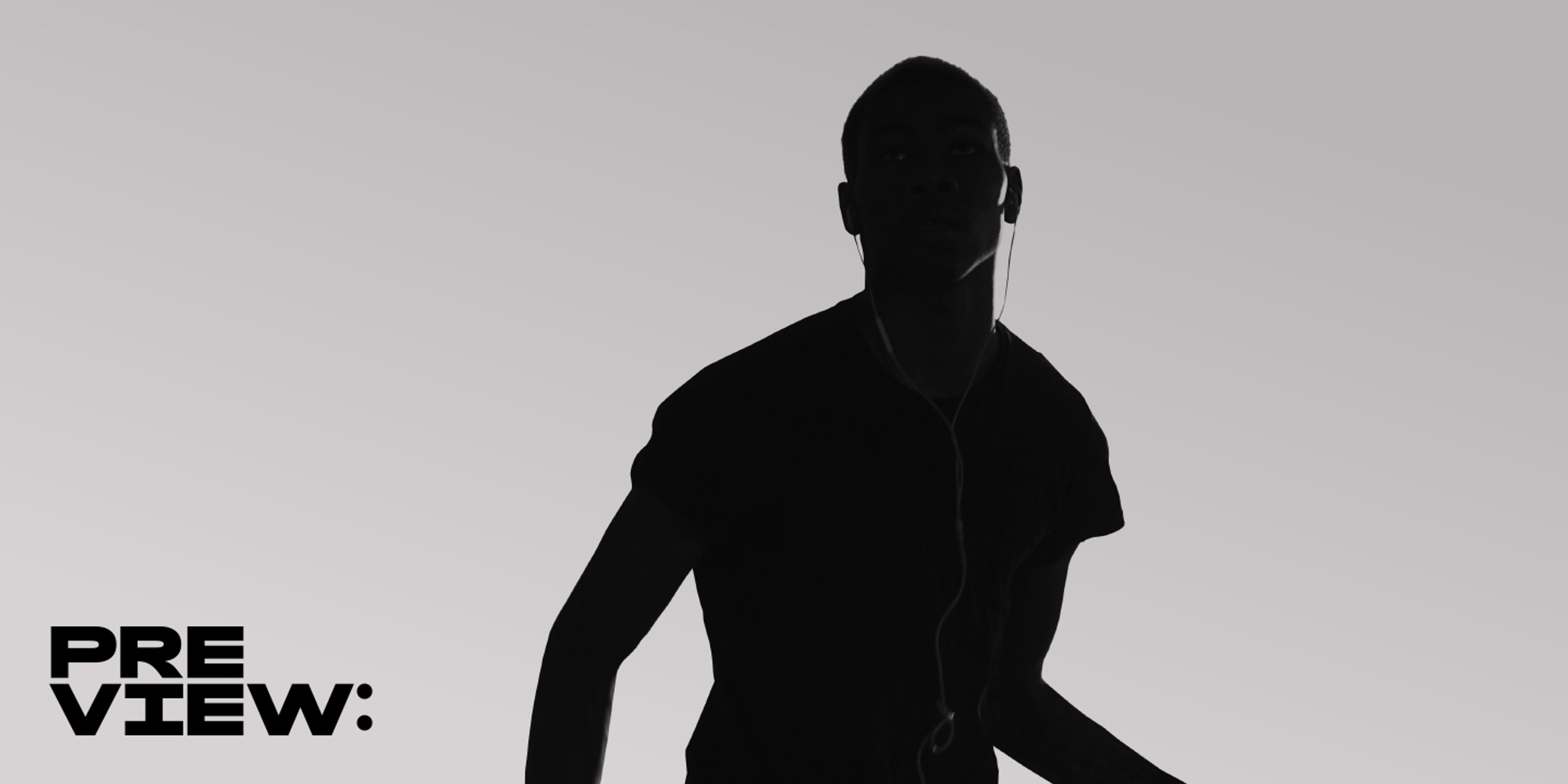
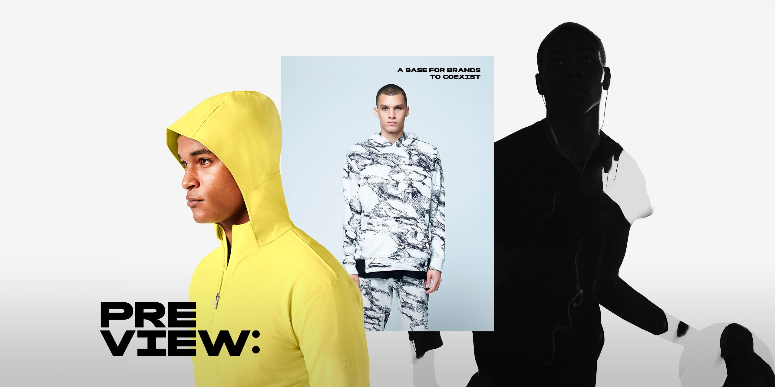
We wanted to produce for them a branding that was both strong in terms of recognition and versatile in its application. In order to develop a visual language that would work on behalf of many other partners, all of whom differ in terms of aesthetics, we decided to make central their product photography alongside a distinctive yet understated brand logo. The physical store design was to act as a platform for these partners, by providing a space that would be neutral enough to allow them to use their own content but would also incorporate aesthetic elements from the field they share a passion for - sport - to act as a unifying theme.
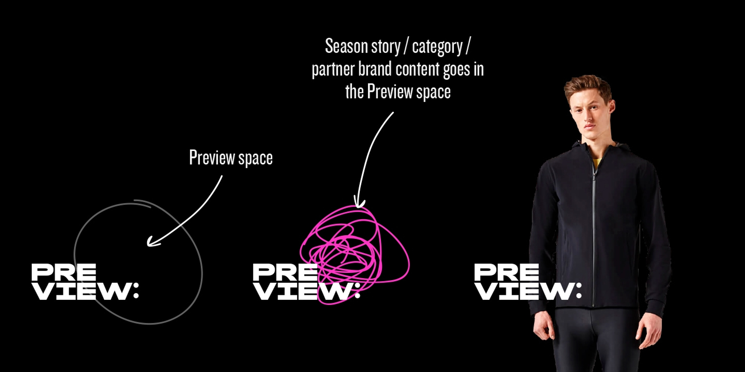
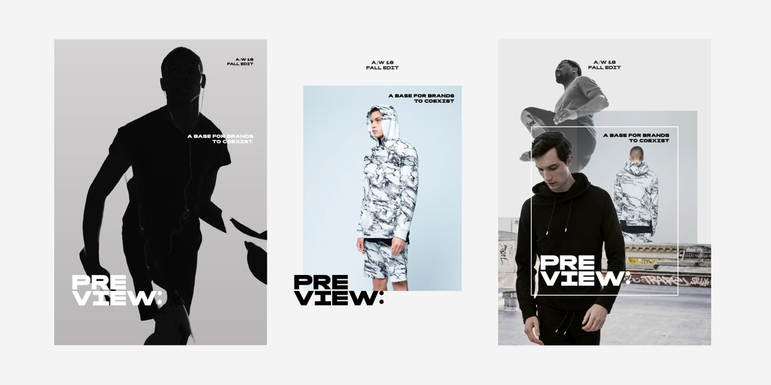
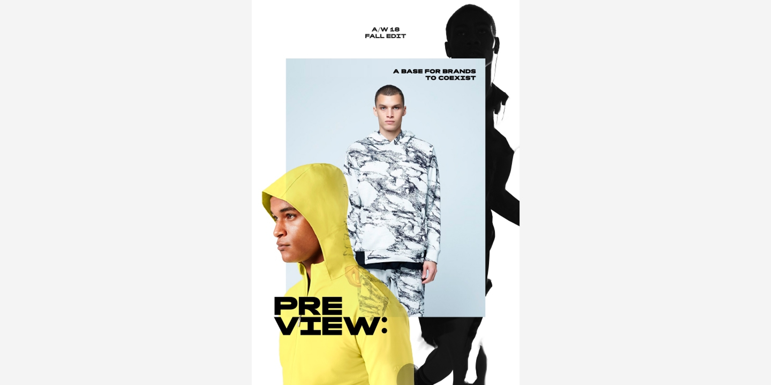
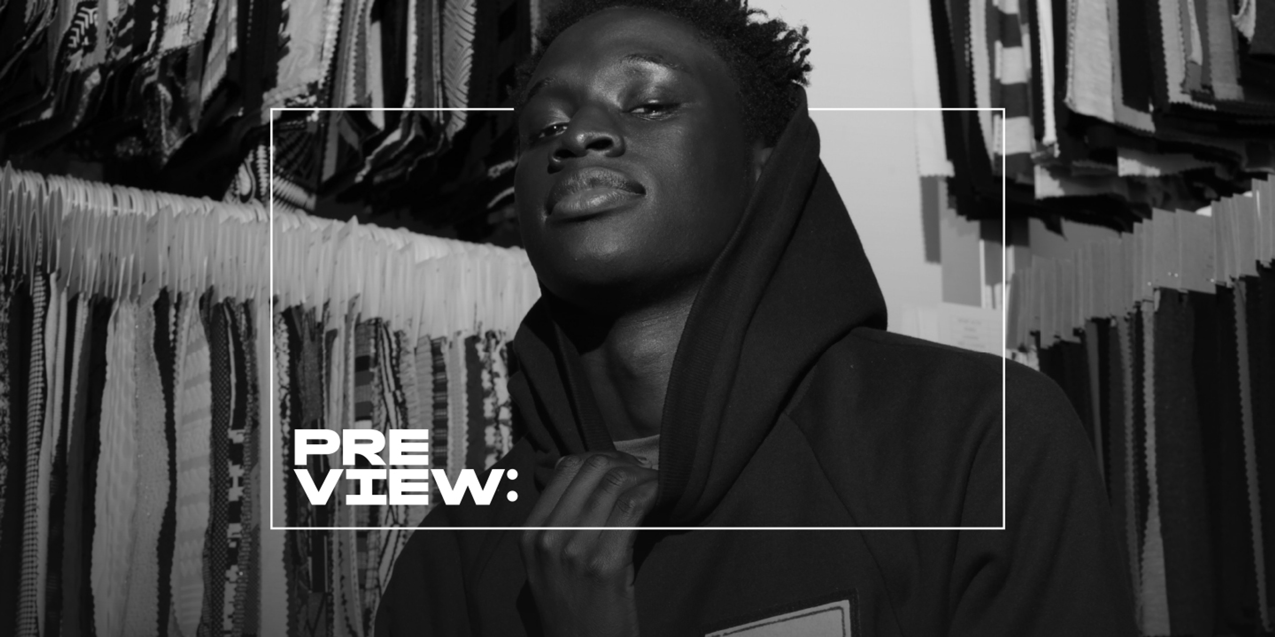
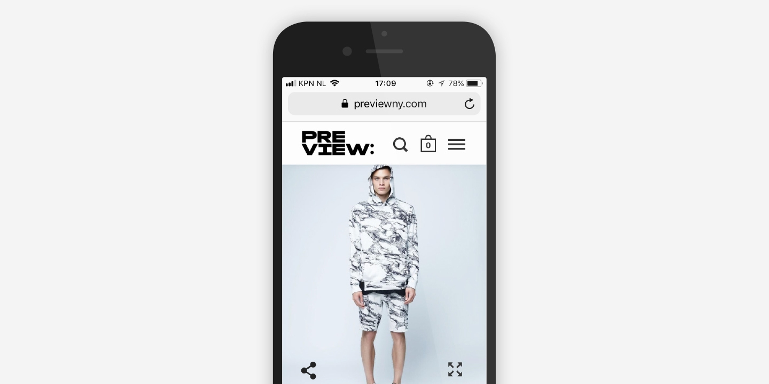
The type stack arrangement, low positioning and colon used in the logo we designed gives it a sense of weight and anticipation, creating an implied space for partner brands to occupy. It’s shown both in isolation and alongside a responsive framing device, which encloses product and lifestyle photography.
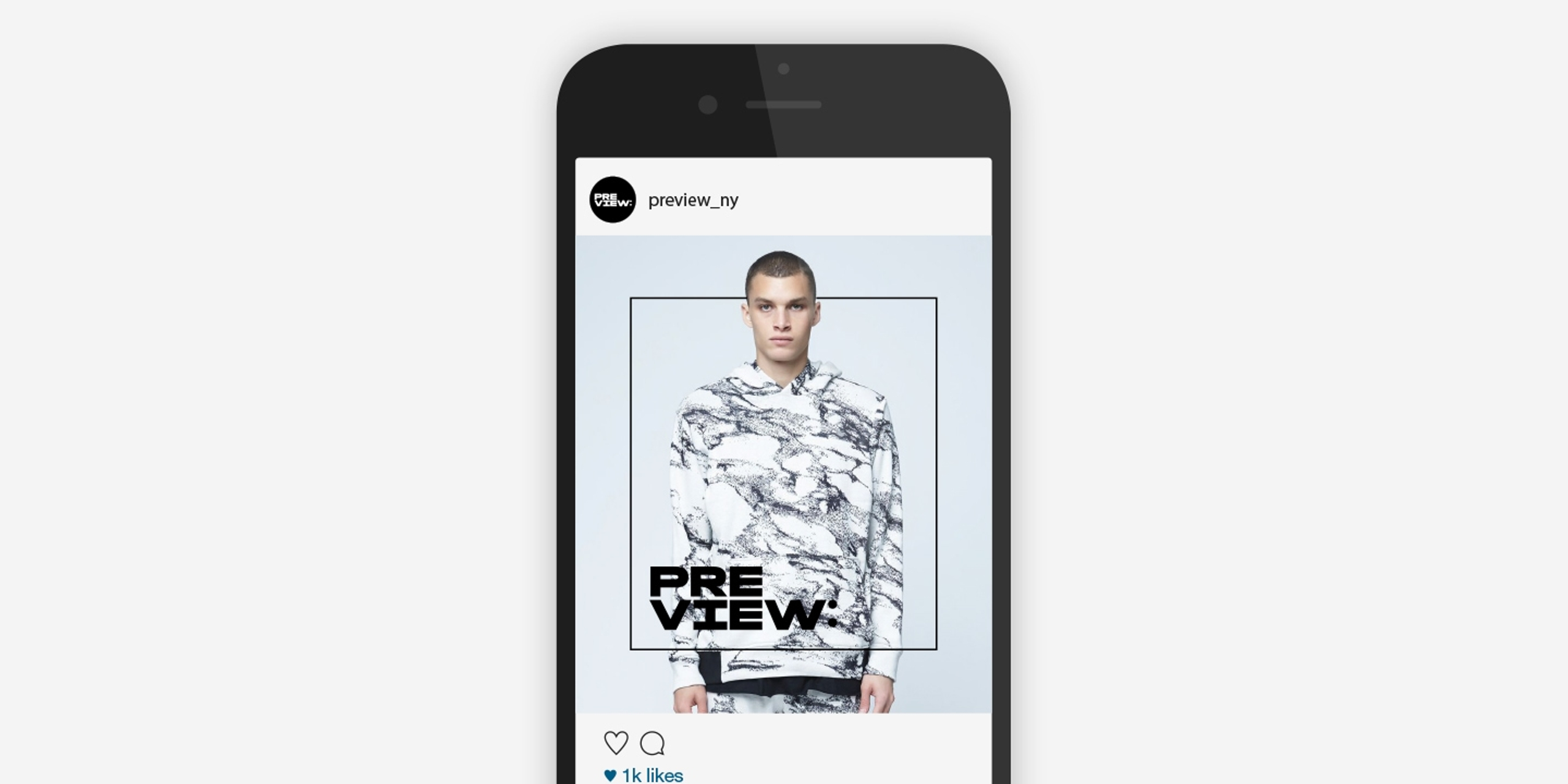
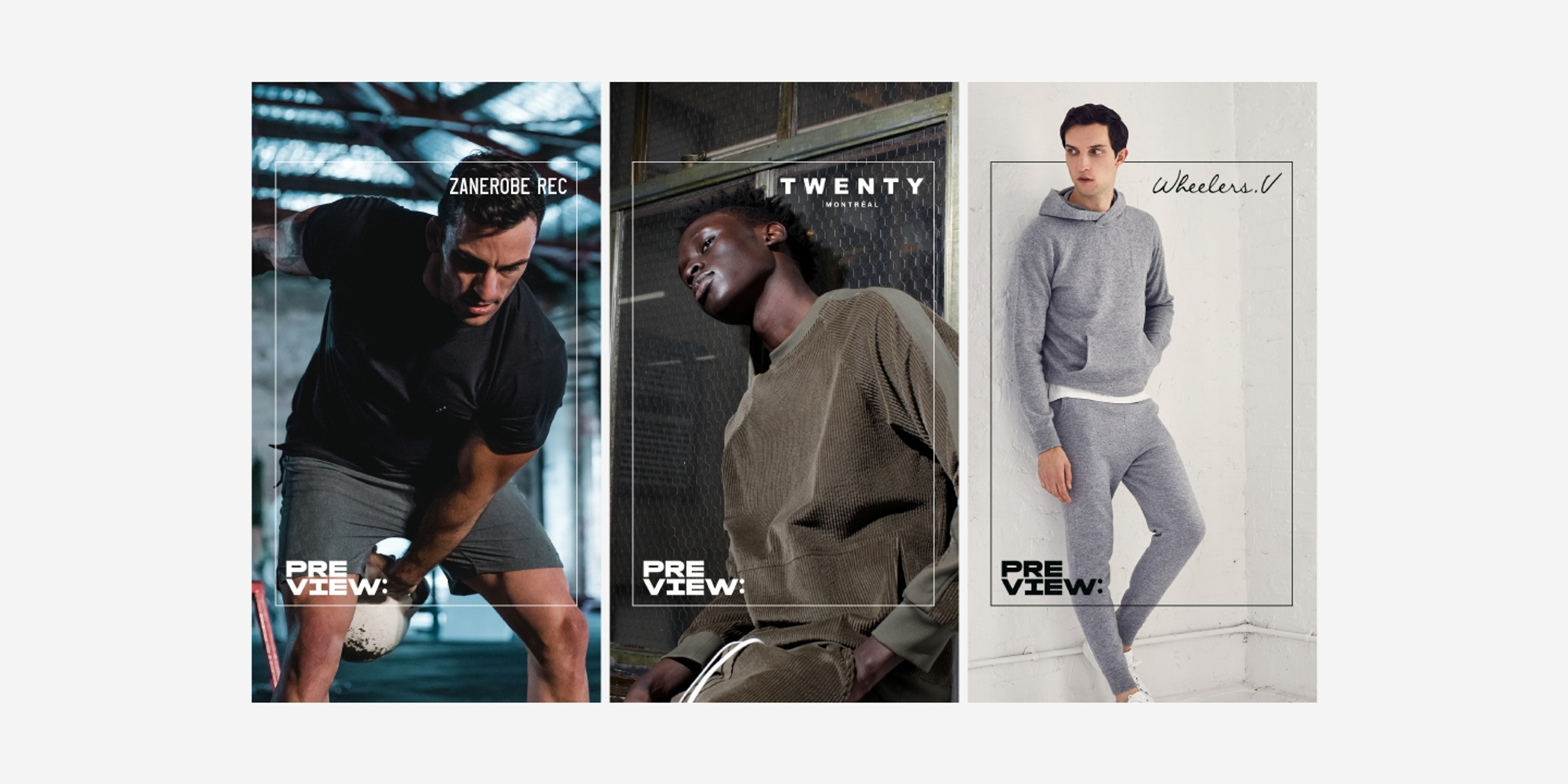
The frame is resized for use online and across social media platforms to maintain a cohesive visual identity. On Instagram, the middle picture is a swipeable carousel that allows users to check out different looks from a collection.
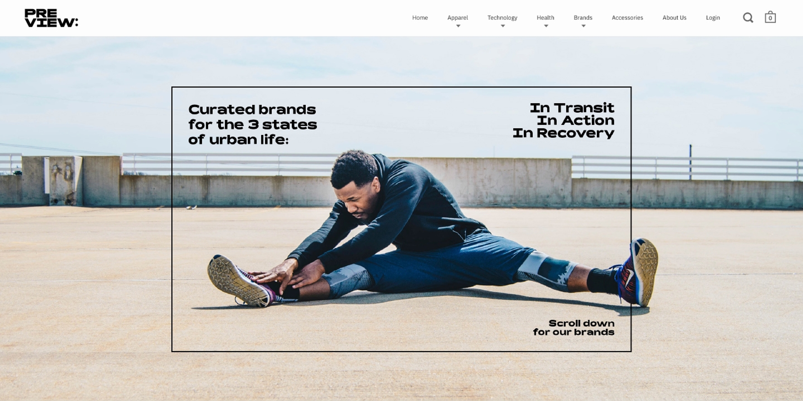
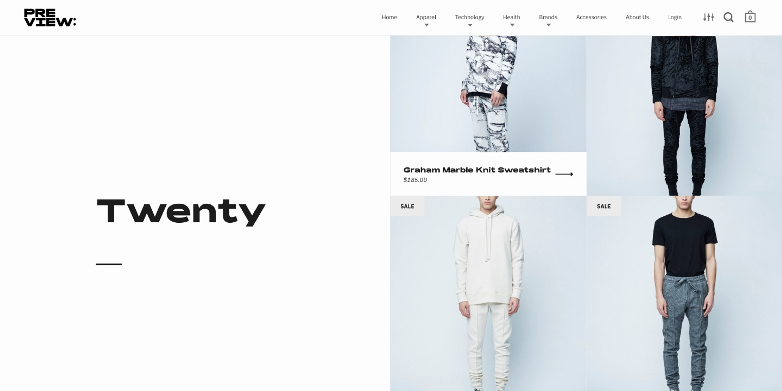
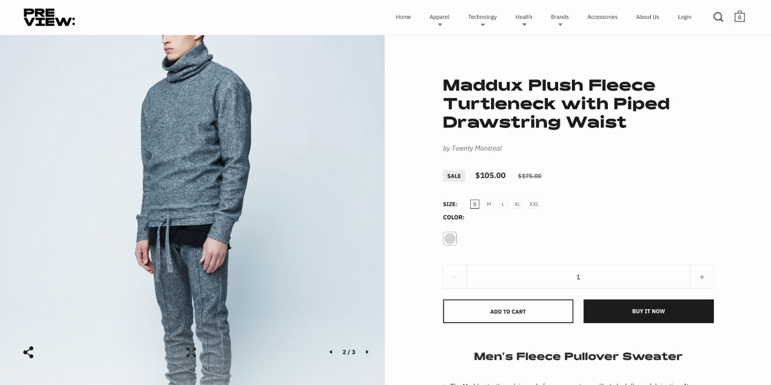
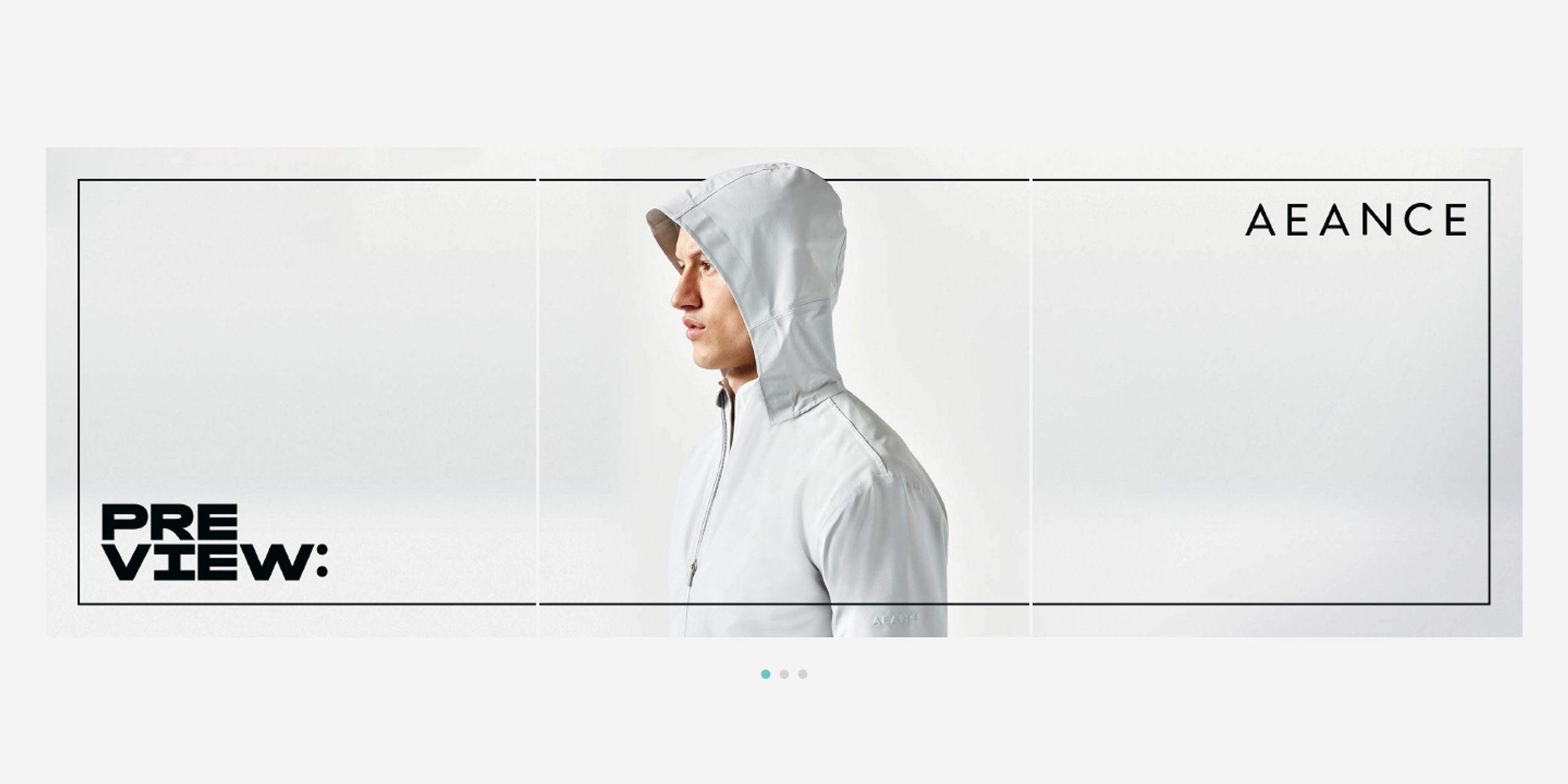
Their website, built on Shopify, is designed to feel active, and allows the brands to express themselves individually while maintaining consistency.
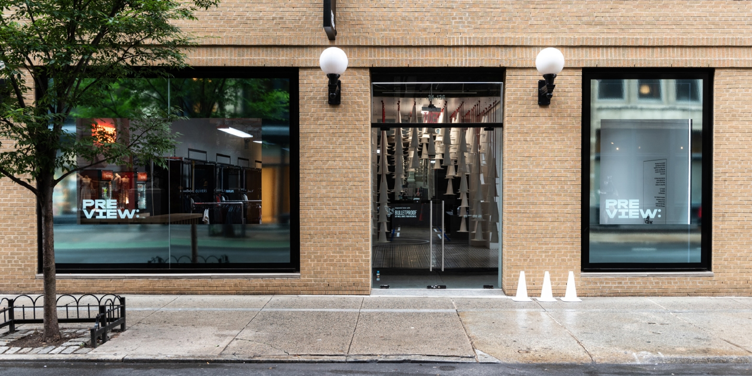
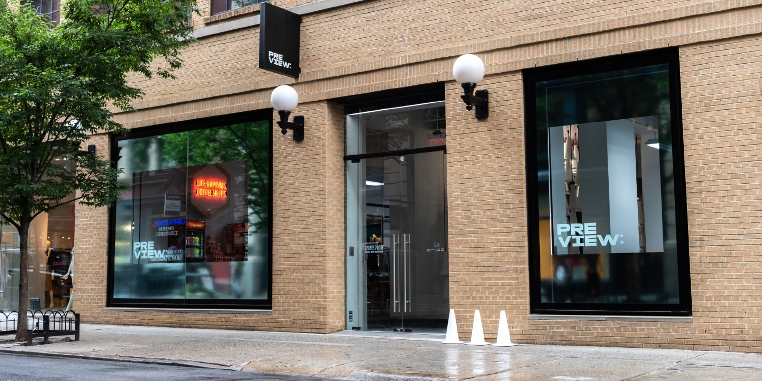
On the store’s exterior windows, the logo is placed at the bottom of the pane, with the reflective framing device used to both highlight products featured in displays and capture the urban movement of the city sidewalk.
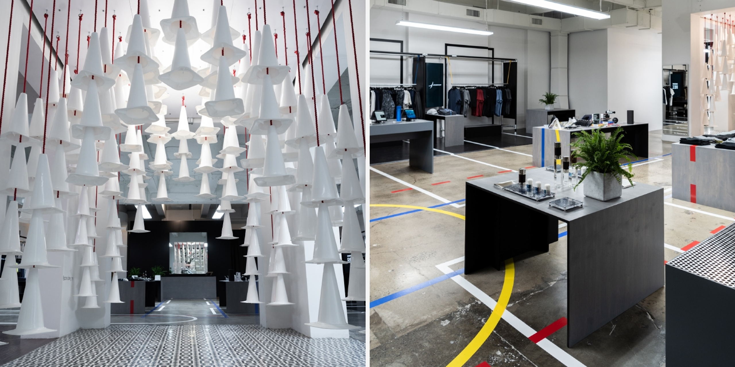
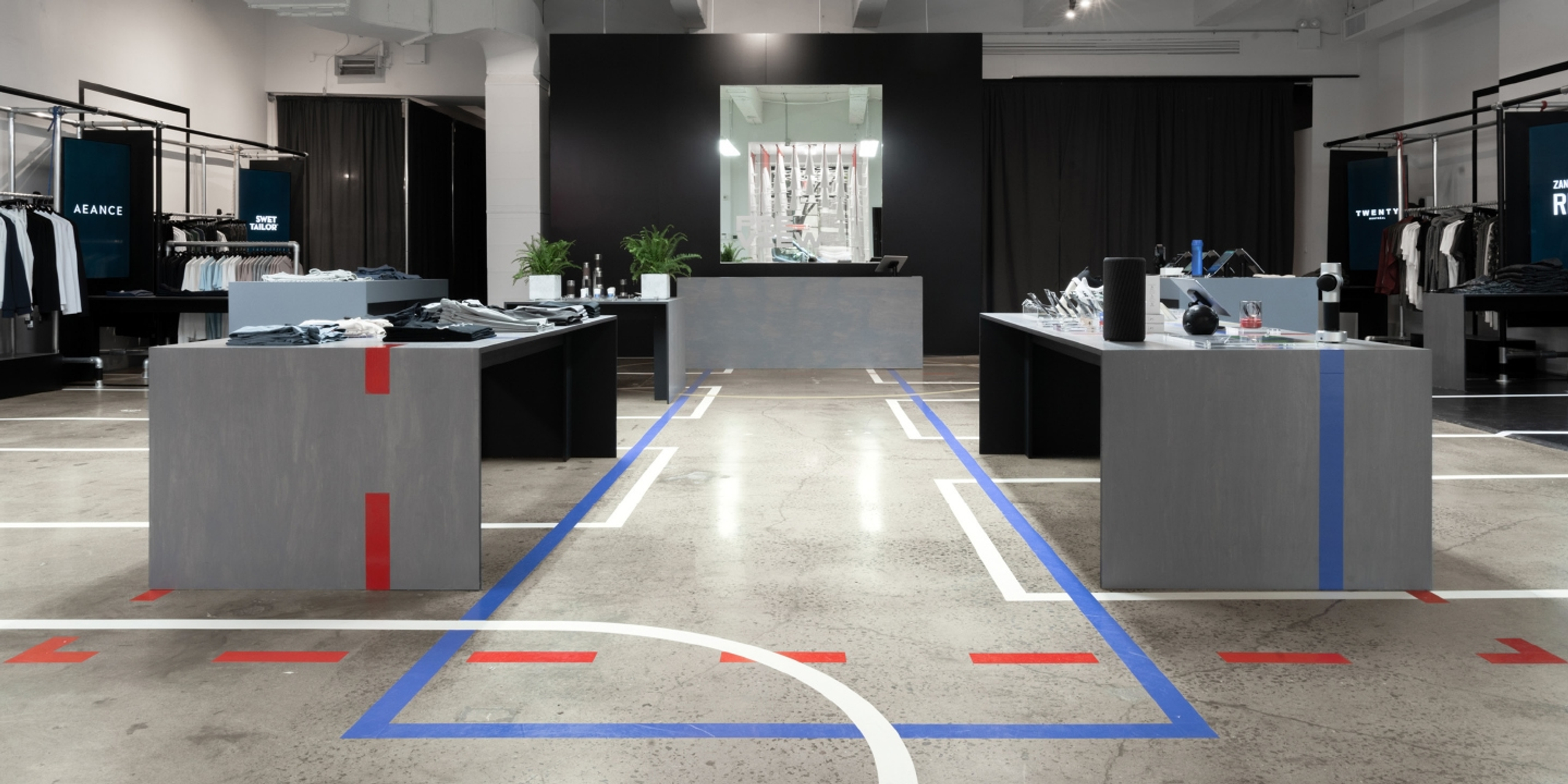
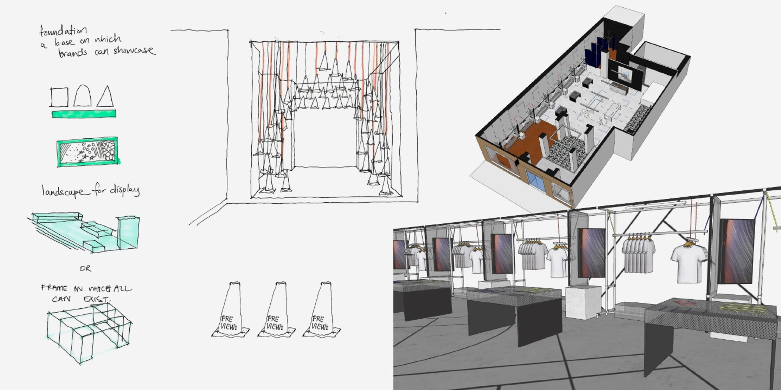
Inside, a common framework gives each brand its own distinct space and digital screen to display personalised content.
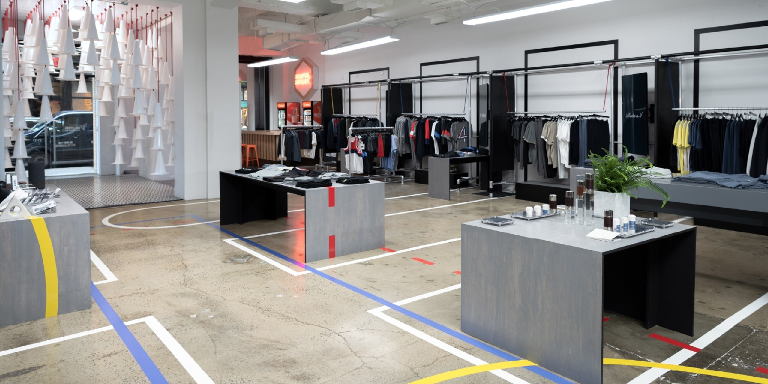
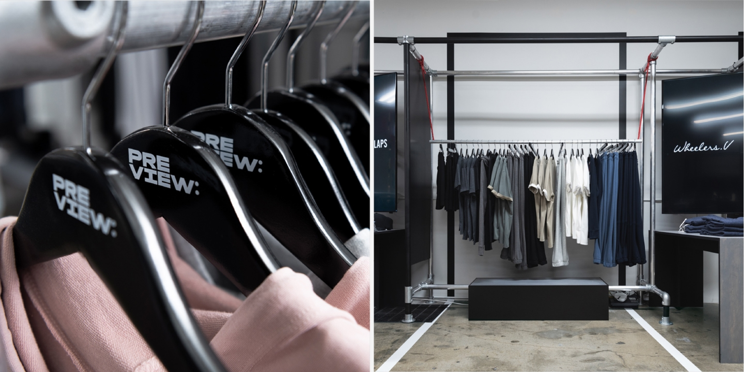
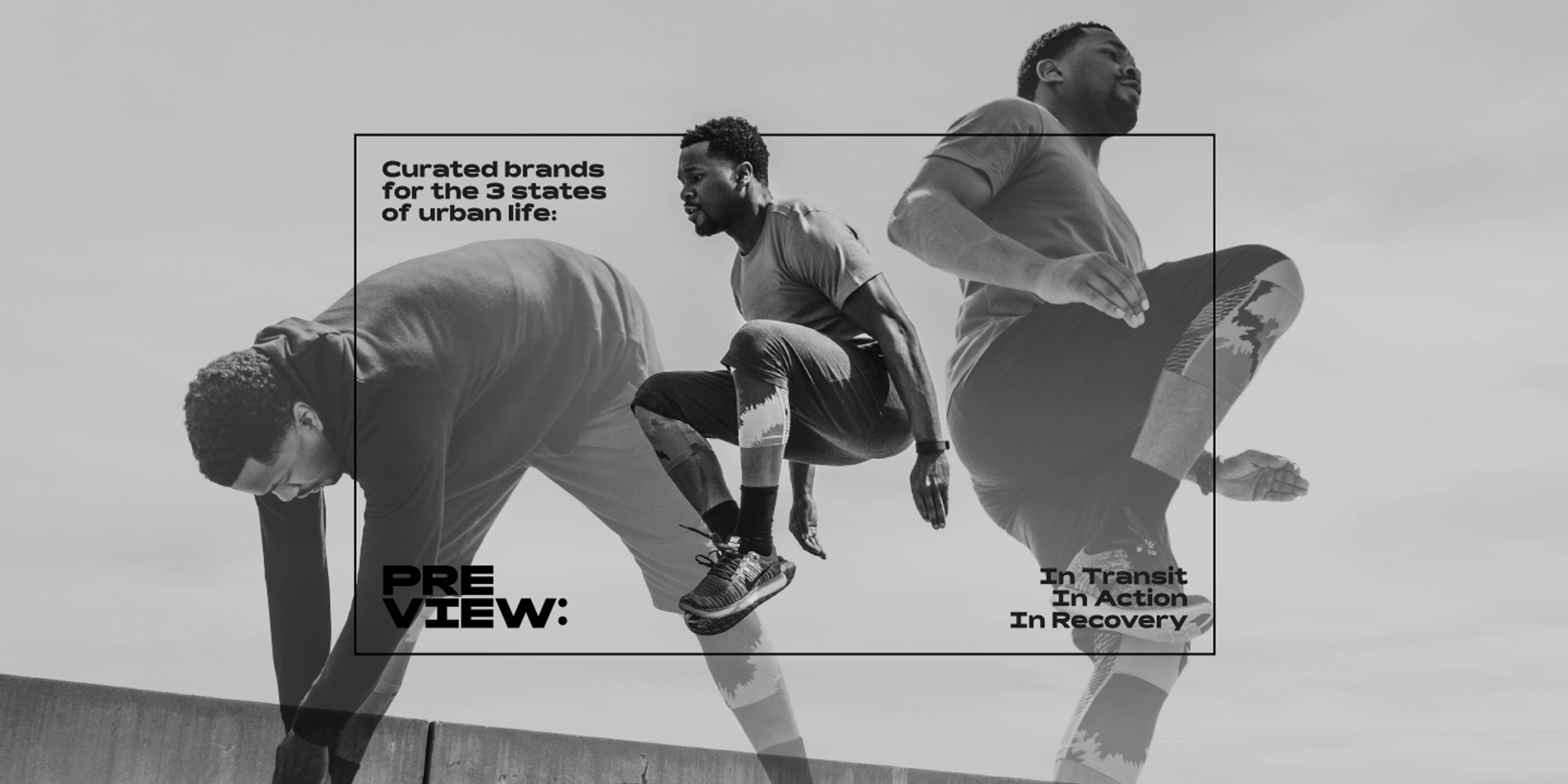
An installation at the centre of the store and custom flooring repurpose sports cones and court markings respectively to create bold pieces that celebrate both athleticism and the states of urban movement: transit, action, and recovery.
Results

was featured in print and online media, including the New York Post.

adapts consistently to a broad range of applications.

allows multiple brands to coexist in one space.