An immersive 360 virtual retail experience to remove trash from our oceans.
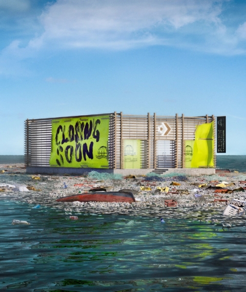
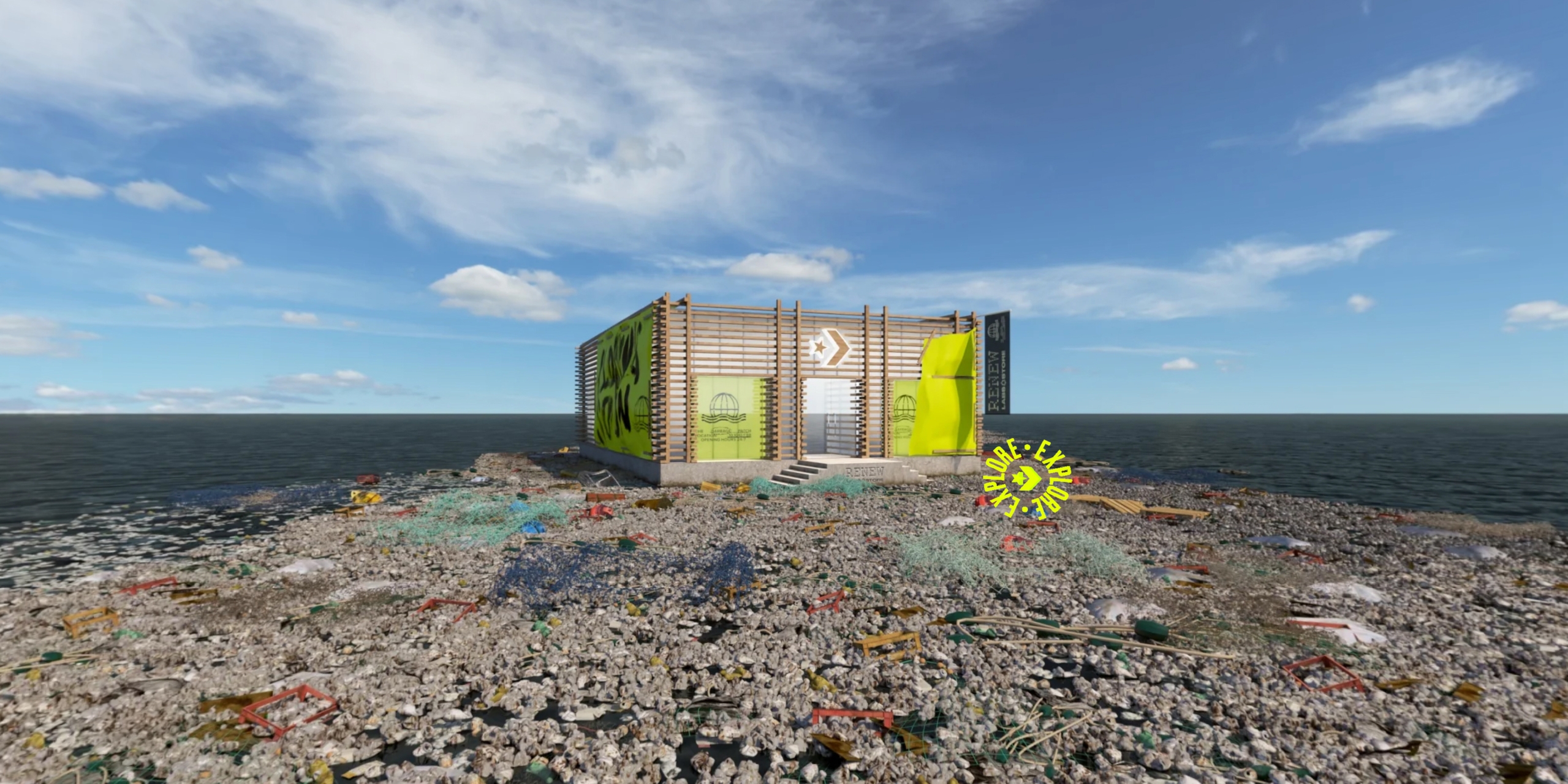
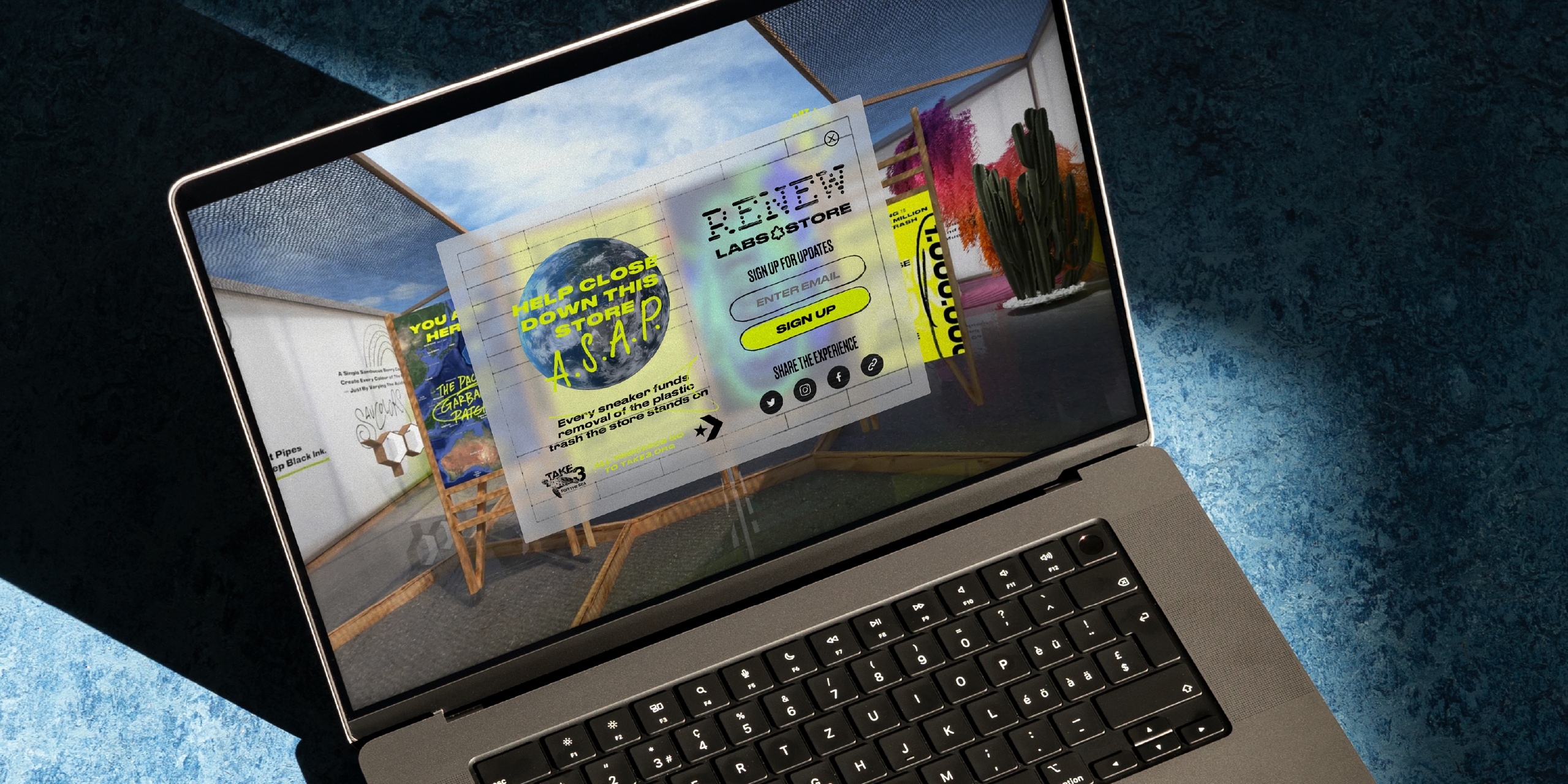
Virtue Worldwide came to us to support the launch of a store concept they had developed in collaboration with Converse’s Global team and Converse Australasia. The aim was to build a virtual store floating on a garbage patch in the ocean to instantly communicate the issues we have with our oceans today.
We are asked to collaborate on a variety of different projects, but this one holds as one of our favourite projects we’ve ever worked on. We particularly enjoyed the approach to sustainability with the end goal, product and experience design all lining up to support and communicate around important planetary issues.
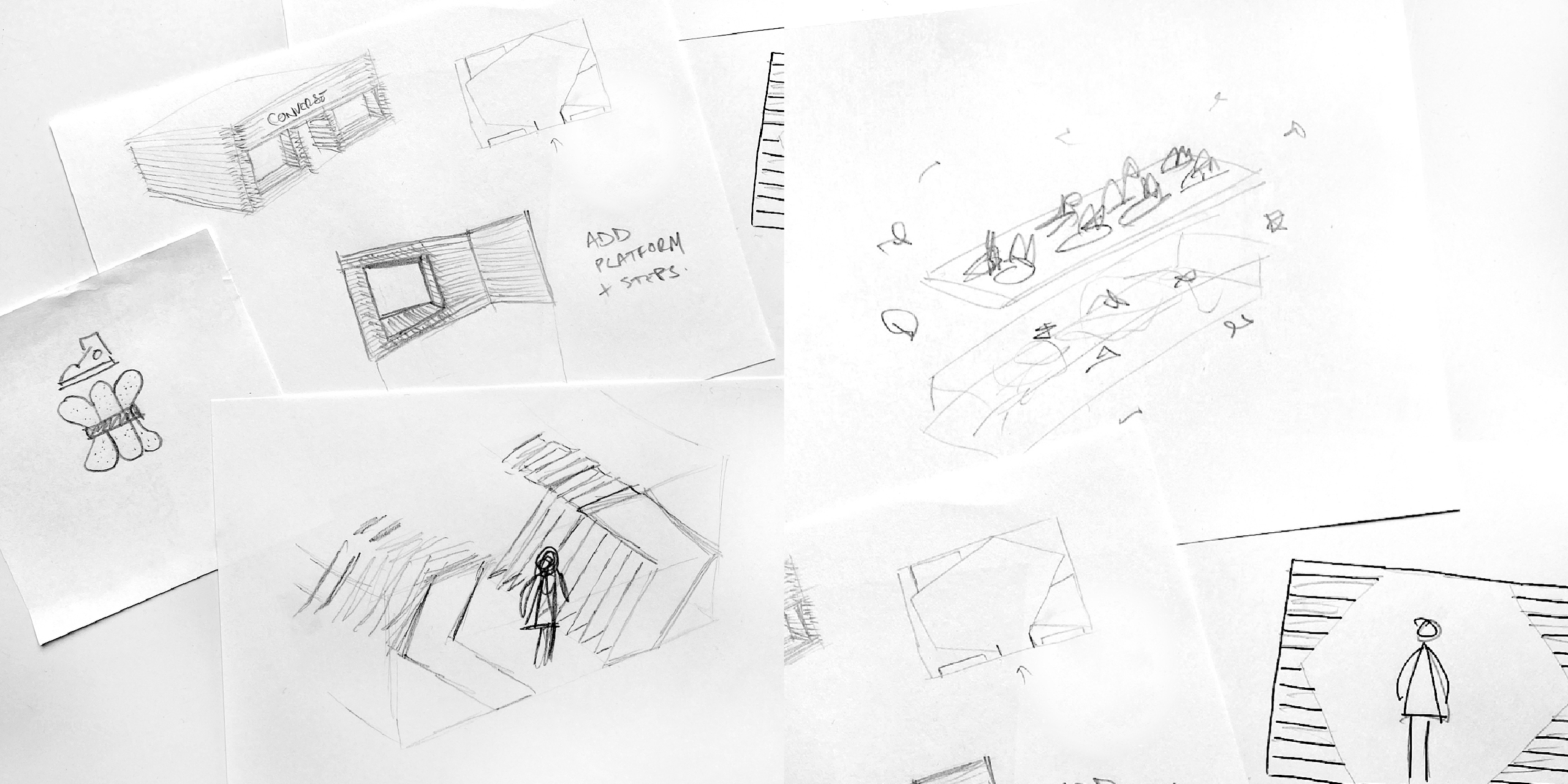
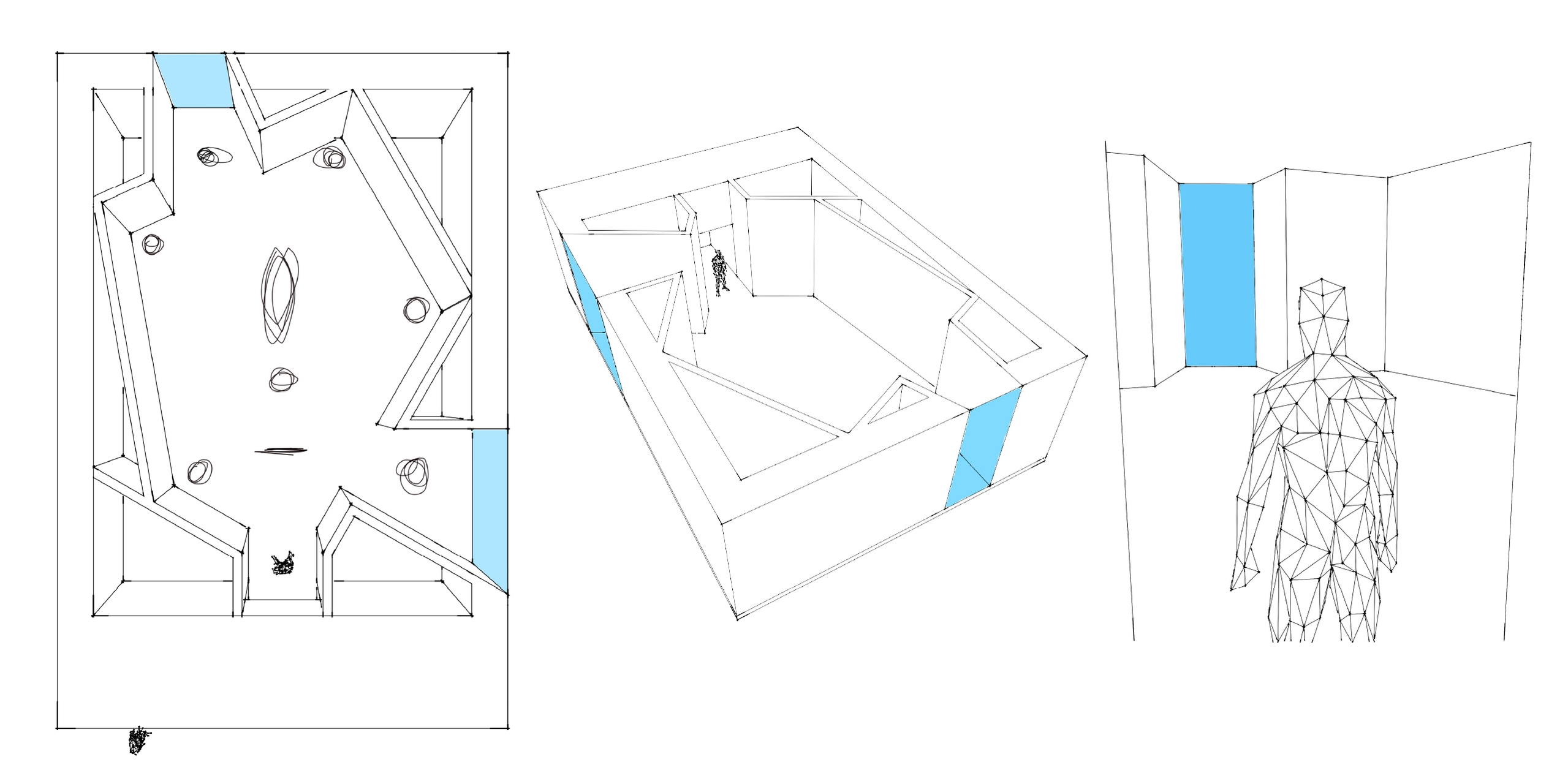
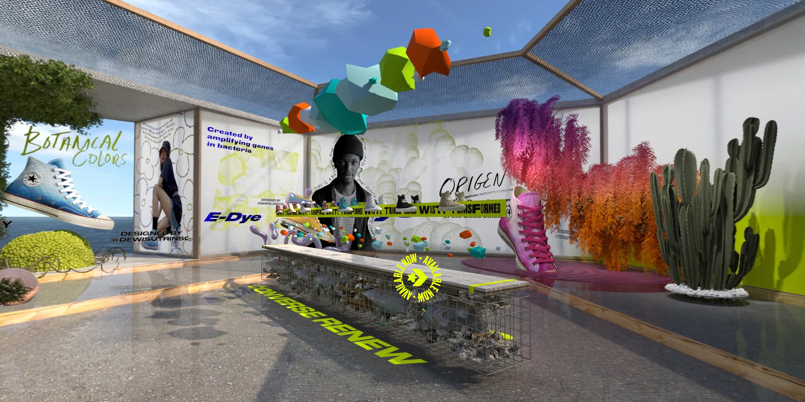
A virtual store with this kind of ambition gave us an opportunity to design without worrying about physics, gravity or health and safety, so we started with a store that appeared smaller on the outside than it was on the inside to immediately communicate that this wasn’t like a regular physical store. We also played with oversized scaling of the limited edition displays and elements that floated in space.
Our CGI visual artists and our development team (now Rosie Lee Digital) took care of building the experience once the overall design intent was locked in.
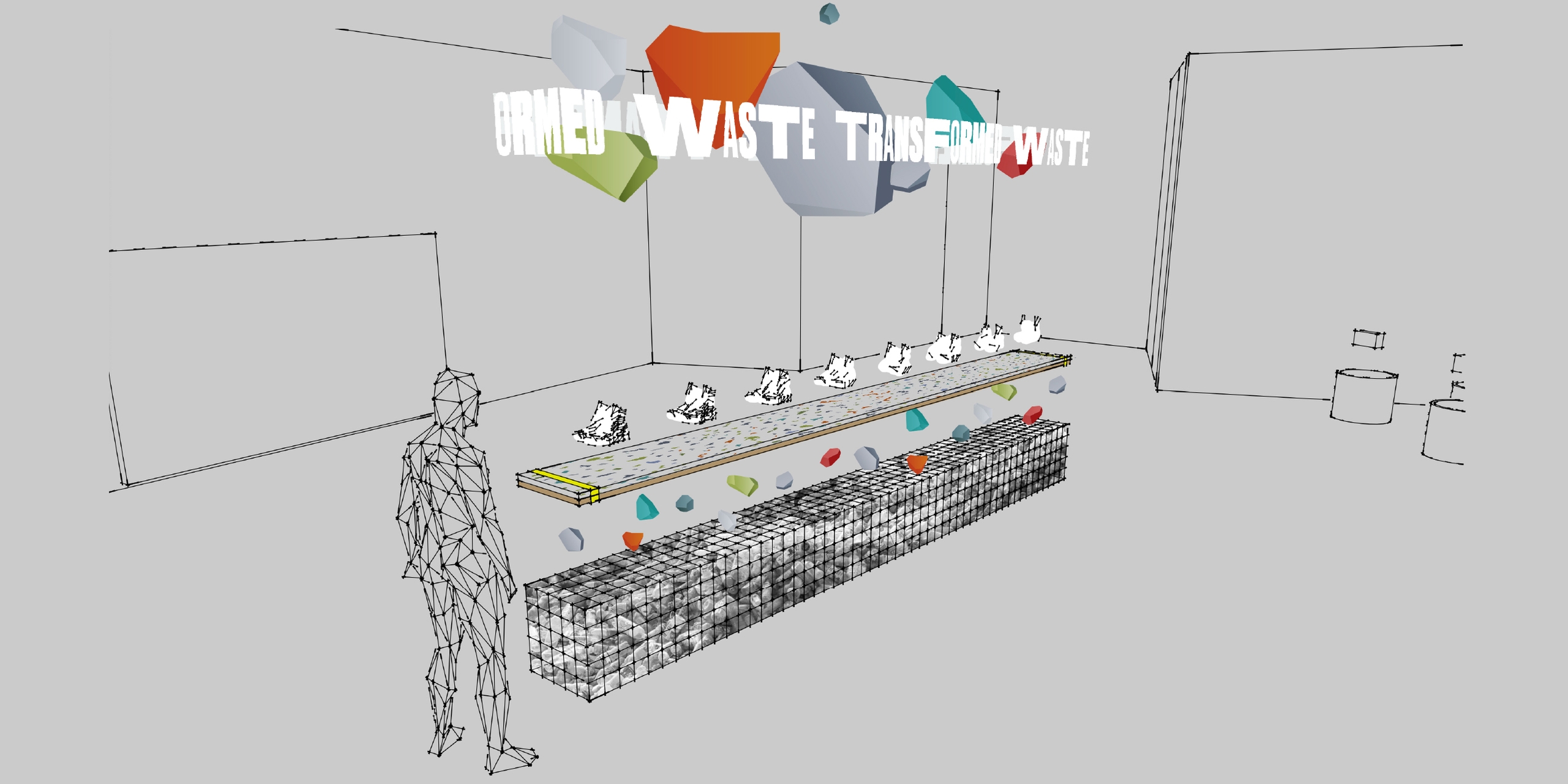
Our creative team designed the overall spatial experience, starting with the exterior and interior architecture and the central table display. We collaborated with Virtue on other design elements in the space.
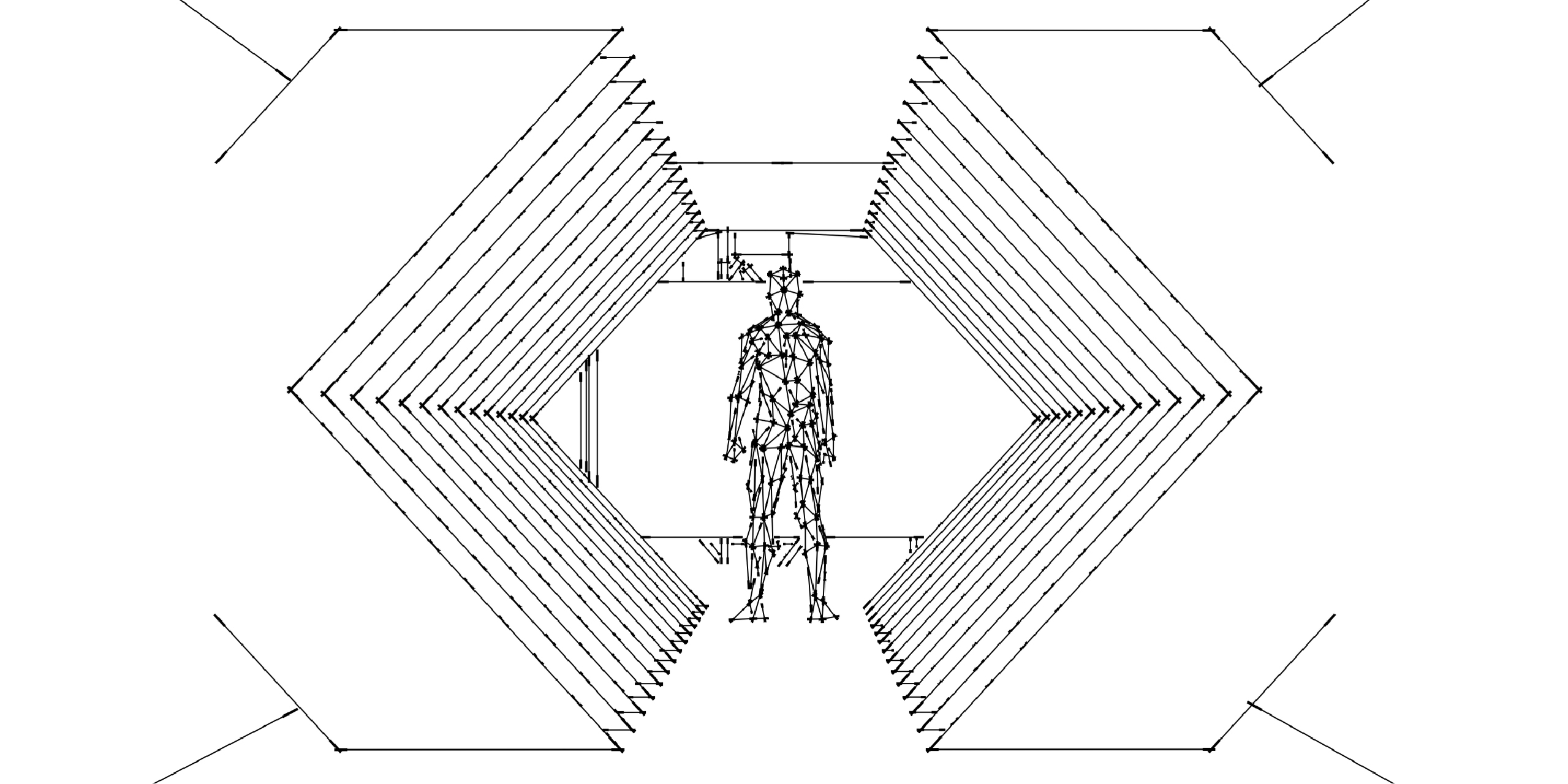
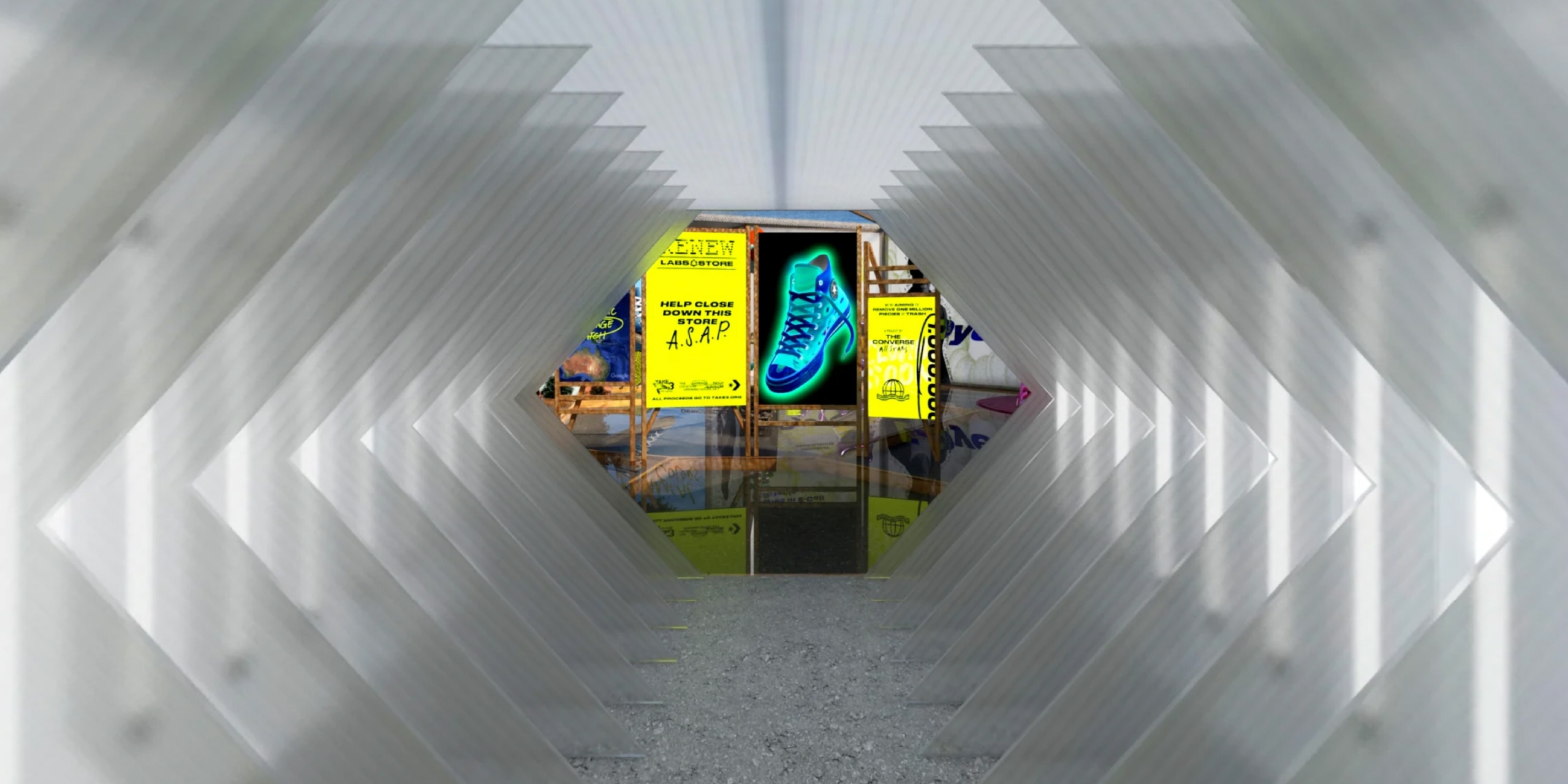
Before entering the store, visitors were able to walk around the floating waste plastic island using a familiar navigation style similar to Google Street View. The entrance way was designed as a portal into a slightly surreal space with the entrance tunnel formed by repeating the Converse chevron shapes. The overall aesthetic took inspiration from Converse’s pinnacle retail design along with visibly recycled materials, which were designed to appear rough around the edges.
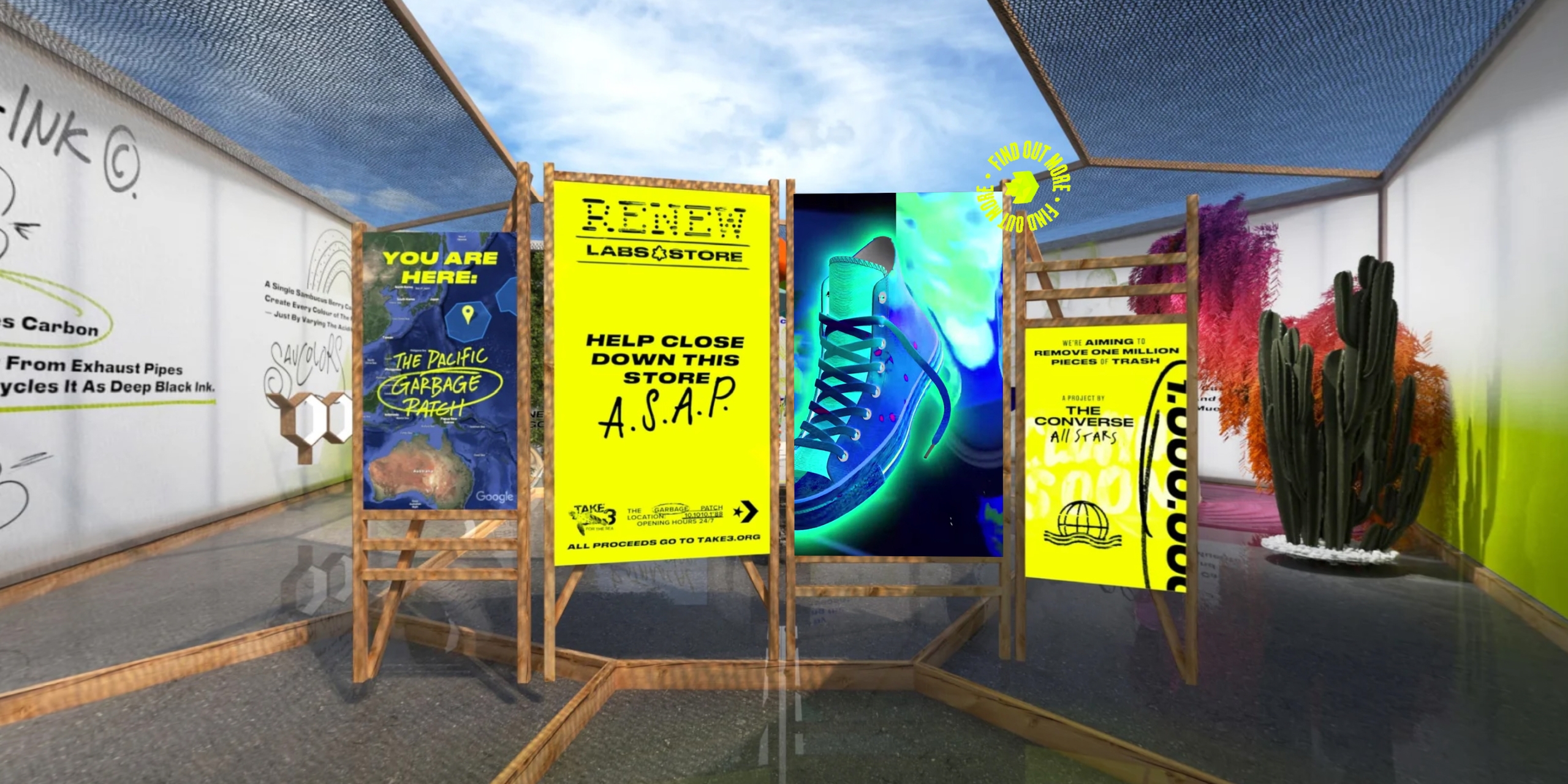
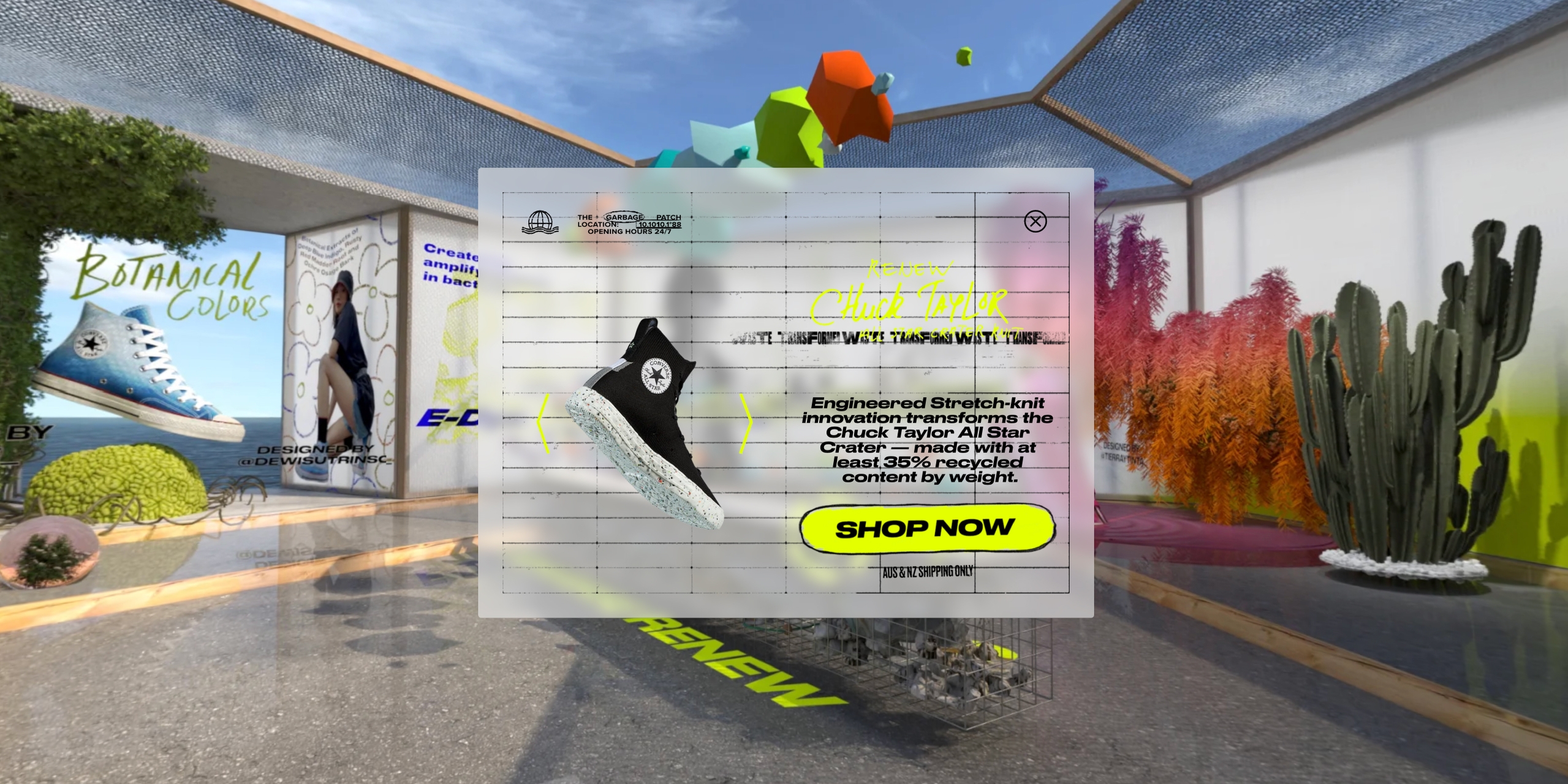
The overall interior was designed to feel futuristic while using recycled materials such as fishing nets, reused wood and plastic, mirroring the ethos of the product design. Just inside the front door, an animated noticeboard gave visitors a flavour of what to expect. On the central table we incorporated a light-touch visual expression of waste plastic being turned into sole material with the product floating in anti-gravity.
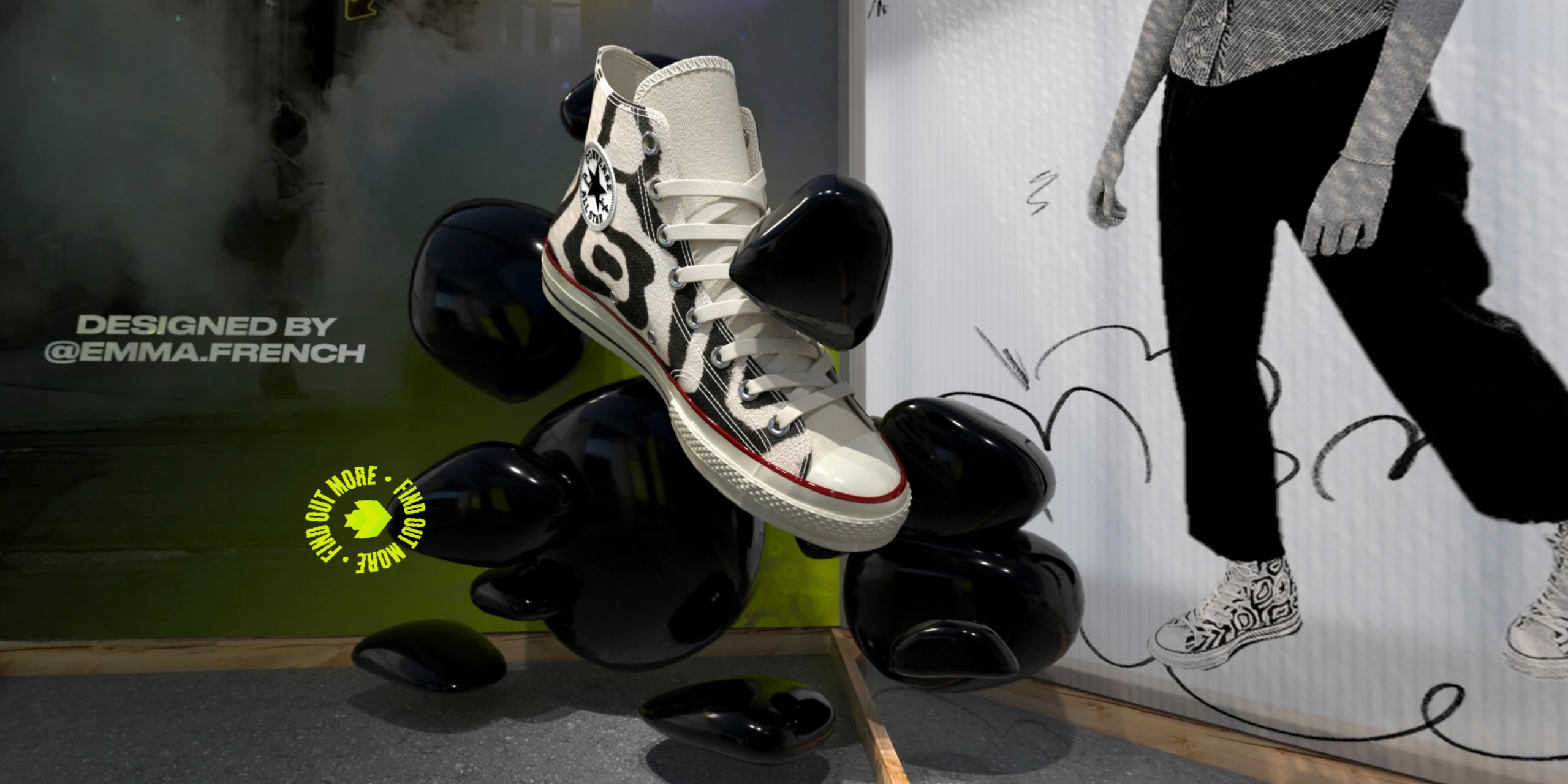
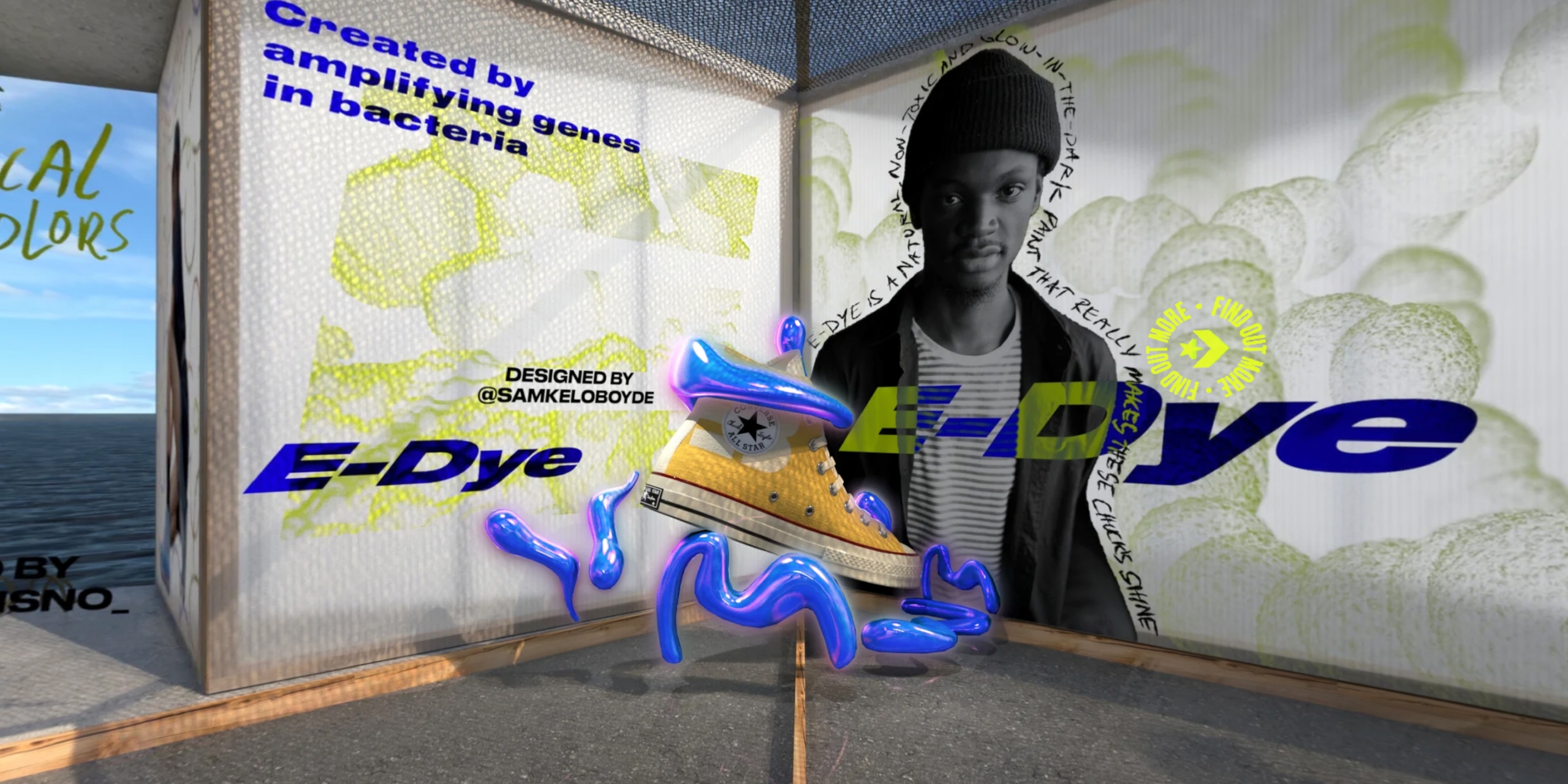
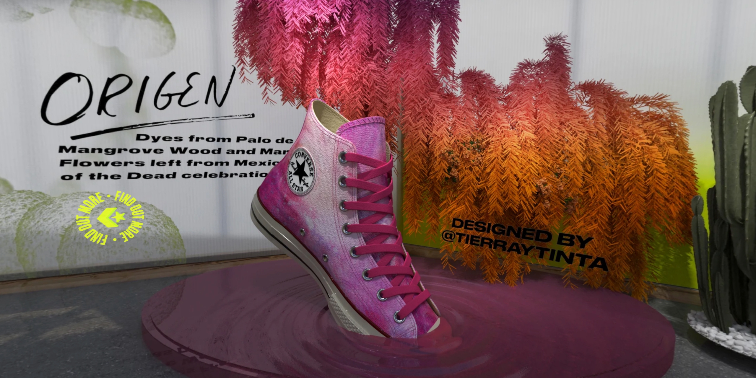
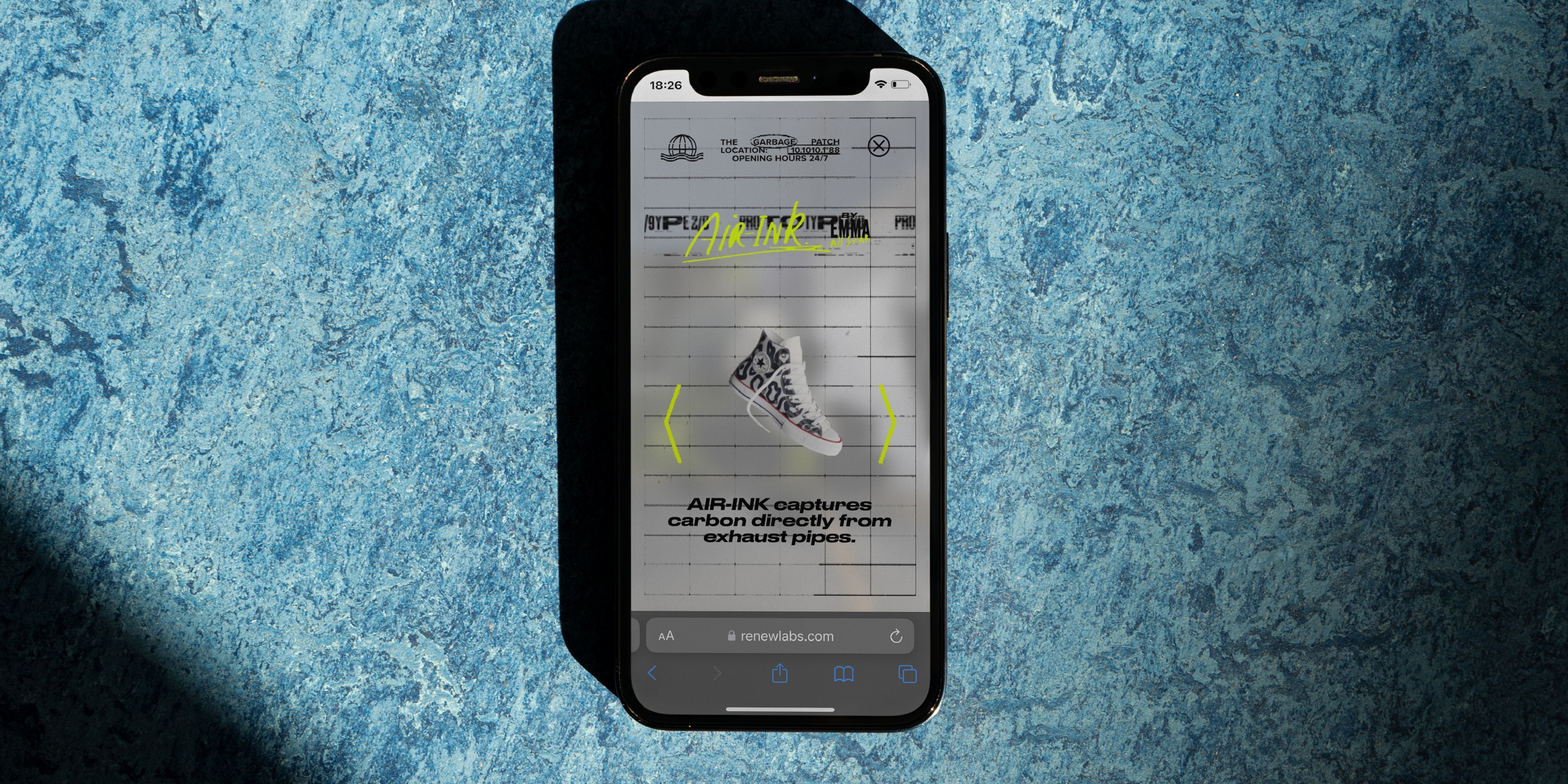
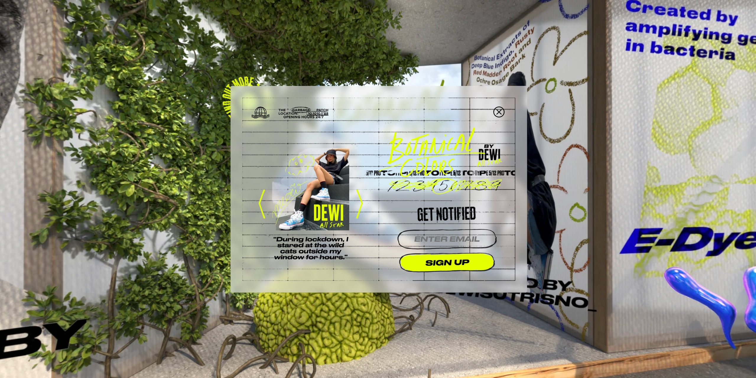
Oversized Chucks around the edges were hand-customised limited editions by influencer-creatives, using eco-techniques, such as ink that sequestered pollution from the air. Each display of the limited edition products visually expressed the processes used and profiled creators in a unique way.
The Renew product line was rendered in rotating 3D and could be purchased through interactive overlays. Each limited edition Chuck had an additional layer of interactivity through overlays, where visitors could enter a draw to win a pair.
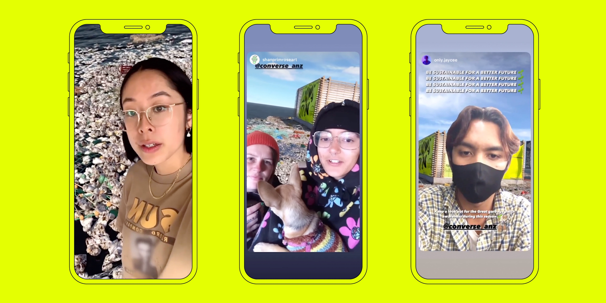
To launch the activity, influencers were given the virtual environment as an AR backdrop so they could use on their various channels.
Explore the experience for yourself: renewlabs.com
