Alix Glow
Strong Girls
Revealing a new visual identity for Strong Girls.
Throughout 2025 we partnered with Alix Glow to clarify and future-proof her evolving brand ecosystem. As her practice expanded from yoga into strength-led community formats —and her profile grew through collaborations with international sport brands— it became essential to define how each expression of her work could coexist with clarity and confidence.
Our process began with stakeholder interviews and brand audits to surface perceptions, tensions and growth opportunities. We explored how Alix was experienced by her community versus how she presented externally, identifying a core duality at the heart of the brand: nurturing yet disruptive, soft yet strong. This would help us to understand the routes to develop the existing identity to something more evolved.
From our foundational work we identified two archetypes for Alix as Outlaw and Caregiver. This duality became central to the strategic direction of the brand.
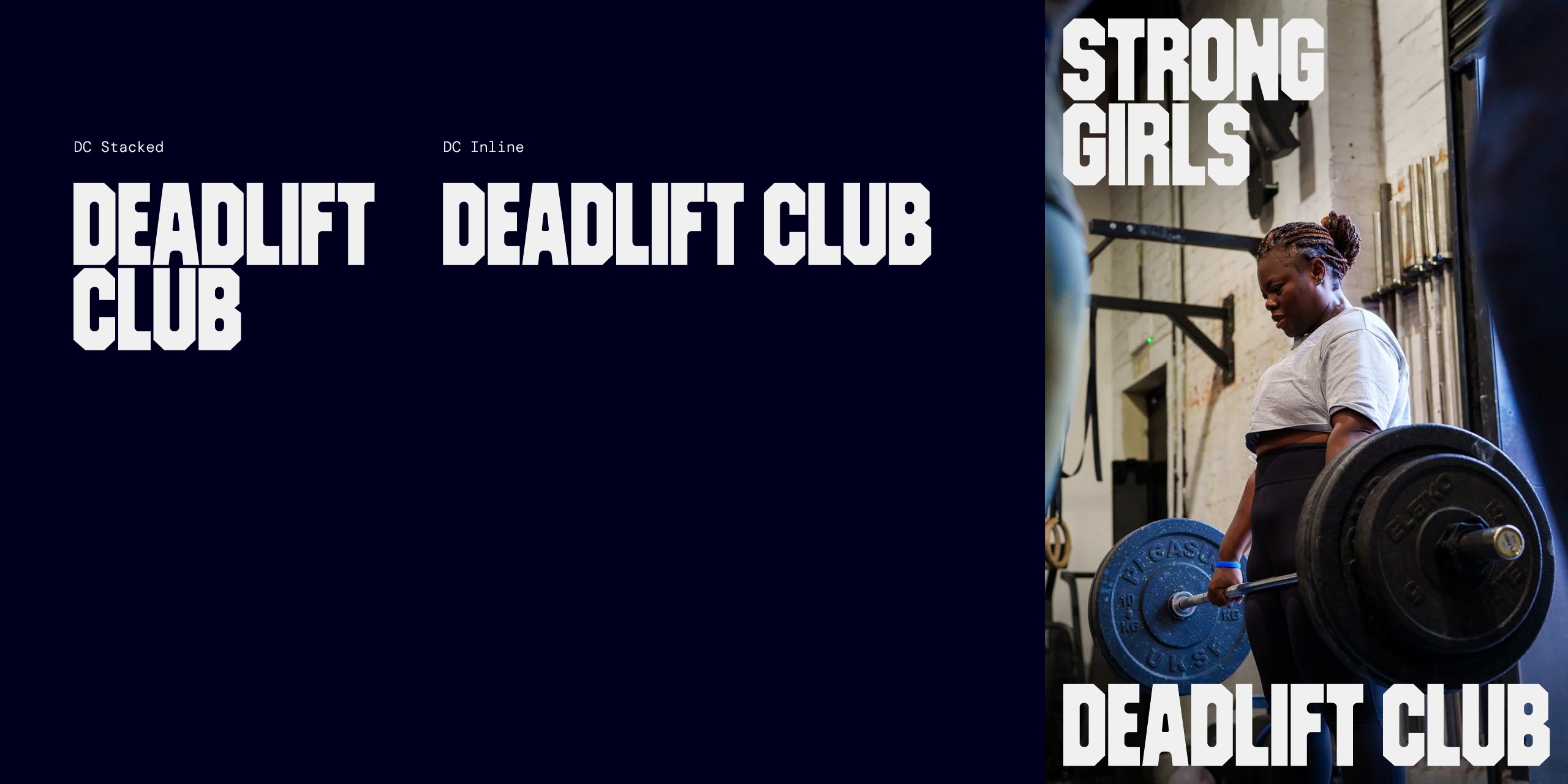
We originally explored a structured ‘house of brands’ approach for her brand architecture. However, as Strong Girls continued to gain momentum and cultural relevance, it became clear that rigid visual consistency would constrain its energy.
Instead, we shifted toward a more fluid ecosystem model — one where each offer could fully embody its own expression while remaining philosophically aligned.
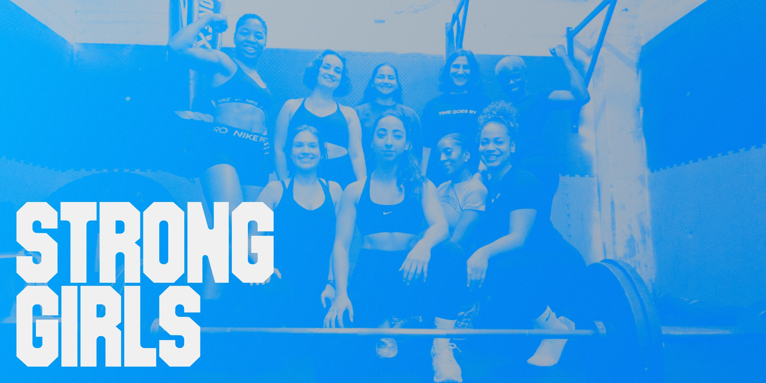
A key outcome of the strategy was recognising that Strong Girls had evolved beyond a programme into a community-led movement. It required a visual and verbal identity that could stand independently —bold, confident and culturally current— while still rooted in Alix’s broader philosophy.
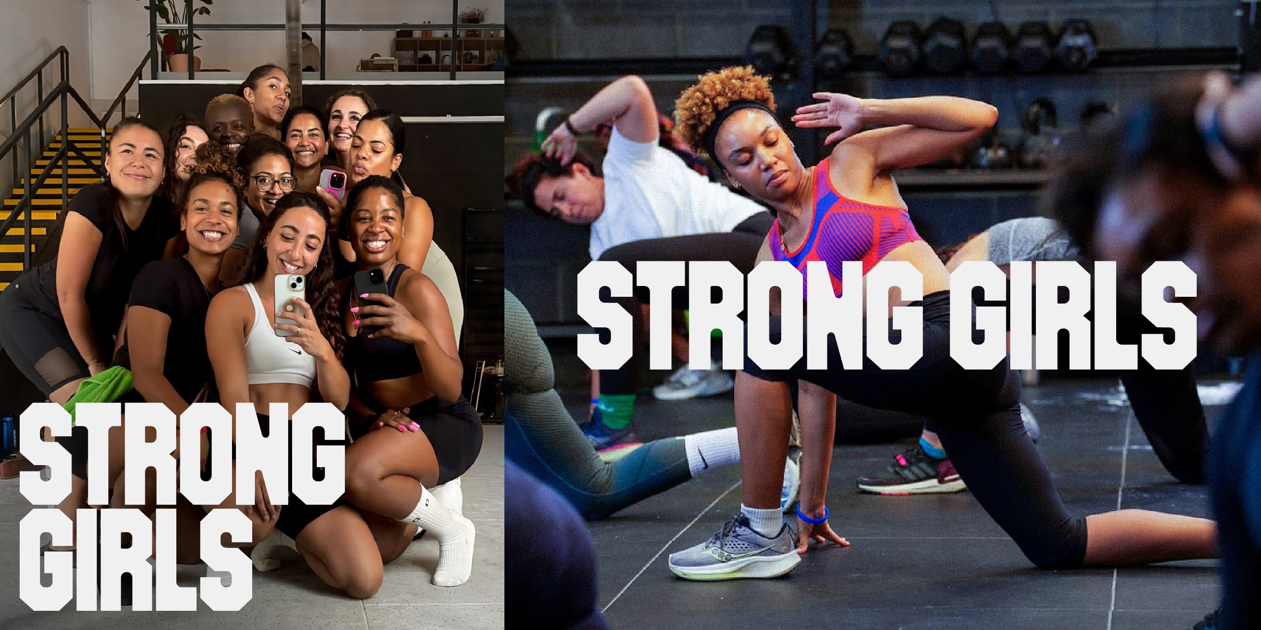
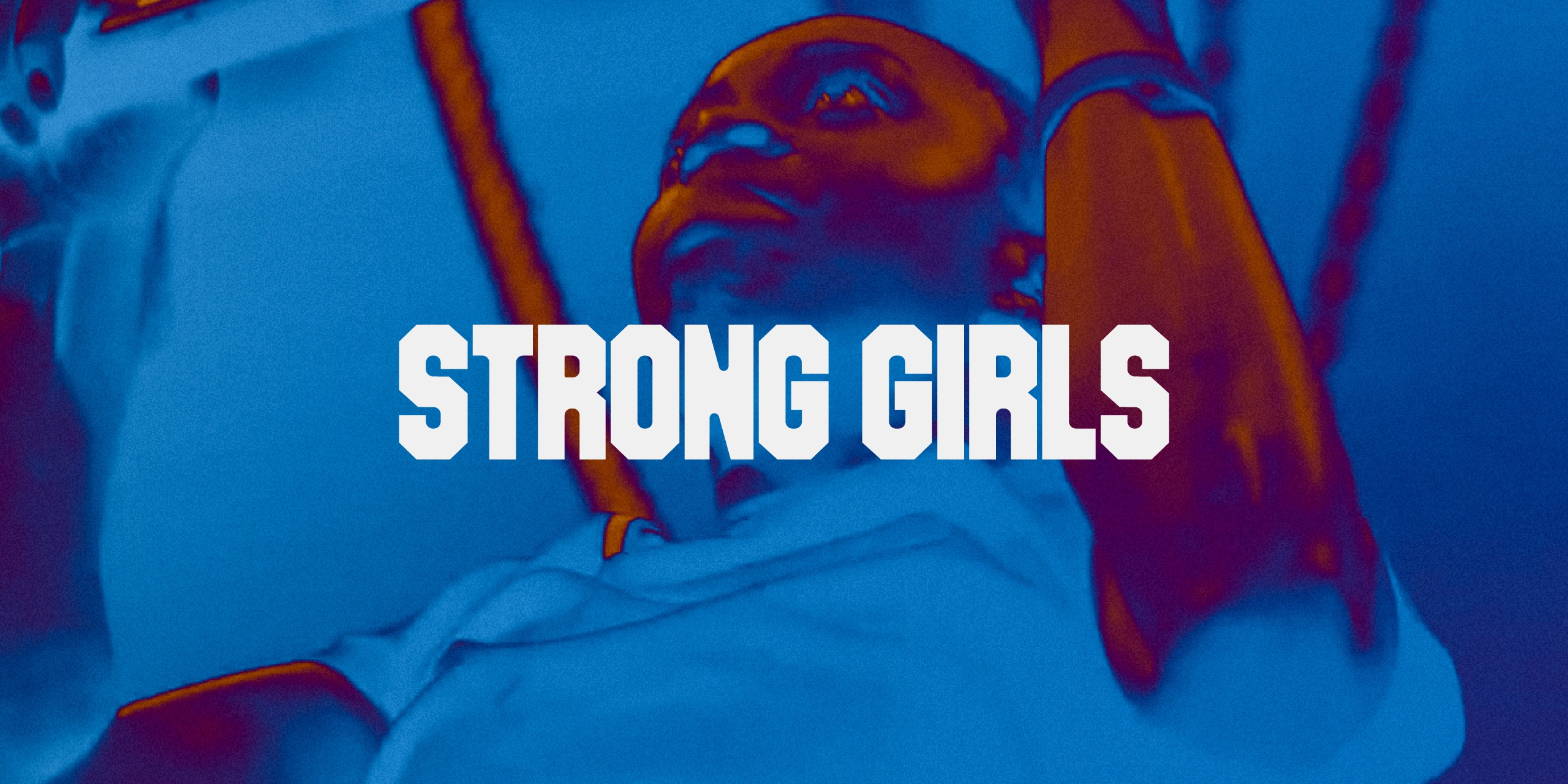
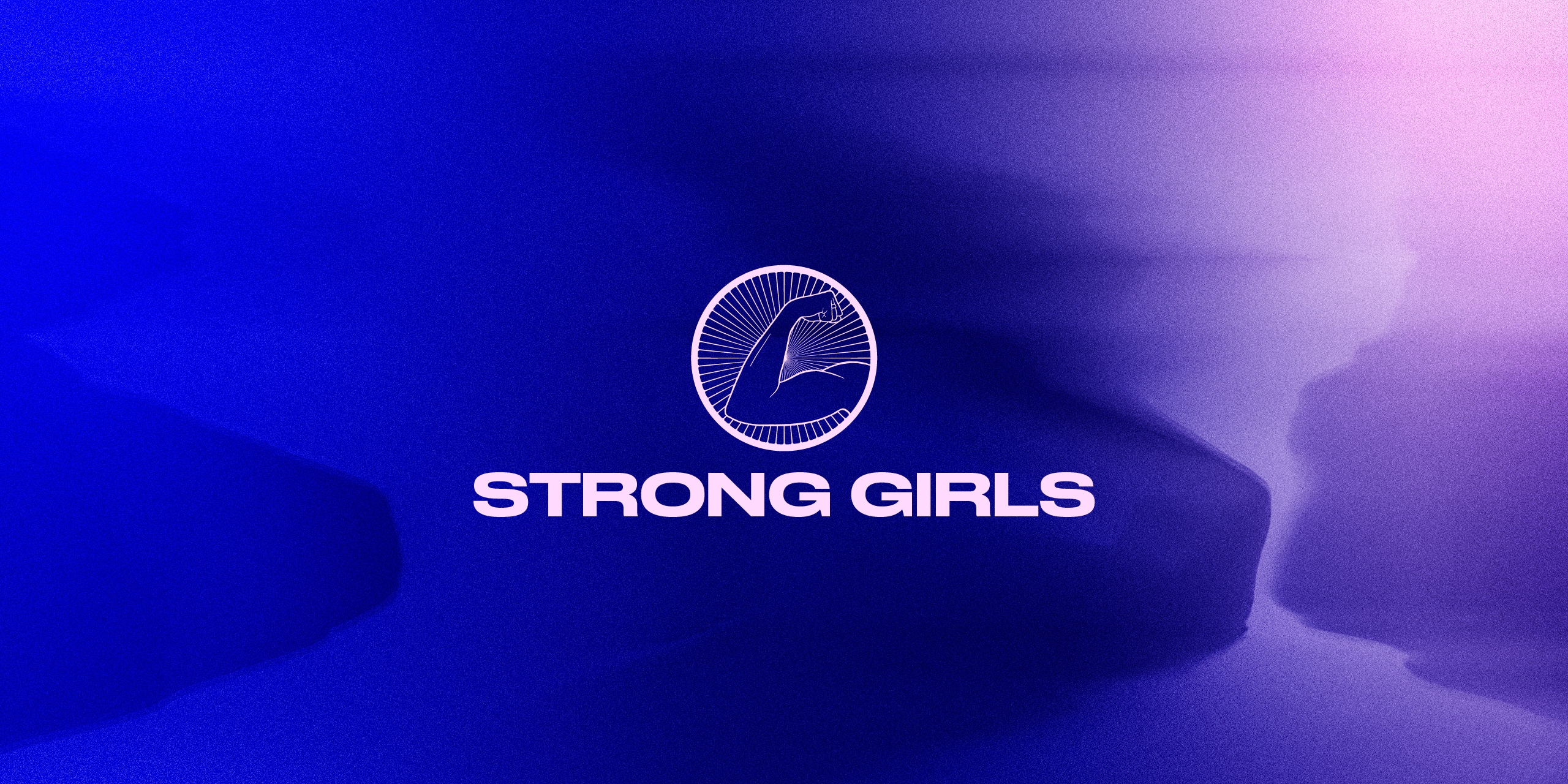
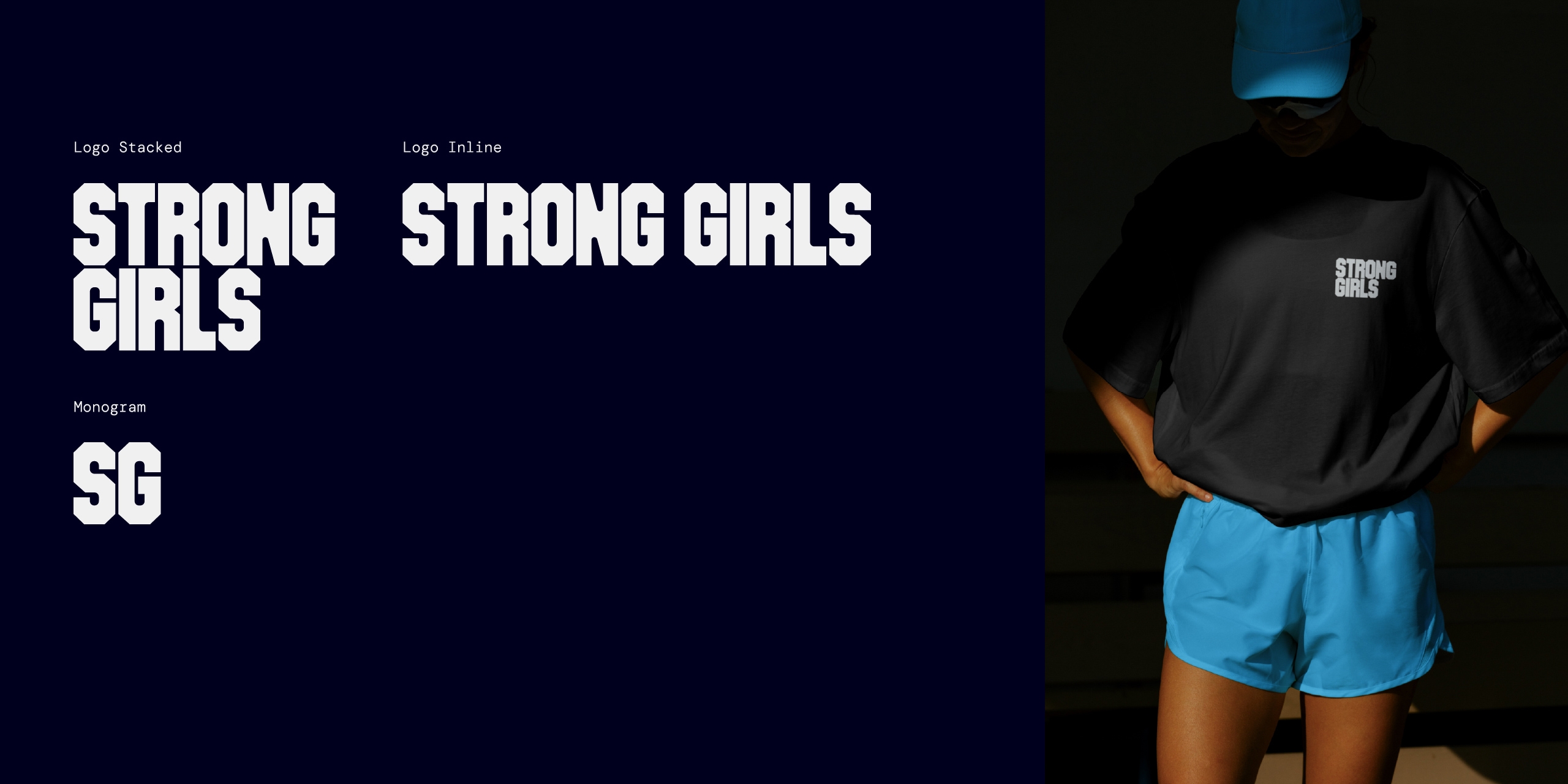
We developed the logo in close collaboration with Alix, ensuring it fully exuded a sense of strength and avoided any expected clichés of what training for women might look like.
We selected the final typeface for its sense of weight, confidence and overall feeling of strength and then customised the letterforms for a clearer aesthetic sense of purpose.
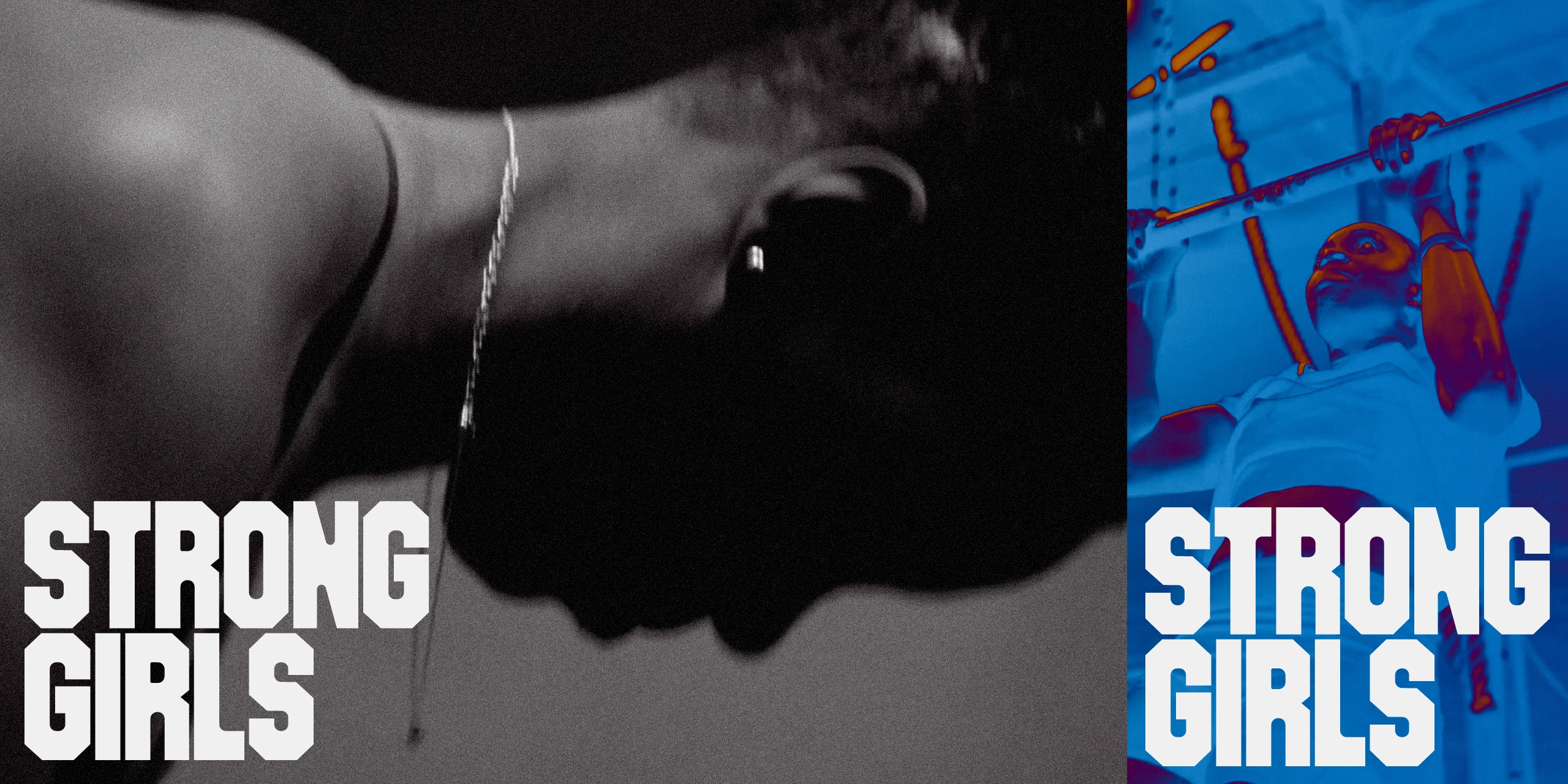
Working with her existing photography we put together art direction examples showing how tight selection, cropping, simple effects and colour-tuning can amplify the power of the imagery and become distinctly evocative of the brand’s values.
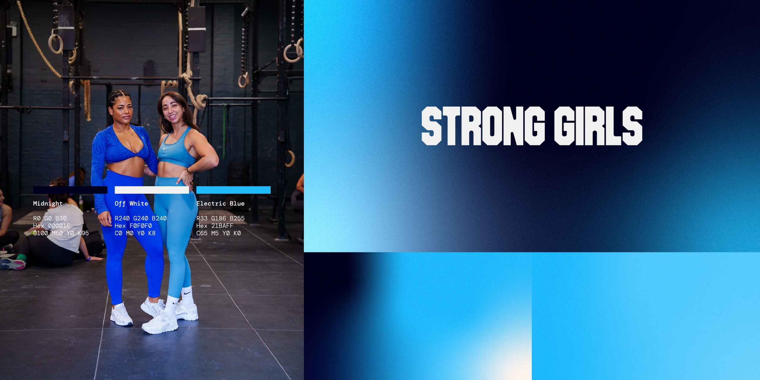
We created a pack of logo assets, brand-tuned photography, colour palette, supporting fonts, and a deck template geared for presenting to potential brand partners.
This was a successful brand update for Alix, and an instantly recognisable identity for the launch of Strong Girls with a strong brand position.
Credits:
Original photography by Jerome Brown-Hanson