Raw materiality meets augmented reality as we blur the lines between spatial and digital for Timberland's expressive campaign
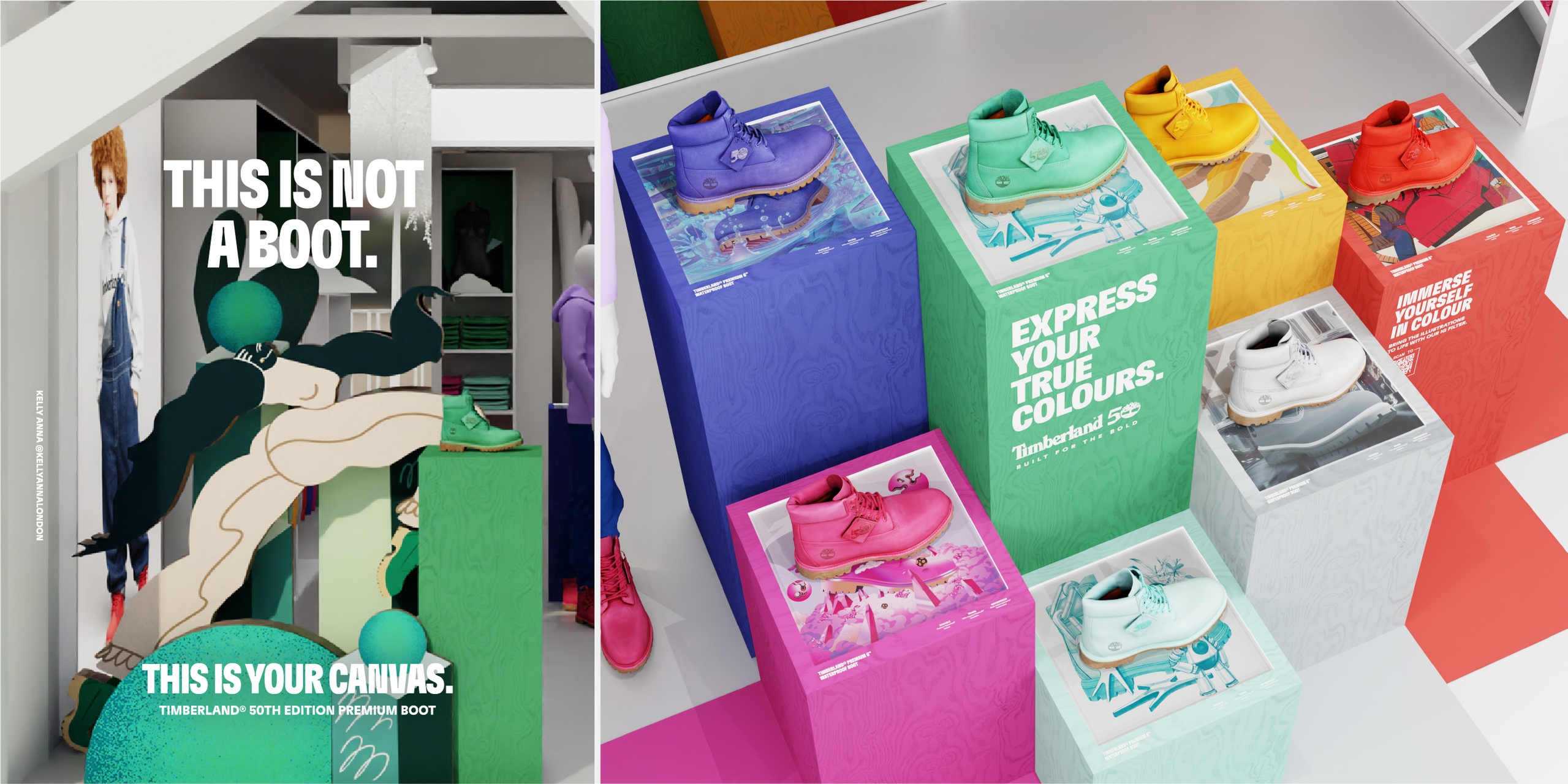
In October 2023, Timberland launched a new range of premium products across NORA, EMEA and APAC. They took their iconic Original Timberland® Boot and applied a range of bold colours to the full silhouette.
They commissioned a series of illustrators to develop key visuals to sit alongside the product launch, and we were asked to develop a tiered retail concept for the launch.
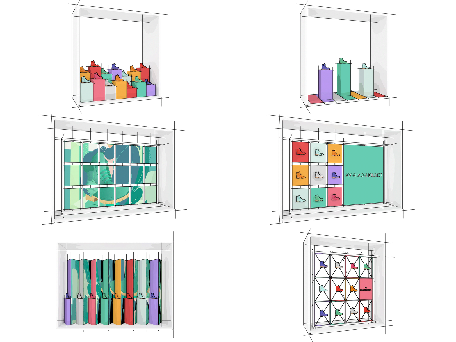
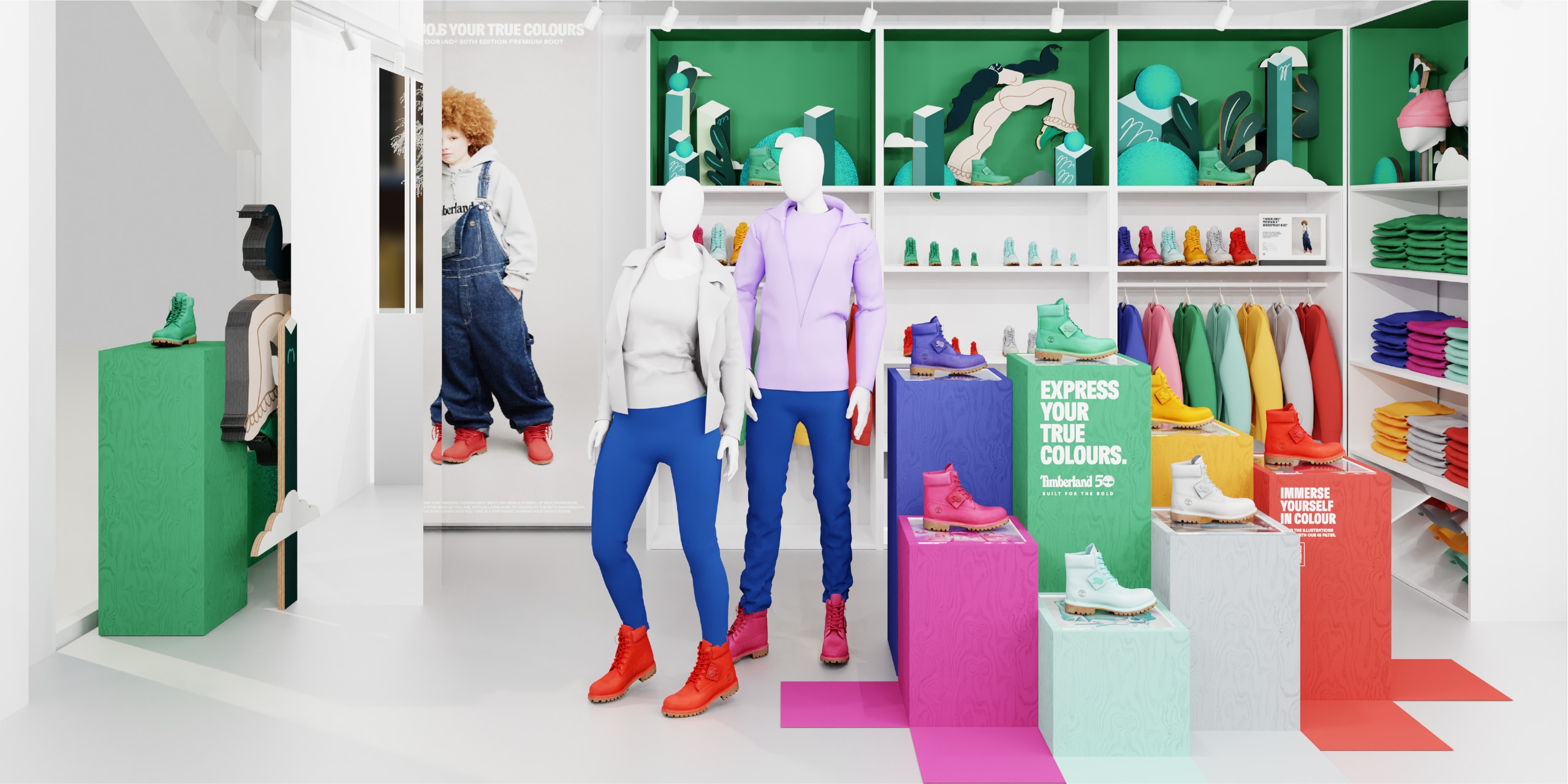
We were asked to consider windows, launch zones, footwear walls and other customer touchpoints throughout the store.
When we immersed into the brief and the core campaign assets, we knew that the illustrations were the thread that would bring this to life.
We are always looking for ways to create a seamless experience for customers across physical and digital environments. We wanted to make the experience accessible to as many people as possible and to improve shareability, but not everyone can interact with the campaign in a store.
Having previously experimented with augmented reality, we recognised that this would be an awesome way of bringing the illustrations to life.
The original project was being developed by us, but we decided to bring Rosie Lee Digital on as co-creators to ensure an integrated approach to retail and digital experience.
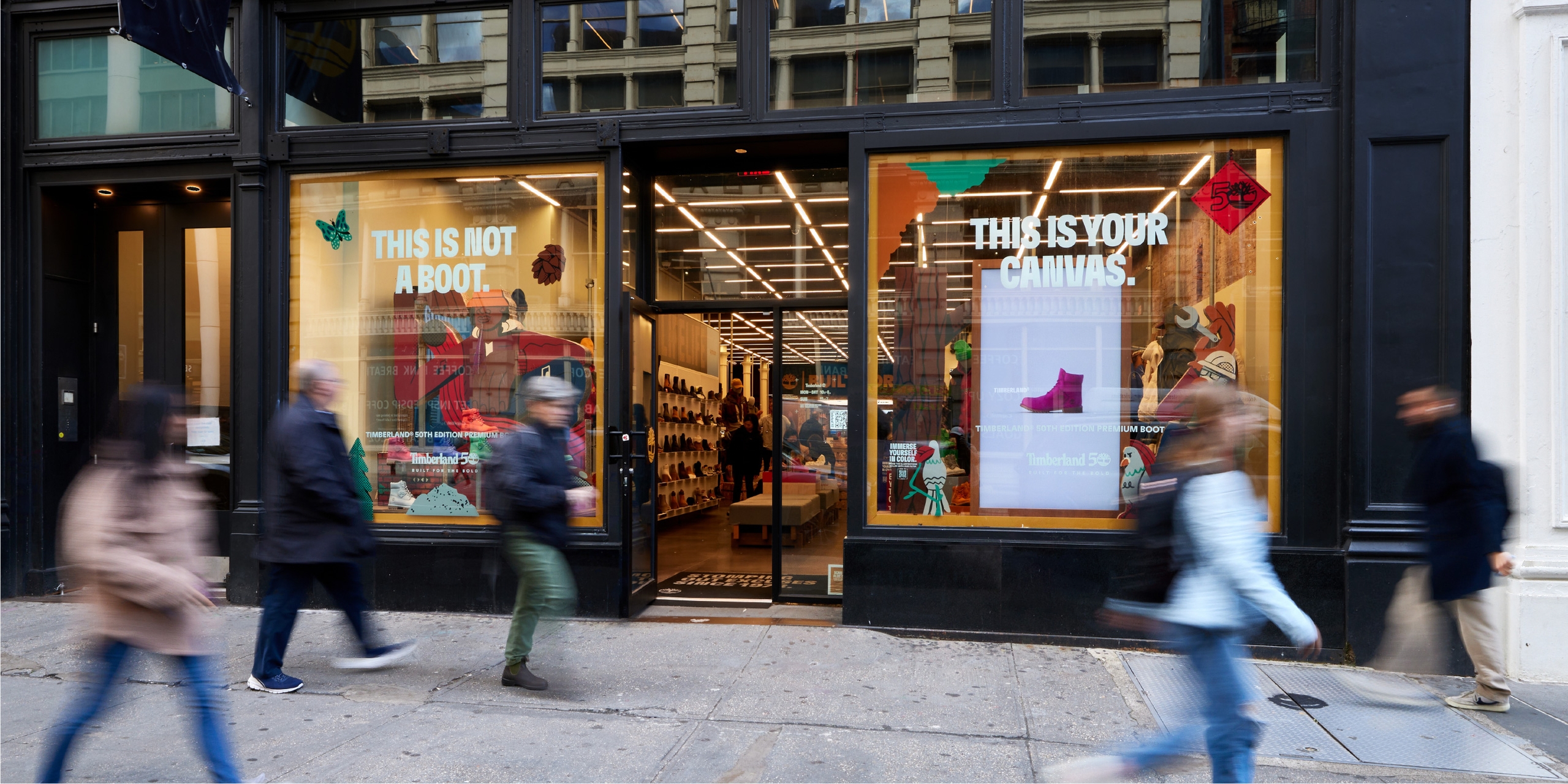
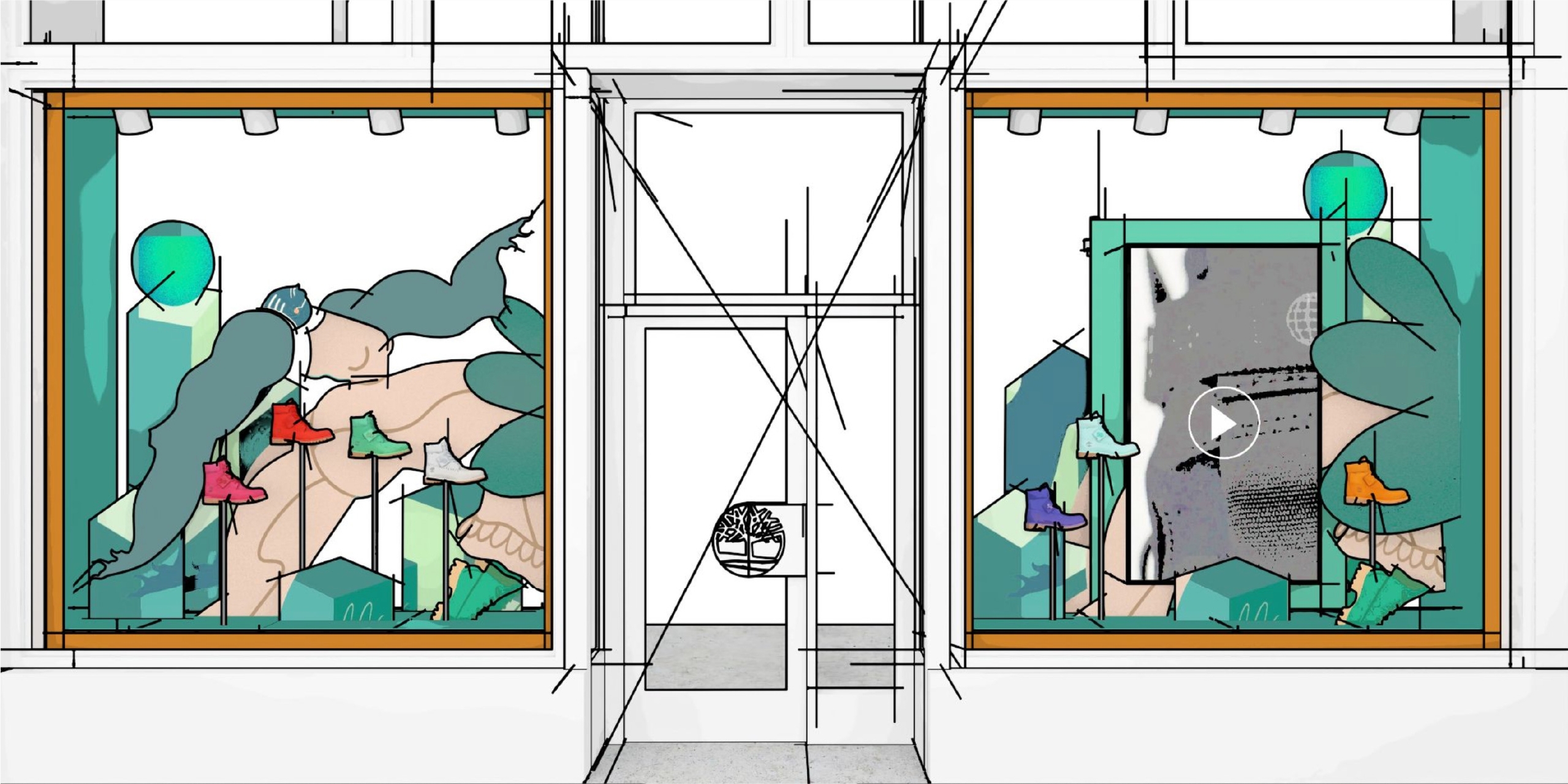
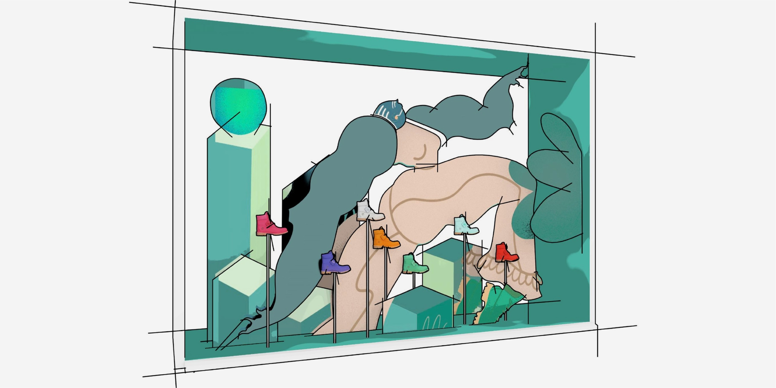
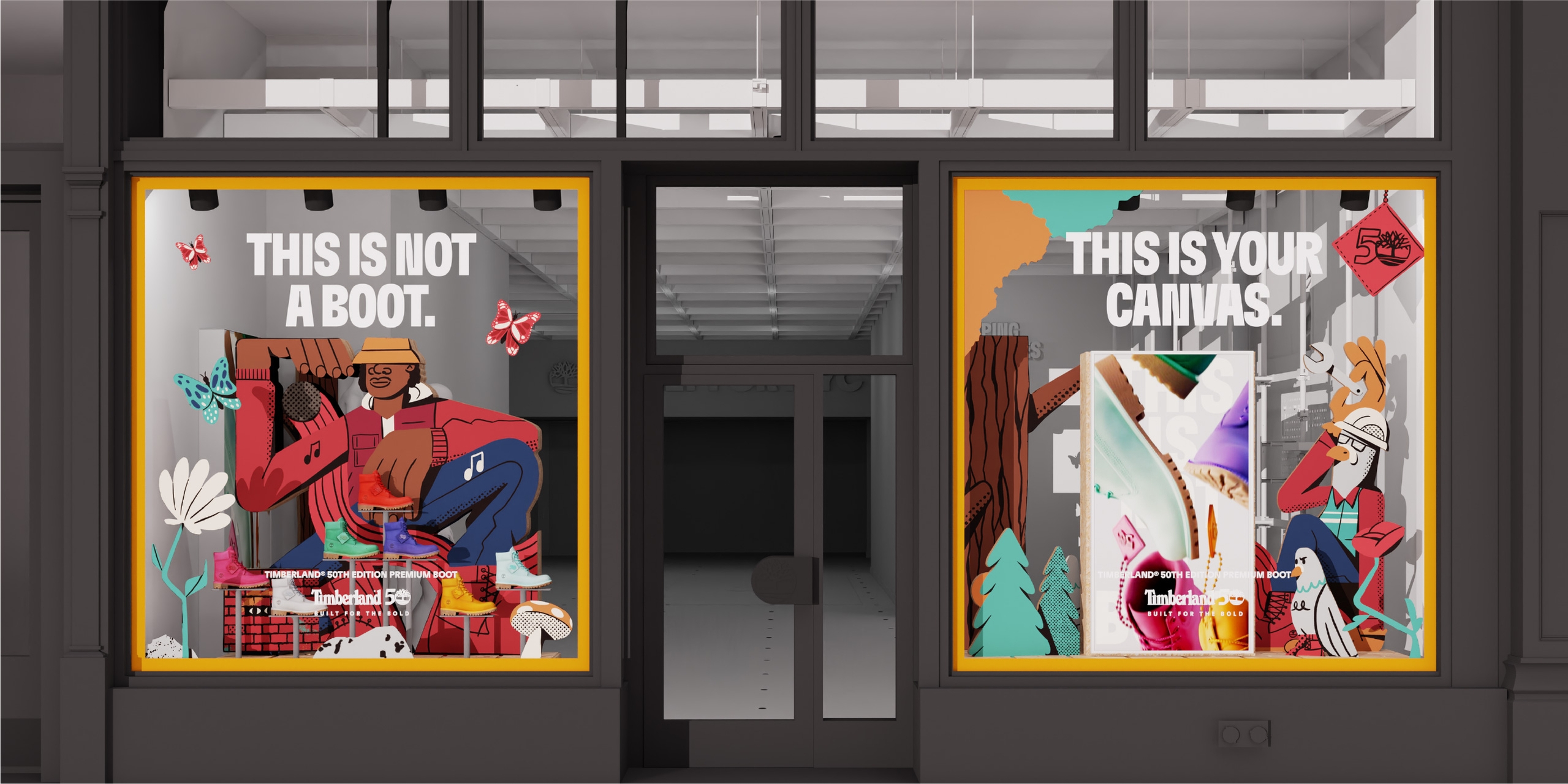
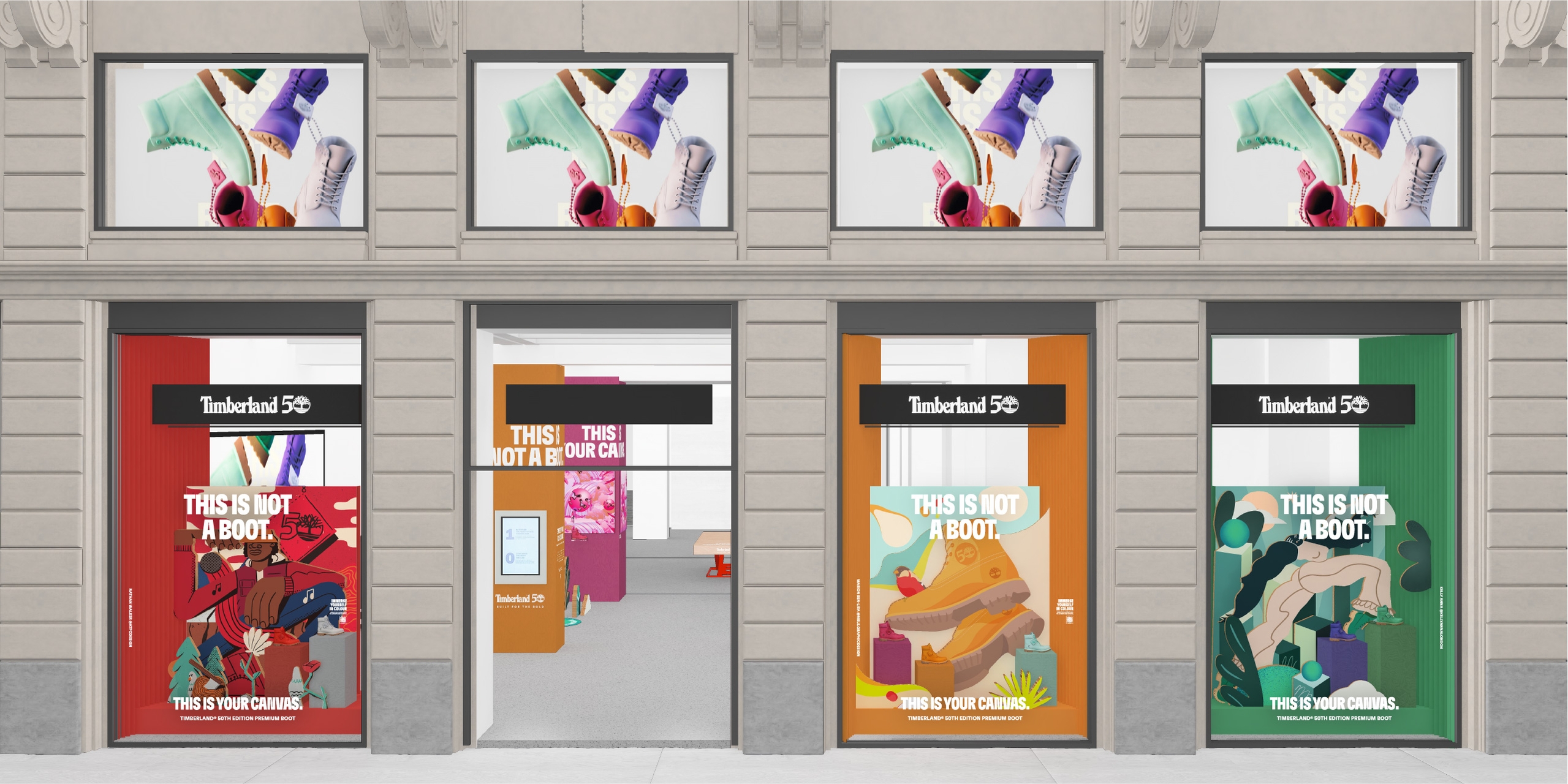
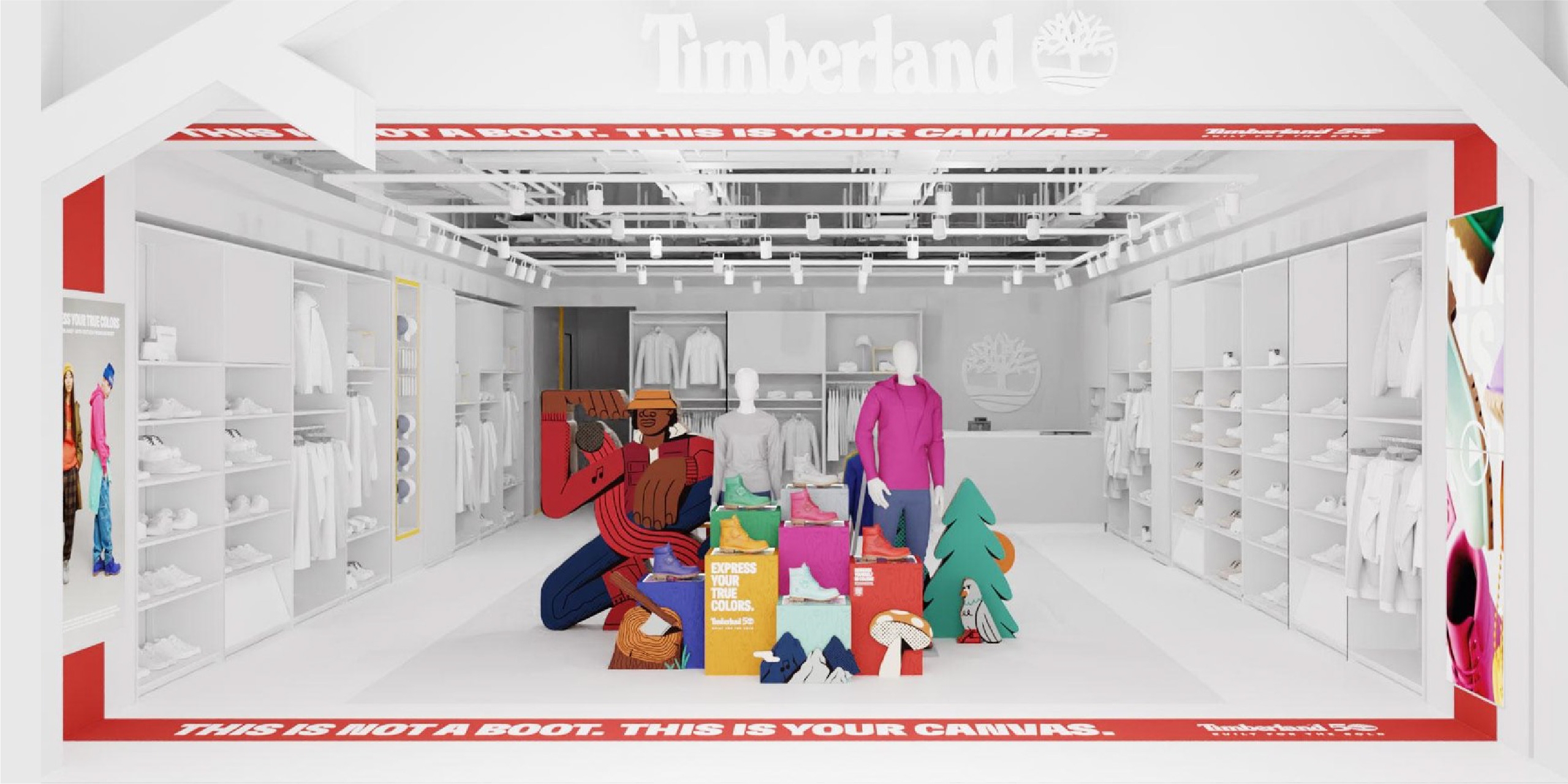
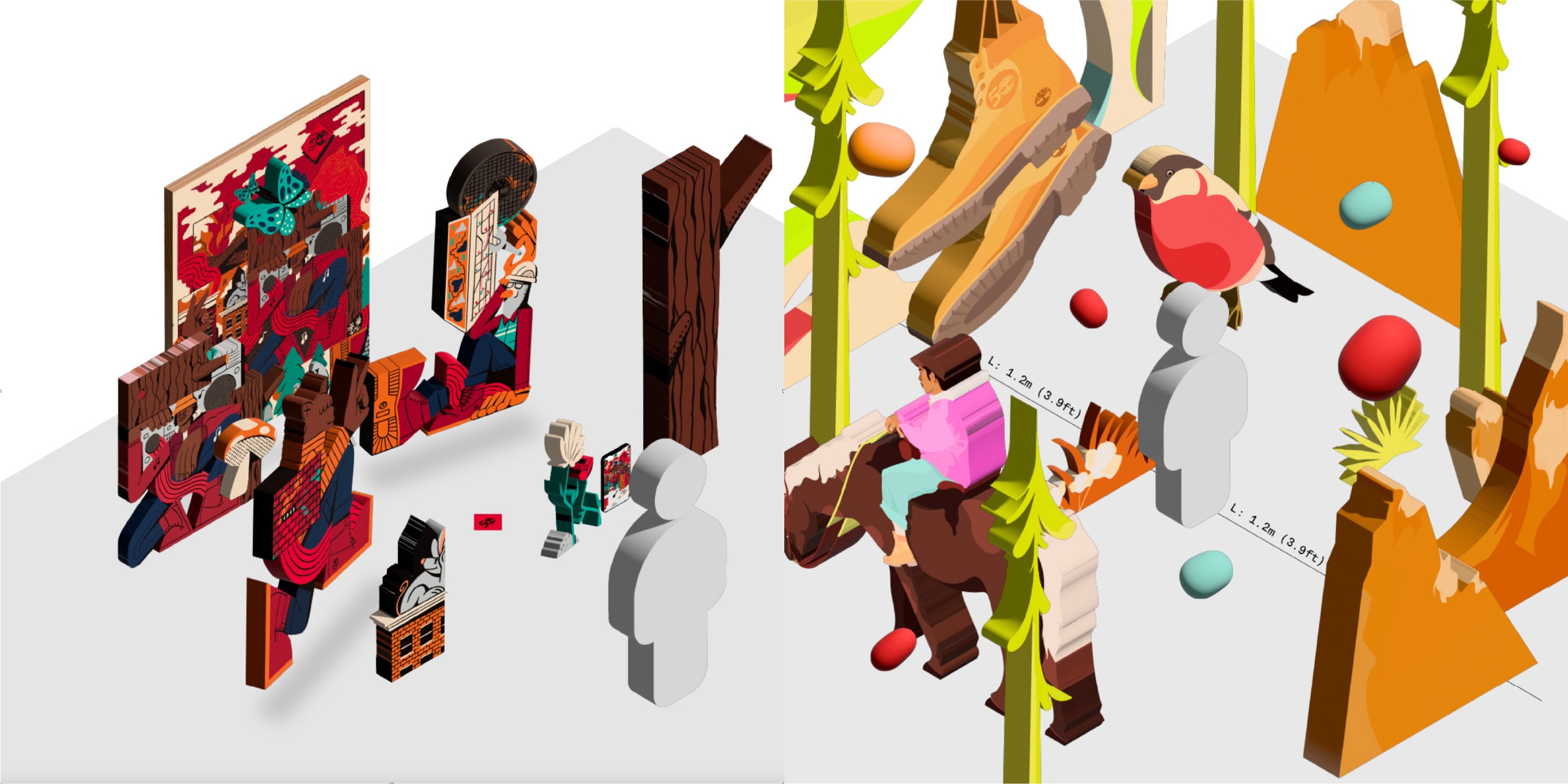
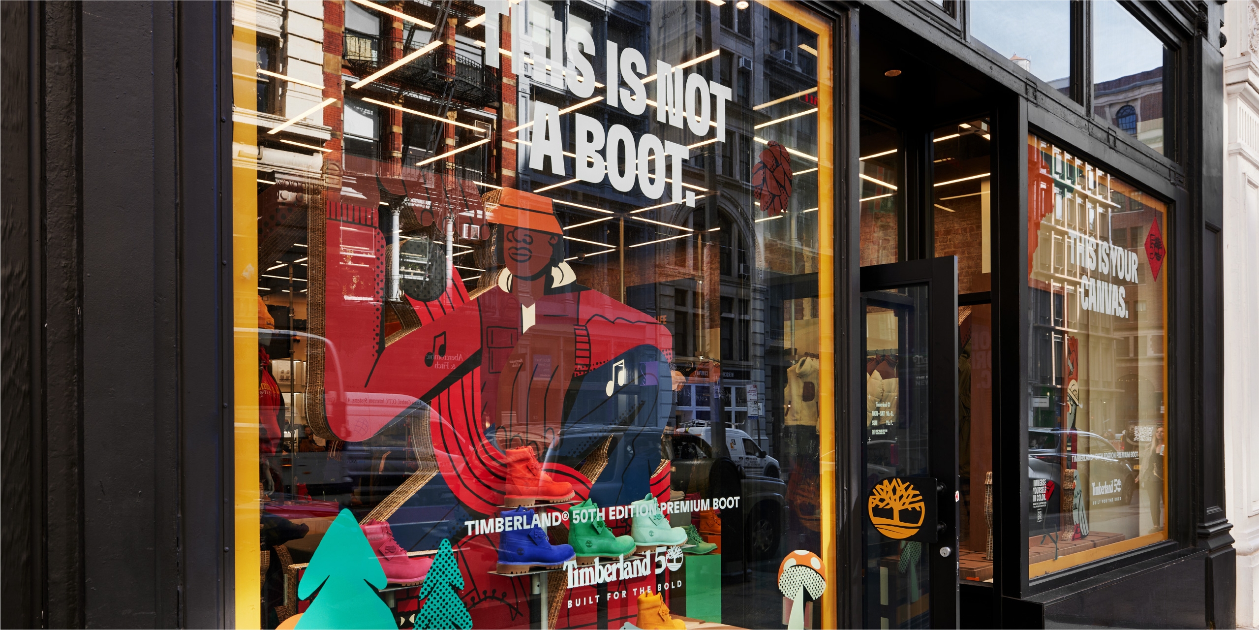
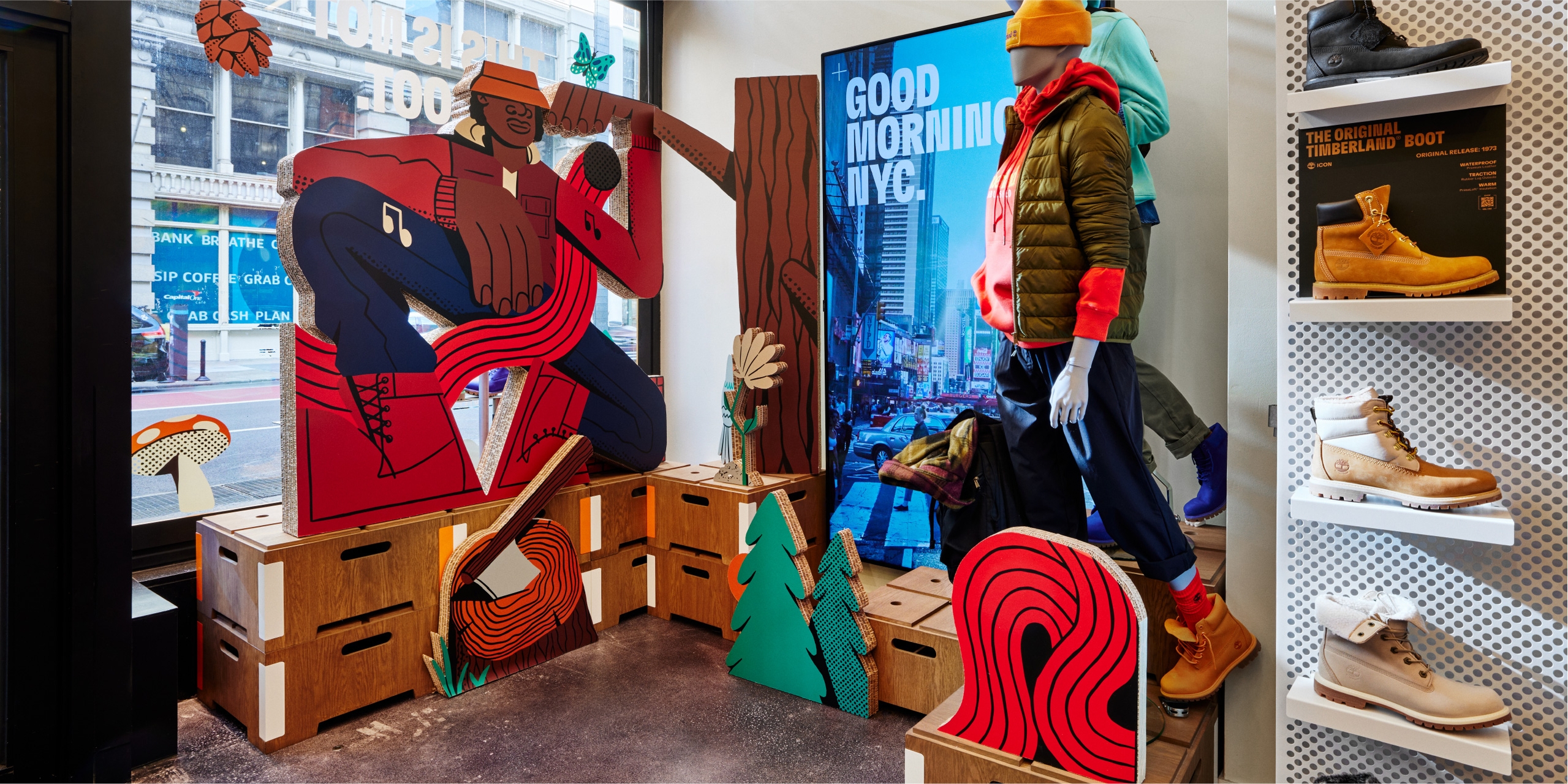
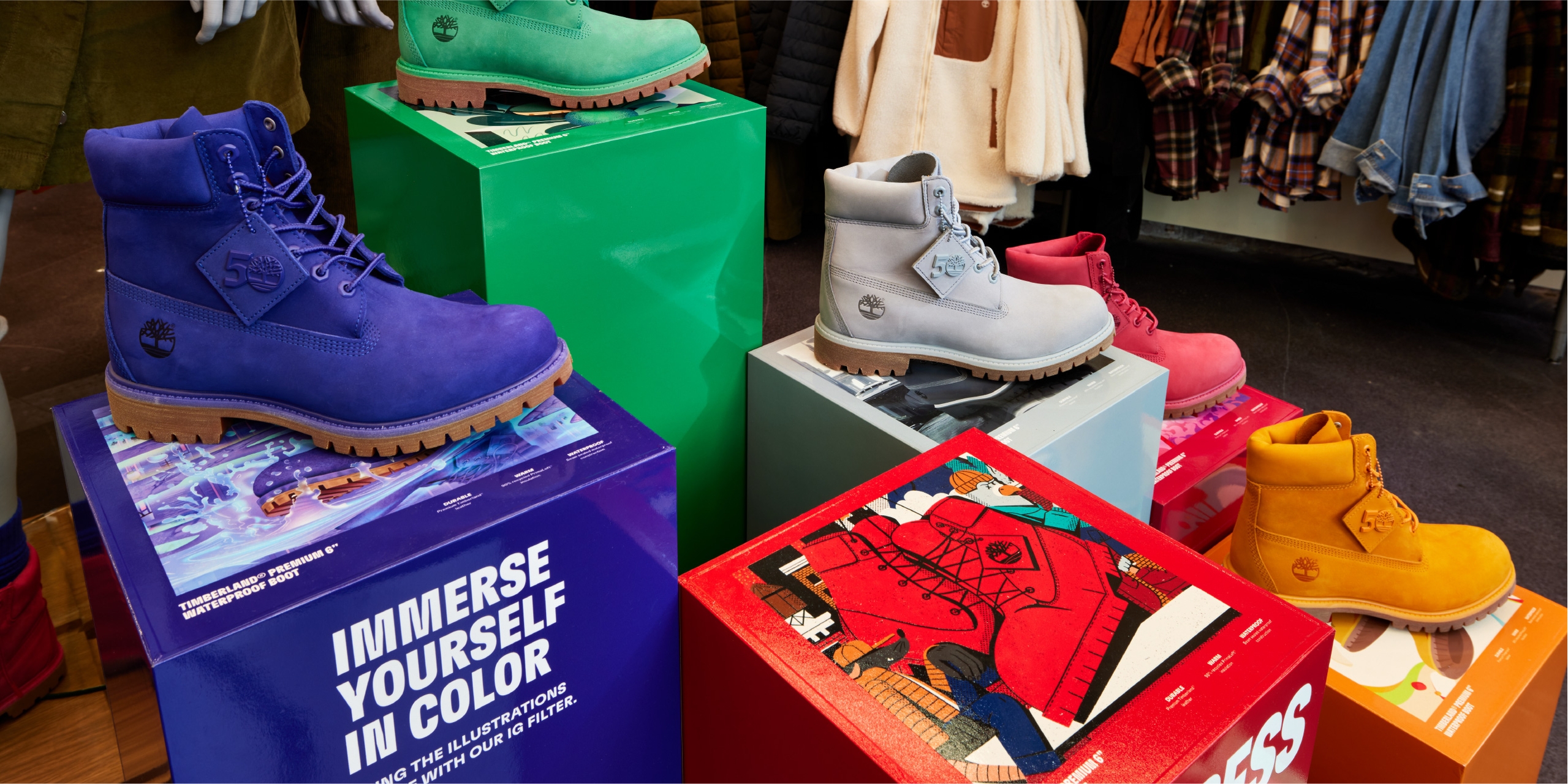
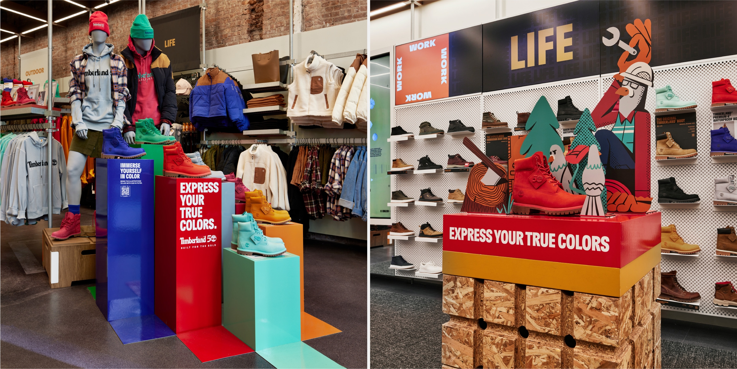
The beginning of the physical experience was the windows. We focused on interpreting the artist’s illustrations by separating them into layers of varying depth and materiality to make eye-catching, fun displays. The boldly colourful product floats in the foreground using the flagship store fixture system we had designed in an earlier project.
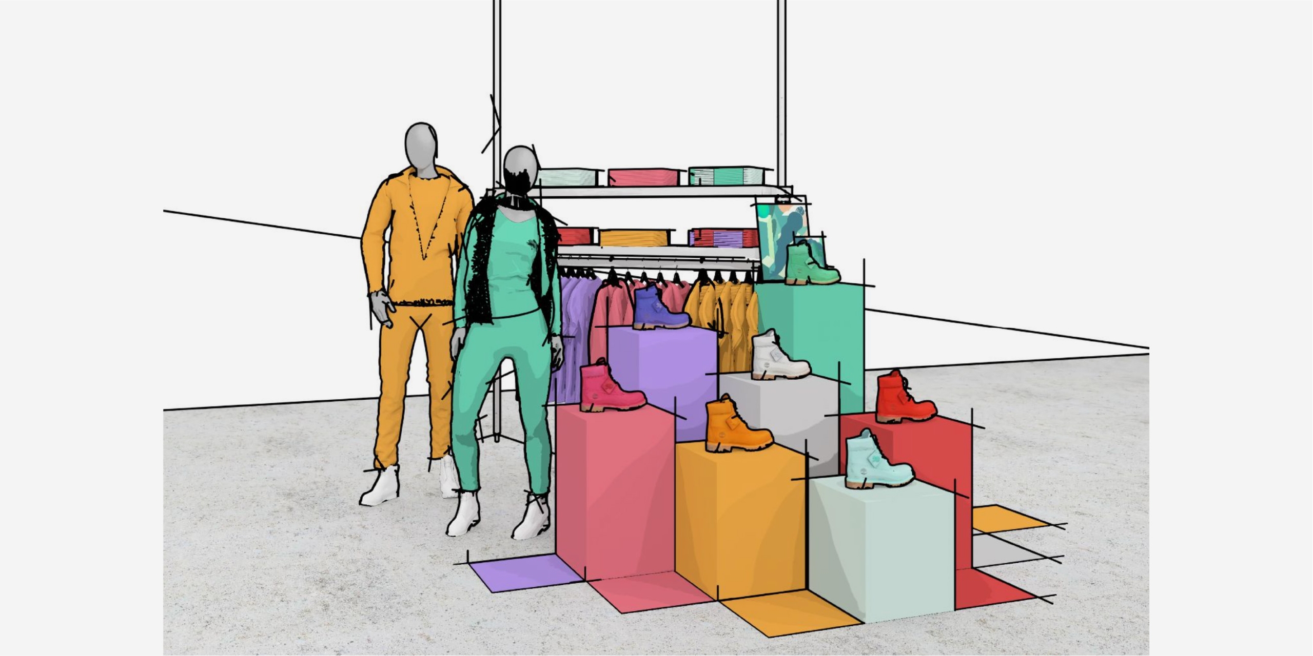
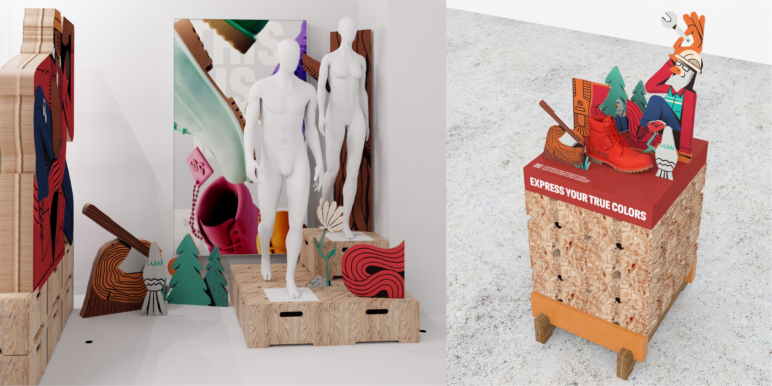
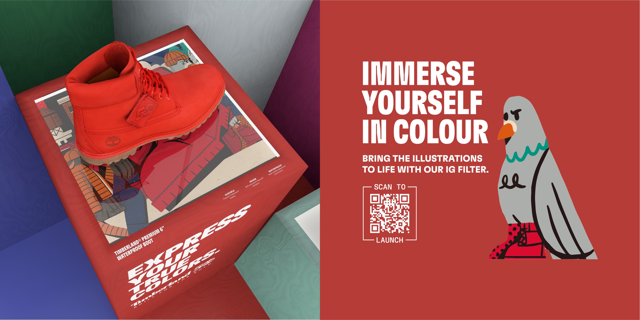
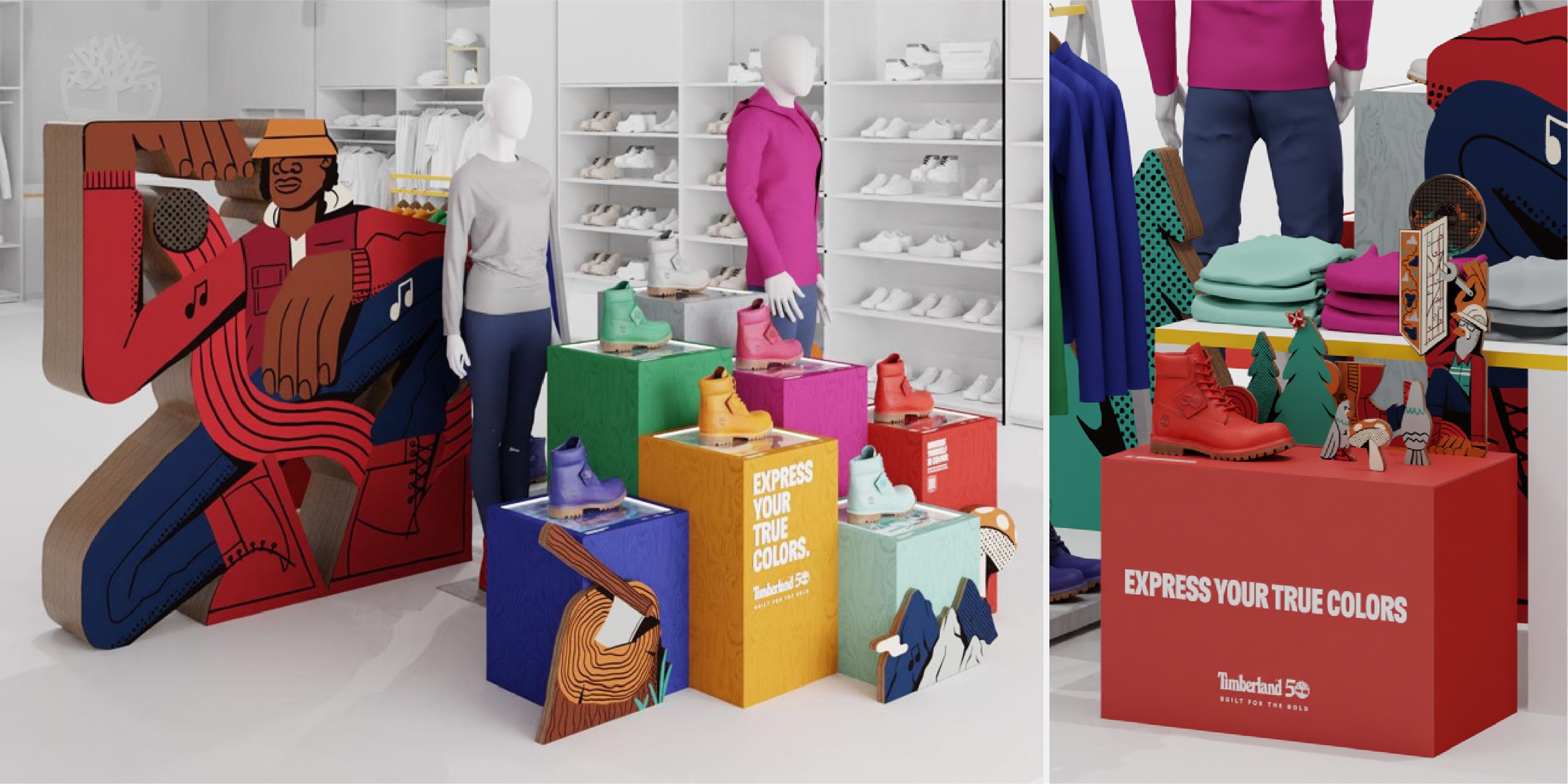
The playful layers of illustration and raw edged materiality continues into the store. Colour-coordinated plinths highlight each boot along with further illustrative storytelling. Here a call-to-action QR code invites people to try an Instagram filter we created that immerses participant’s deeper into the world of colour.
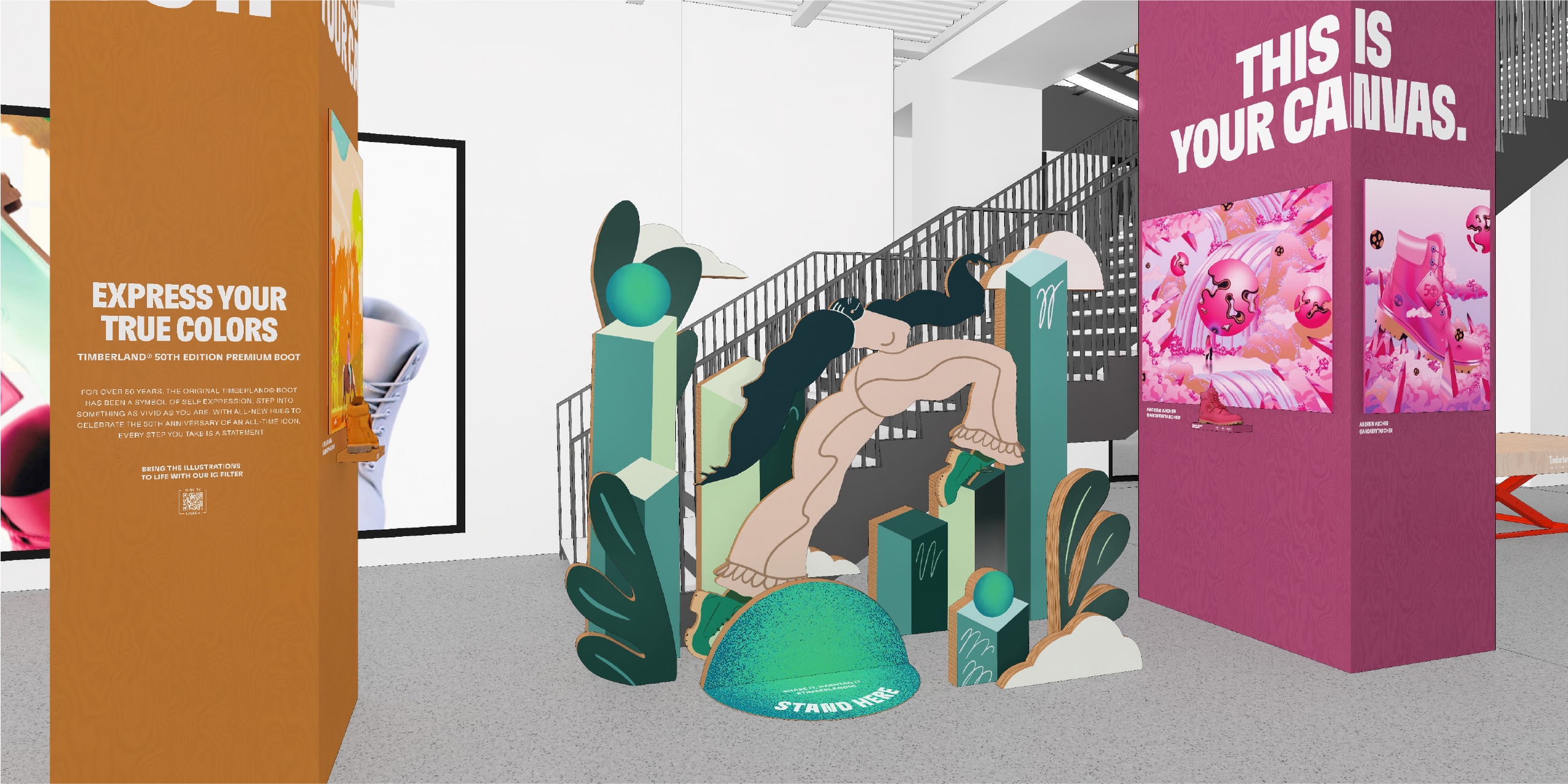
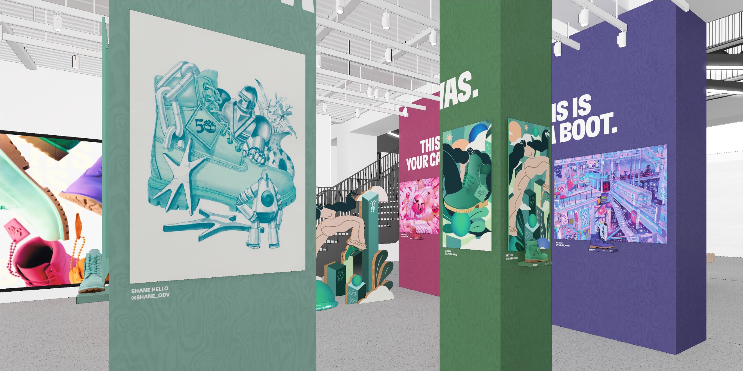
We translated our spatial concept to pinnacle stores at Carnaby Street London, Orefici 11 Milan and Sogo Shanghai, tailoring the approach to suit each stores' unique spaces. Orefici featured a gallery approach, showcasing the illustrations on colour-blocked columns in their entrance hall, with a photo moment highlighting Kelly Anna London's striding character.
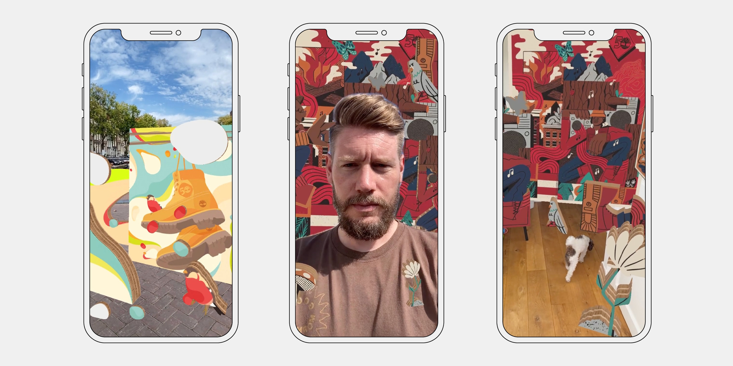
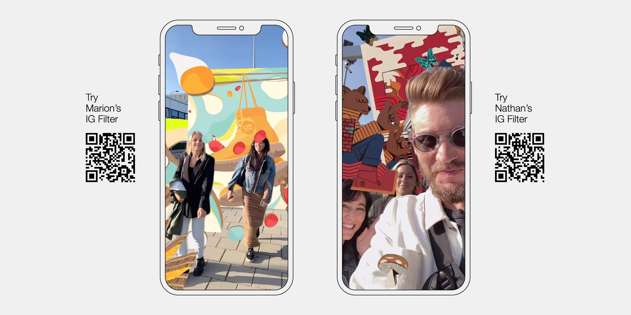
In parallel to the spatial design of the retail spaces, we developed an Instagram filter that allows participants to digitally immerse themselves in the colourful world of illustrations by Nathan Walker and Marion Ben-Lisa.
We separated elements from their illustrations to create a simple but engaging augmented-reality experience. This was tailored to the context of both the front and rear camera, to create both a selfie experience and one to drop the illustrations into real-world space.
While in-store visitors are invited directly to try, the filter is accessible anywhere, which is where it gets really fun.
Experience Nathan Walker’s world of colour on Instagram via Timberland’s filter gallery here.
Experience Marion Ben-Lisa’s world of colour on Instagram via Timberland’s filter gallery here.
Our spatial retail concept appears in Timberland’s pinnacle stores in New York (pictured), London, Milan and Shanghai, as well as their many Premium and Standard stores across the globe with the design tailored to each situation.
The AR experience on Instagram is accessible at any time, so give it go and express your true colours!
