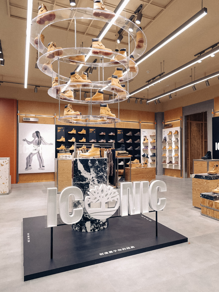
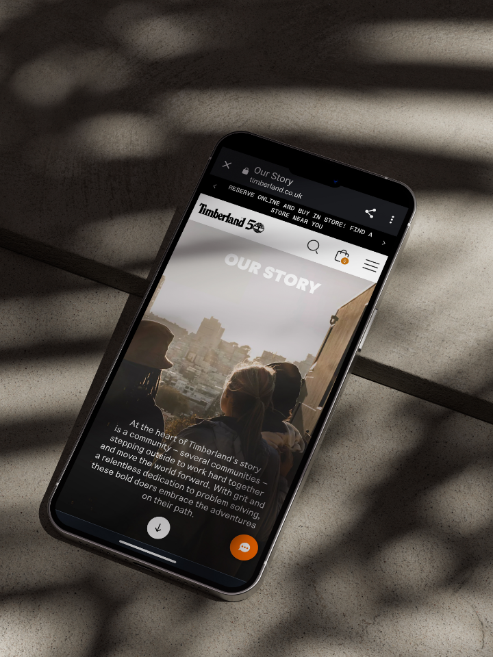
Continuing our work with Timberland, our latest designs have hit stores to launch their new hiking-focused product range.
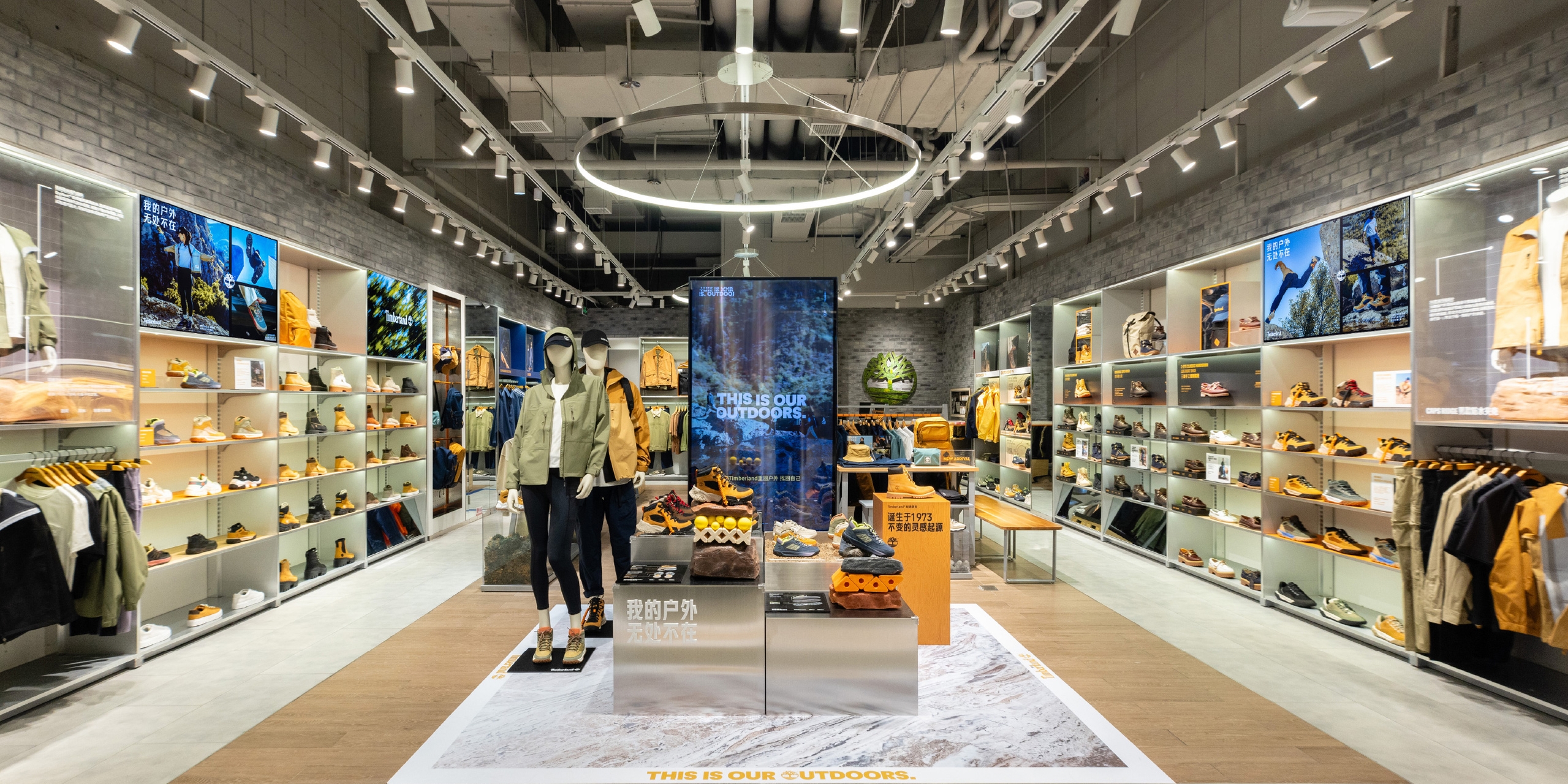
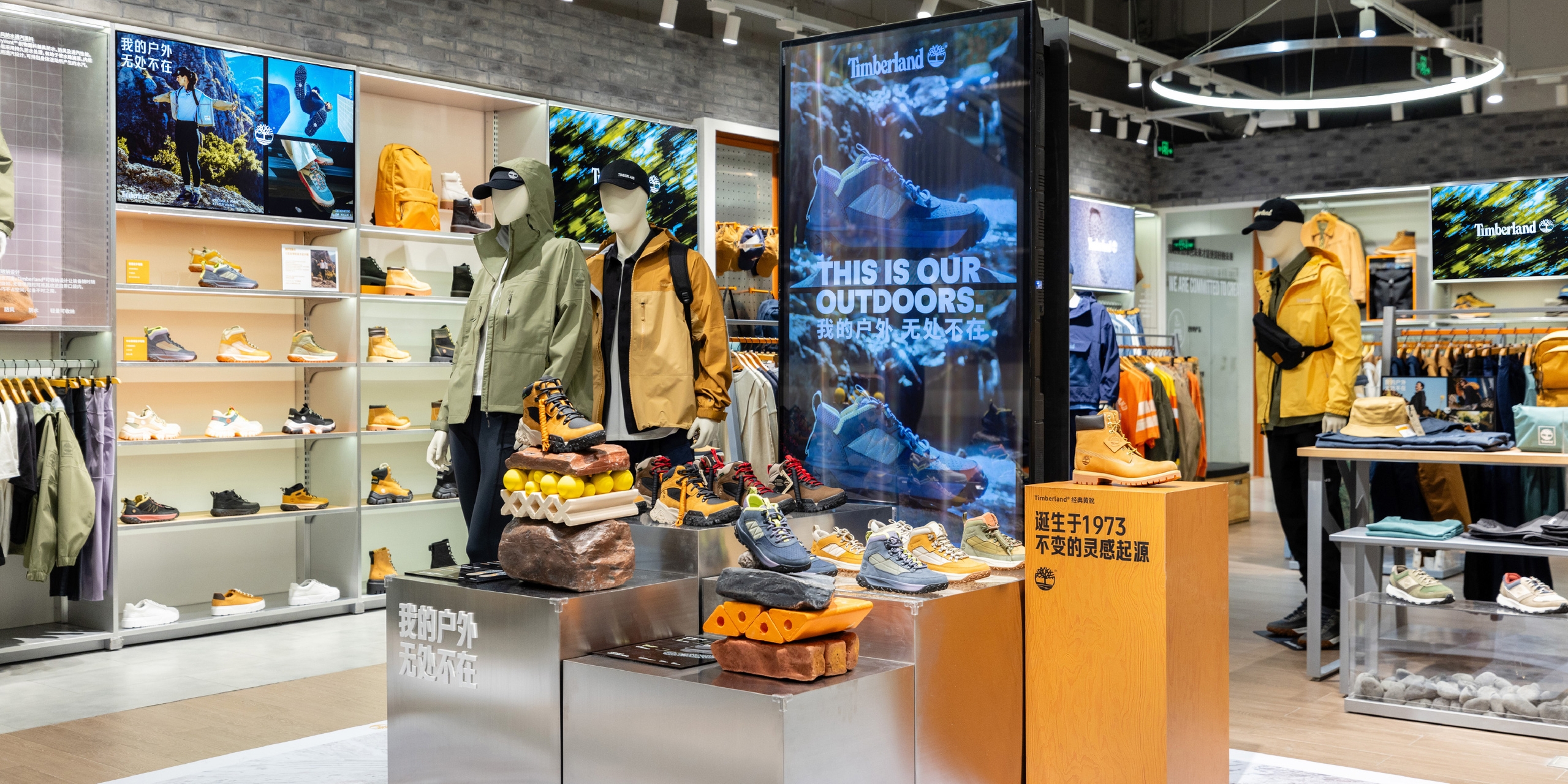
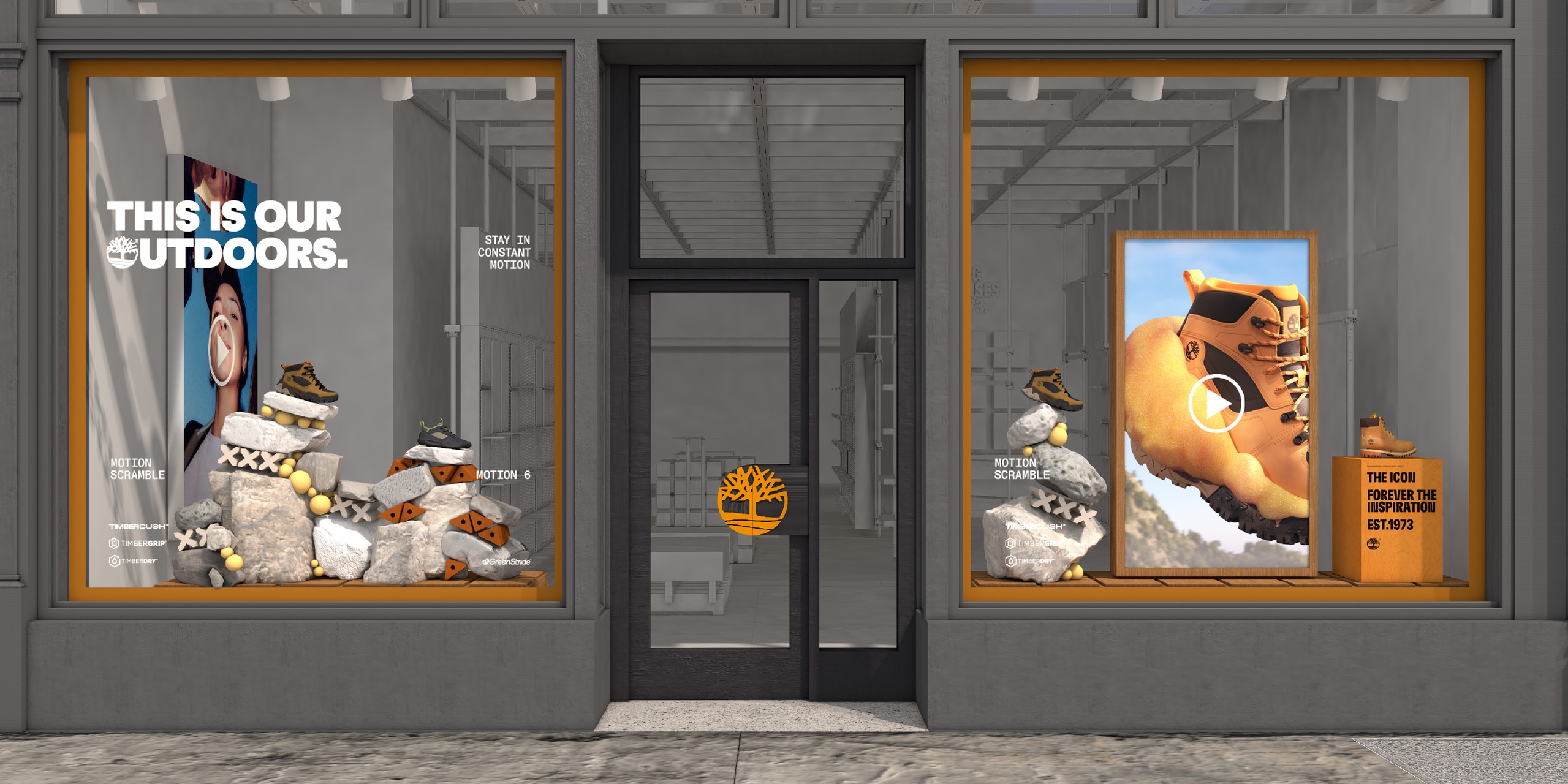
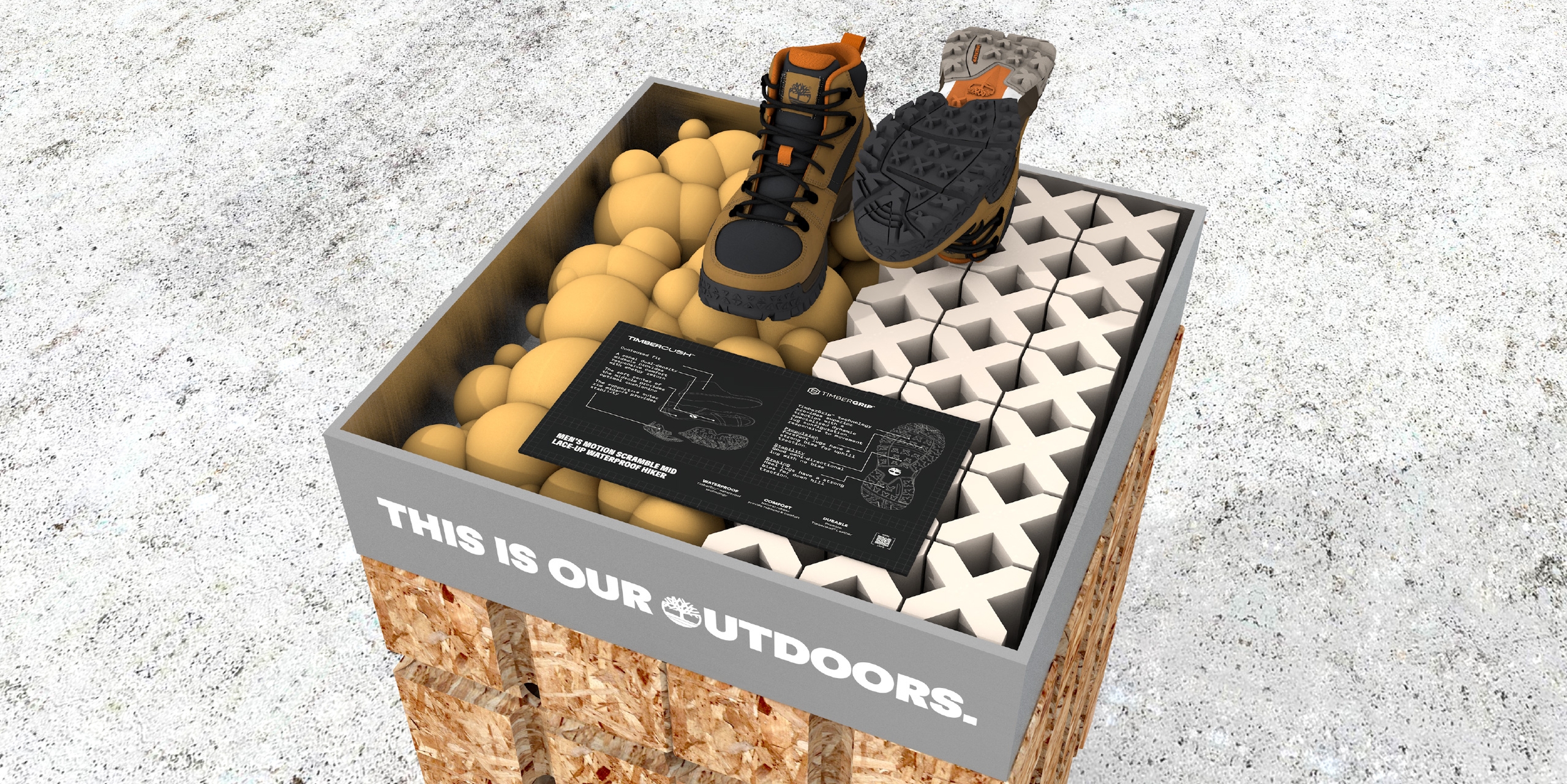
Our work for the This Is Our Outdoors campaign included various physical and digital retail touchpoints throughout the customer journey, including window displays, launch zones, footwear walls and in store graphics for Pinnacle, Premium and Standard levels.
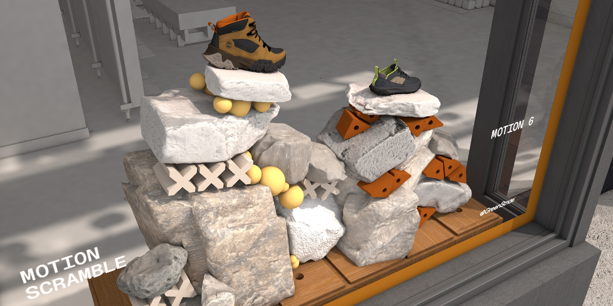
We drew inspiration from both work-in-progress product benefit-focused animations and location-focused photography to create a spatial concept consistent with the campaign as whole. We referenced materials, textures and finishes from outdoor hiking environments and cityscape locations and contrasted that with bold graphic elements representing the product’s sole technology. Rugged rocks and boulders represent hikes in nature whilst rough concrete and brushed steel evoke the navigation of urban locations; soft cushiony foam shapes alluded to the boot’s cushioning and sole traction.
We wanted to create an inclusive environment that would speak to a range of consumers and work with the product tagline “If your mind can go there, the boot can take you there.” Alongside this we created bespoke graphics to concisely communicate product benefits.
At the outset of this project, we utilised AI to quickly visualise our ideation, and to help clearly communicate our vision with the Timberland team. We then developed these ideas into detailed 3D models tailored to each store. The expansive toolkit we developed included territory variations for the implementation of our designs, as well as including scaled ideas to work across the range of stores Timberland has globally, including flagship stores in London, Milan, Shanghai and NYC.
